

The Challenge
Mosaic Counseling, PLLC came to us with a clear sense of purpose but a brand identity that had yet to catch up. As a therapeutic community dedicated to helping individuals navigate life's most complex emotional terrain, they needed a logo that could carry real symbolic weight — one that communicated inclusivity, personalized care, and hope without leaning on the tired visual clichés that often flood the mental health space. The challenge wasn't simply aesthetic. The logo needed to resonate deeply with an existing clientele while remaining welcoming and accessible to those encountering the practice for the first time. Striking that balance — emotionally warm yet professionally credible — required a thoughtful, concept-driven approach from the very beginning.
Our Approach
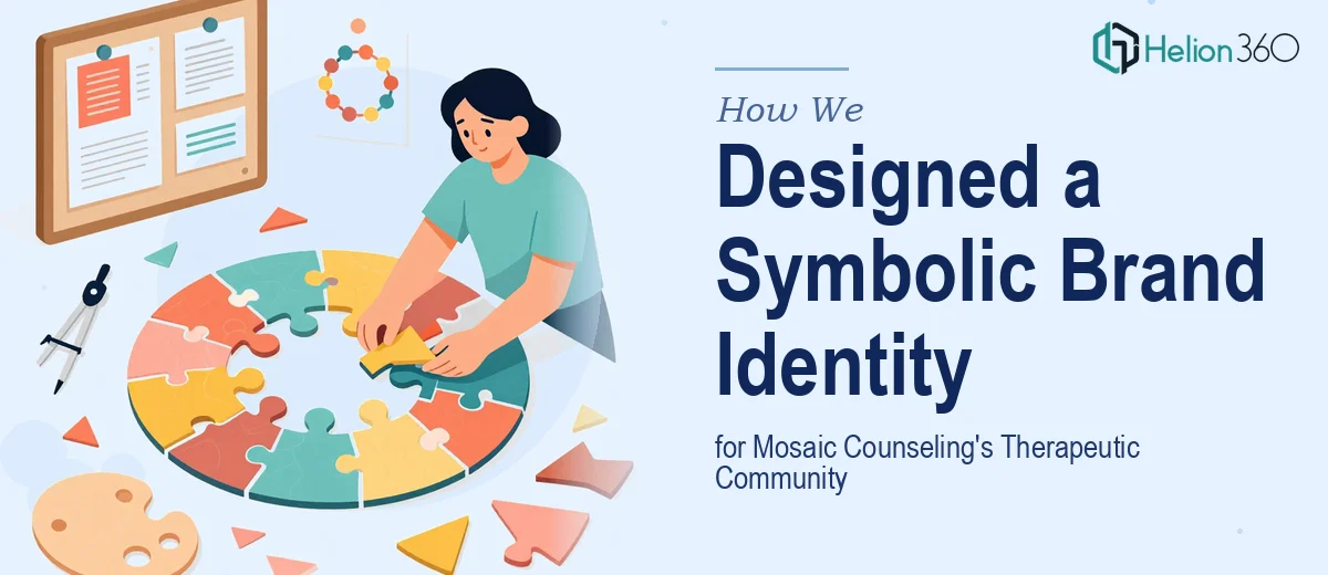
The Helion360 design team began by conducting a thorough brand discovery process, exploring the etymology and symbolism behind the name "Mosaic" itself — fragments coming together to form something whole and meaningful. This metaphor became the creative anchor for the entire identity. The team explored how geometric tile-like forms could be arranged to suggest unity, diversity, and the layered nature of human experience, while keeping the composition clean and scalable across digital and print applications. Color palette selection was guided by the emotional language of therapeutic environments — tones that evoke calm, trust, and quiet strength rather than clinical coldness. Typography choices reinforced approachability without sacrificing the sense of professional authority that a licensed counseling practice demands. Multiple concept directions were developed and refined based on feedback, ensuring the final mark truly reflected the practice's values and voice.
The Outcome
The final logo delivered a distinctive, symbolically rich mark that positioned Mosaic Counseling, PLLC with a brand presence worthy of its mission. The mosaic-inspired visual identity communicated inclusivity and wholeness at a glance, giving the practice a recognizable, emotionally resonant anchor for all of its client-facing materials — from its website and social presence to intake documents and signage. The logo system was delivered in full across multiple file formats and colorway variations, ensuring seamless use across every touchpoint. The result was a brand identity that not only looked professional but felt genuinely human — the kind of first impression that invites trust before a single word is spoken.
Helion360 brings the same level of conceptual depth and craft to every branding engagement, whether it is a single logo or a full visual identity system.