

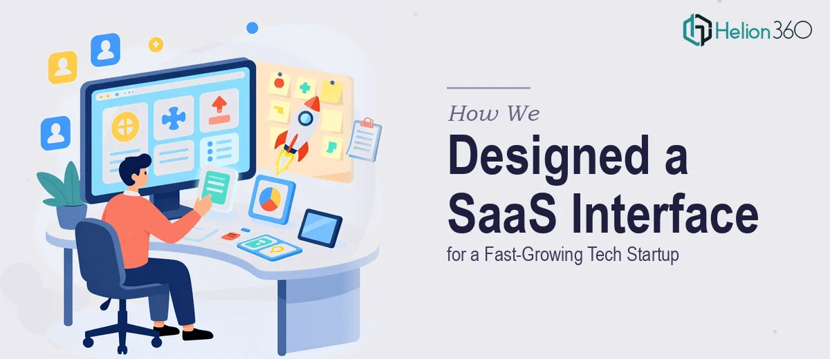
The Challenge
A fast-growing technology startup based in San Francisco needed a comprehensive UI/UX design overhaul across its SaaS platform, marketing landing pages, and mobile application. The difficulty was not simply visual — the client required a unified design language that could scale with their product roadmap while remaining intuitive for end users at every touchpoint. Their existing designs lacked consistency in typography, color application, and component structure, making it difficult for the development team to build efficiently and for users to navigate confidently. The challenge called for someone who could bridge the gap between aesthetic clarity and functional usability without slowing down an already fast-moving product cycle.
Our Approach
Helion360 began by conducting a thorough audit of the existing design assets, identifying inconsistencies in layout grids, type hierarchies, and interactive component behavior. From there, a foundational design system was established — covering color tokens, spacing rules, typography scales, and reusable UI components — to ensure that every screen, whether a landing page or an in-app dashboard, felt coherent and purposeful. The landing page designs were structured around clear conversion flows, with visual hierarchy guiding users toward key calls to action. For the SaaS interface itself, the team focused on reducing cognitive load through logical information architecture and clean data presentation patterns. Mobile app screens were designed with thumb-zone accessibility and platform conventions in mind, ensuring a native feel across both iOS and Android contexts. Throughout the process, close collaboration with the client's development team ensured that design specifications were handed off in a developer-ready format, minimizing back-and-forth and accelerating implementation.
The Outcome
The engagement resulted in a fully documented design system, a set of high-fidelity landing page templates optimized for conversion, and a complete UI kit covering the core screens of both the SaaS dashboard and the mobile application. The startup now had a scalable visual foundation that their internal team could extend independently, reducing future design debt and enabling faster feature releases. Navigation clarity improved significantly, and the new landing pages presented the product's value proposition with the visual confidence expected of a Series-A-stage company. The work gave the client a professional, consistent design presence that matched the ambition of their product and the expectations of their market.
Helion360 works with SaaS companies and tech startups that need design systems built right the first time — scalable, developer-friendly, and aligned to real user behavior.