

When a Simple Folder Design Turned Into a Full Brand System
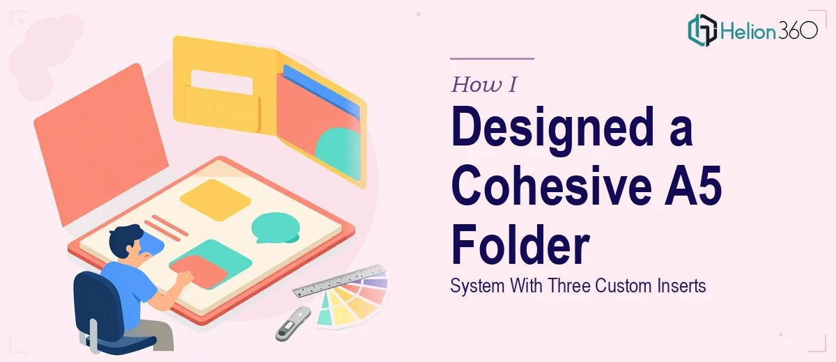
It started with what seemed like a straightforward task: design an A5 presentation folder for an upcoming brand rollout, along with three matching A5 inserts. The brief was clear enough on paper — elegant, functional, on-brand. But once I sat down to actually work through it, the scope revealed itself to be a lot more layered than I had anticipated.
The folder and inserts were not just marketing collateral. They were the first physical impression this startup was going to make on potential partners and investors. Every design choice — the layout, the color treatment, the typography, the way the inserts related to the folder — carried real weight.
What I Tried Before Reaching Out
I started in Adobe InDesign, sketching out the basic structure of the A5 folder. I had a general feel for the brand — the logo, the colors, a few brand reference points — but translating that into a print-ready folder design that also coordinated with three distinct inserts was more involved than I expected.
The challenge was not any single element in isolation. It was making everything feel like one cohesive system. The inserts needed to complement the folder without looking identical to it. Each insert had to carry its own message while still reading as part of the same visual family. I spent a couple of sessions trying different grid structures and typographic hierarchies, but none of them fully clicked.
I also ran into practical questions around bleed settings, print specifications, and how to handle the spine and pocket areas of the folder itself — details that require both design sensibility and technical knowledge of print production.
Bringing In the Right Team
After hitting a wall on the cohesion piece, I reached out to Helion360. I shared the brand references, the rough structure I had started, and the specific requirements: one A5 presentation folder and three A5 inserts, all designed to work as a unified set.
Their team took it from there. What impressed me was how quickly they understood the design brief — not just the technical deliverables, but the intent behind them. They asked the right questions about the brand's tone, the audience, and how the inserts would be used in context, which made it clear they were thinking about the full experience rather than just placing elements on a page.
What the Final Design Delivered
The finished A5 presentation folder design was clean and structured, with a pocket layout that felt purposeful rather than generic. The three inserts each had a distinct role — one introducing the company, one outlining services, one with supporting data — but visually they all shared the same design language through consistent type scale, spacing, and a controlled color palette.
What struck me about the final files was how print-ready everything was. Proper bleed, correct dimensions, separated layers — it was exactly what a professional printer needs without any back-and-forth on technical corrections. The branding across all four pieces felt genuinely cohesive, the kind of consistency that is easy to describe but hard to execute.
What This Project Taught Me
Designing a presentation folder system is not just a graphic design task — it is a brand coherence exercise. The inserts cannot live independently of the folder, and the folder cannot look like it was designed without knowing what goes inside it. Everything has to be conceived as a system.
I also came away with a better appreciation for print-specific design knowledge. Screen design and print design share principles but diverge significantly when it comes to file setup, color modes, and production requirements. Underestimating that gap is easy to do when you are working primarily in digital environments.
If you are working on a similar project — a presentation folder, a set of branded inserts, or any print collateral that needs to feel like a coordinated system — Helion360 is worth reaching out to. They handled the parts I could not, and the final output was something I would not have arrived at on my own timeline.