

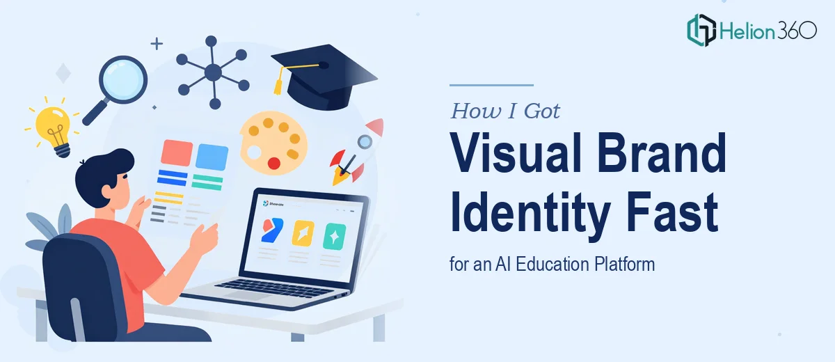
When Your Brand Identity Needs to Say Everything at Once
We were getting close to launch. The platform was built, the messaging was mostly locked, and the one thing that still needed to land — cleanly, confidently, and immediately — was the visual identity. Specifically, the logo. For an AI education startup, this wasn't a cosmetic decision. It was the thing that would appear on every deck, every partnership email, every onboarding screen, and every press mention from day one.
The brand had to communicate three things at once: intelligence, accessibility, and growth. That's not a vague creative brief — that's a genuinely hard design problem. I started looking into what a proper logo and visual identity design process actually involves, and I quickly realized this was not a task I could hand off casually or attempt to shortcut.
What I Found the Work Actually Requires
A logo for a technology education brand isn't just a nice mark. Done well, it's a system — and designing that system takes a level of craft that's easy to underestimate until you start pulling the thread.
The first thing I discovered is that professional logo design starts with a structured exploration phase: defining the conceptual territory, mapping visual metaphors, and stress-testing ideas against the brand values before a single vector is drawn. For a platform sitting at the intersection of AI and education, those metaphors had real constraints — too abstract and you lose the education angle, too literal and you look like clip art.
The second thing that surprised me was the typography dimension. The wordmark treatment — how the brand name sits alongside or within the mark — carries as much weight as the icon itself. Getting that relationship right involves typographic decisions that affect legibility at 16px on a mobile screen and at 300dpi on a printed banner simultaneously.
Third, the deliverable isn't a single file. A proper logo system produces a suite of variants — primary, horizontal, stacked, monochrome, reversed — each tested across contexts. That scope alone signals this is a multi-day professional engagement, not an afternoon exercise.
The Design Work That Actually Needs to Happen
The structural work starts before any software opens. A designer working at this level begins by auditing the competitive landscape — identifying visual codes already claimed in the AI and edtech space — and then mapping a conceptual brief that articulates what the mark must communicate versus what it must avoid. This phase typically involves three to five distinct concept directions, each grounded in a different strategic rationale. Skipping this step is where most rushed logo projects fail: the mark looks fine in isolation but says nothing differentiated about the brand it represents.
The visual mechanics of mark-making at a professional level are precise. A well-constructed logomark uses a geometric grid — often a 16-unit or 24-unit construction grid — to ensure proportional harmony between every curve, stroke, and negative space. Weight decisions (stroke width relative to overall mark size) follow optical sizing rules, not arbitrary preferences. The color palette is constrained to a primary brand color, one supporting tone, and a neutral — typically no more than three active colors in the core system — because any more creates fragmentation across applications. Typography pairings for wordmarks follow contrast rules: a geometric sans for the mark pairing with a humanist secondary face for body copy, creating a system that feels both precise and approachable.
Polish and consistency across the full deliverable set is where the real time investment lives. Each logo variant — primary lockup, horizontal version, icon-only, reversed — must be tested across a minimum of six to eight application contexts: app icon, dark background, light background, print, social profile, and co-branding scenarios. Master files need to be organized in both vector (AI/EPS/SVG) and rasterized (PNG at 2x and 3x) formats, with a basic usage guide that documents clear space rules, minimum size thresholds, and color reproduction values in RGB, CMYK, and HEX. Building and packaging all of this correctly takes time that most people don't account for upfront.
Why I Brought Helion360 in to Handle the Full Project
Once I understood the scope — the concept exploration, the geometric construction work, the variant production, the file packaging — I wasn't going to attempt this myself or hand it to someone who'd treat it like a quick turnaround task. The stakes were too high and the timeline too short.
Helion360 handled the full brand identity project end-to-end. That meant the conceptual brief, the mark exploration, the wordmark development, the full variant suite, and the formatted deliverable package — all of it. They turned it around quickly, in a fraction of the time it would have taken me to even get a single direction to a presentable state on my own.
What stood out was that there was no ramp-up time. The team understood the AI education space, the visual conventions of the category, and the specific tension between feeling technical and feeling approachable. That expertise was already built in. I wasn't explaining the brief three times or reviewing rough work that missed the mark entirely — the first round of concepts was already at a level I could actually evaluate meaningfully.
What Got Delivered and What I'd Tell Anyone in the Same Position
The final deliverable was a complete visual identity system: a primary logomark and wordmark, four lockup variants, a defined color system, typography pairings, and a concise usage guide covering clear space, minimum size, and reproduction specs. It was the kind of asset package that the entire team — product, marketing, partnerships — could immediately pull from without asking questions.
More importantly, the mark itself did what it needed to do. It read as intelligent without being cold. It communicated education without being childish. It scaled cleanly from app icon to slide header. That outcome came from a brand identity and presentation system that took the conceptual and technical work seriously — not from luck.
If you're looking at a similar project and want a complete visual identity handled end-to-end without spending weeks on a learning curve, Helion360 is the team I'd engage — they delivered fast and brought exactly the depth of execution this kind of work demands.