

The Situation and What Was at Stake
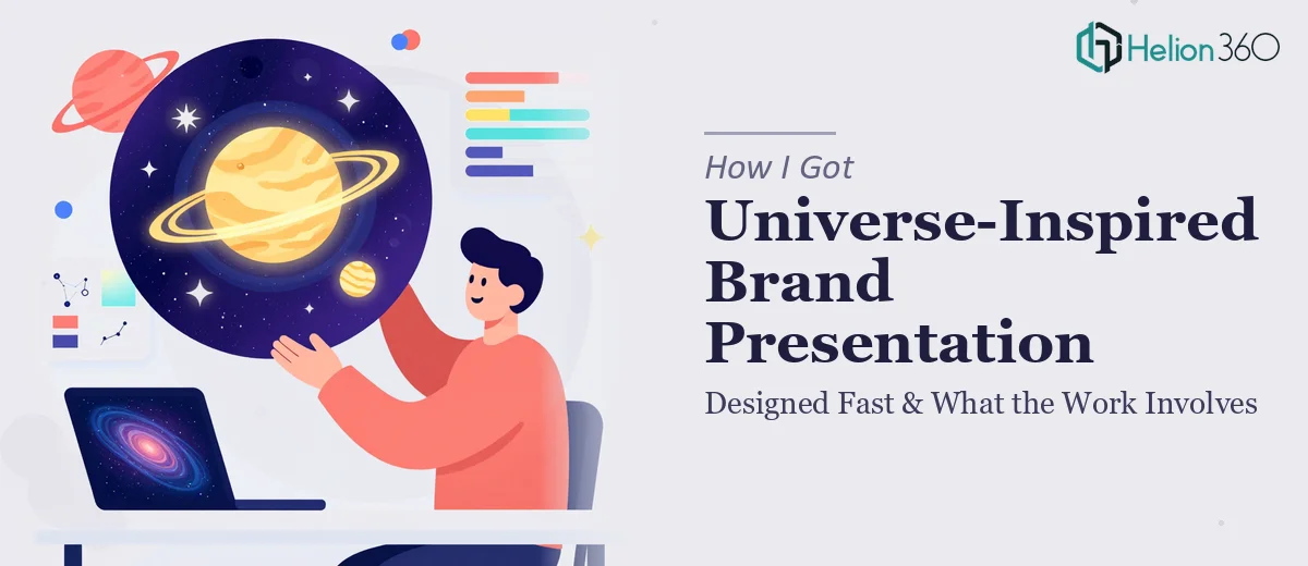
I had a set of AI-generated images that genuinely looked striking — a cosmic, universe-inspired visual language that felt right for the brand direction we were building. The problem was that raw AI output, no matter how impressive, isn't a brand. It's raw material. What I needed were professional vector logos, scalable assets, and website mockups that would hold up across print, digital, and marketing presentations — and I needed a brand presentation that could communicate the full visual identity story to internal stakeholders and agency partners.
The deadline was close. The assets were going to feed into a product marketing push, which meant delays weren't just inconvenient — they would stall downstream work. I knew immediately that the gap between "striking AI image" and "polished, production-ready brand presentation" was not a small one. This needed to be done properly, not patched together.
What I Discovered the Work Actually Required
Once I started mapping out what "production-ready" actually meant, the scope became clear fast. Vector logo work from AI-generated source images isn't a simple export. AI images are raster by nature — pixel-based, not path-based — which means every curve and edge has to be rebuilt as a clean vector path before the file is truly scalable. That process alone requires a trained eye for what defines the mark versus what's visual noise.
Beyond the logo, website mockups built around a specific visual world require consistent application of the brand — not just dropping images into a template. Color palette decisions, typographic hierarchy, spacing rules, and the way cosmic visual elements translate to a clean UI all have to be thought through deliberately. And then there's the brand presentation itself: the document that explains the identity system to anyone who will use it. That's a different discipline again — visual storytelling, layout, and a clear narrative arc that makes the brand legible to a room full of people who didn't build it.
The Work That Needs to Happen
The first phase of this kind of project is structural and narrative — auditing the source AI imagery, identifying which visual elements are strong enough to anchor the identity, and mapping the story arc the brand presentation needs to tell. A practitioner doing this well will identify a hero mark, a supporting visual motif, and a clear hierarchy of assets before a single file is opened in a design tool. Skipping this step means building on an unstable foundation — the logo ends up disconnected from the mockups, and the presentation ends up feeling like a collection of slides rather than a coherent brand story. This phase typically takes longer than people expect, especially when source material is AI-generated and hasn't been curated yet.
The second phase is visual mechanics — rebuilding the logo as clean vector paths in SVG format, establishing a color palette capped at four brand colors with defined hex and CMYK values, and setting typographic rules (typically a 36pt/24pt/16pt hierarchy for display, subheading, and body). Website mockups require a 12-column layout grid so that homepage and product page compositions are consistent and hand-off-ready. Getting a grid to propagate correctly across multiple artboards, while maintaining the cosmic visual language without turning the UI into chaos, is exactly the kind of execution detail that trips up anyone who doesn't do this work regularly. One misaligned master element can cascade across every mockup.
The third phase is polish and consistency across every deliverable — ensuring that the brand application reads identically whether someone is looking at the logo on a white background, the product page mockup in dark mode, or a slide in the brand presentation. Palette discipline at this stage means checking every instance of every color across every file. Typography rules have to be enforced at the paragraph-style level, not manually slide by slide. Exporting final files in both SVG and high-resolution PNG, sized correctly for print and digital contexts, adds another layer of precision that takes time and methodical QA.
Why I Brought in Helion360 to Handle It
Looking at what this project actually involved — vector reconstruction, multi-format asset production, UI mockups with a consistent grid, and a brand presentation that had to tell the full identity story — I didn't spend time wondering if I could manage it myself. The answer was obvious. The combination of technical execution depth and the tight timeline made it a straightforward decision: this needed a team that does this kind of work every day, with the tooling and expertise already in place.
Helion360 handled the full project end-to-end. That meant taking the AI-generated images through to clean vector logos delivered in SVG and PNG formats, building out the homepage and product page mockups with placeholder content structured around the brand identity, and producing the brand presentation with a narrative that made the full visual system legible to any stakeholder walking into the room. The whole thing was turned around quickly — done in days, not weeks, and handled in a fraction of the time it would have taken to ramp up and execute independently.
What the Project Delivered and What I'd Tell Anyone in This Spot
The final deliverables were exactly what the downstream work needed: production-ready logo files that held up at any size, website mockups with enough fidelity to drive real decisions, and a brand presentation that made the universe-inspired visual identity feel intentional and ownable rather than aesthetically interesting but hard to explain. Stakeholders walked away with a clear picture of the brand. The marketing team had assets they could use immediately.
The gap between raw AI-generated imagery and a polished, scalable brand presentation is a real one — and the mechanics of crossing that gap involve disciplines most people don't have on standby. If you're looking at a similar situation and need it handled end-to-end without the weeks of learning curve, Helion360 is the team to engage — they delivered fast, worked to the depth the project demanded, and didn't require hand-holding to get there.