

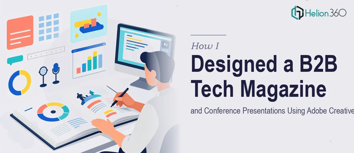
When the Scope Was Bigger Than I Expected
I came into this project thinking it would be a straightforward design engagement. The brief was clear enough on the surface: design a B2B tech magazine for Tech Innovators Magazine and create conference presentation materials for their upcoming annual events. I had solid experience with Adobe Creative Suite — InDesign, Illustrator, Photoshop — and felt ready to hit the ground running.
What I underestimated was the scale and the level of consistency required across two very different formats: print editorial design and presentation design for live conference stages.
Starting With the Magazine Layout
The magazine covers were the first deliverable. Working in InDesign, I built out a grid system that could carry the brand's visual identity across multiple issues without looking repetitive. Typography was a key decision — pairing a geometric sans-serif for headlines with a readable serif for body copy gave the publication a credible, authoritative tone without feeling stiff.
The covers themselves went through several rounds. B2B tech audiences expect precision, so every element — from the placement of cover lines to the choice of color palette — needed to reflect that. I kept the layouts clean, anchored by strong imagery and a dominant accent color pulled from the brand guidelines.
For interior spreads, I developed a modular template system so the editorial team could drop in content without breaking the layout. That part worked well.
Where Conference Presentation Design Got Complicated
The conference presentations were a different challenge entirely. The magazine design was largely self-contained, but the presentations needed to work across multiple speakers, multiple sessions, and multiple event formats — keynotes, panel discussions, and breakout workshops.
Each presentation had to carry the brand consistently while still feeling tailored to its specific session topic. On top of that, the editorial team wanted data-heavy slides — market trend charts, technology adoption infographics, and sector comparison visuals — that could hold up on a large conference screen.
I could design slides. But designing a cohesive presentation system that would scale across an entire event calendar, with multiple stakeholders adding their own content, required a level of slide architecture I hadn't fully tackled before. I was spending too much time rebuilding master slides and reconciling inconsistencies across decks.
Bringing in the Right Team
That's when I reached out to Helion360. I explained where I was in the process — the magazine work was solid, but the presentation side needed a more systematic approach than I could build alone within the timeline.
Their team took over the presentation design work without disrupting what had already been done. They reviewed the brand guidelines, studied the magazine layouts for reference, and built out a PowerPoint master template system that matched the publication's visual language precisely. The slide architecture included pre-built layouts for data visualization, speaker intro slides, section dividers, and content-heavy formats — all locked to a consistent grid.
For the infographics specifically, Helion360 translated raw data from the editorial team into clean visual formats that would read clearly on both large conference screens and printed handouts. That dual-format requirement had been one of my bigger concerns, and they handled it with a process that was faster and cleaner than what I had been attempting.
What the Final Output Looked Like
By the time both workstreams were complete, the magazine and the conference materials felt like they belonged to the same brand — which was exactly the goal. The magazine covers had a polished editorial quality, the interior layouts were modular and consistent, and the presentation decks were structured enough that any speaker could work within the system without needing design support for every revision.
The data visualization slides were particularly effective. B2B conference audiences tend to scrutinize charts closely, and having clean, accurately labeled visuals made a noticeable difference in how the content landed.
What I Took Away From This
The biggest lesson was about scope assessment. Both the magazine and the presentations were achievable — but not simultaneously, not at the quality level required, and not within the timeline, without distributing the work properly.
Working alongside Helion360 on the presentation side meant I could focus on what I was doing well — the editorial design — while the presentation architecture got the dedicated attention it needed. The outcome was stronger because the work was handled by people who specialize in exactly what each format demands.
If you're managing a multi-format design project and find that one piece of it is pulling more resources than you planned for, that's usually a sign the scope is deeper than it first appeared.
Working on something similar and need a team that can step in where the work gets complex? Helion360 handles B2B Sales Presentation Design Services across formats — from conference decks to data-heavy infographics — so your project doesn't stall when the scope expands.