

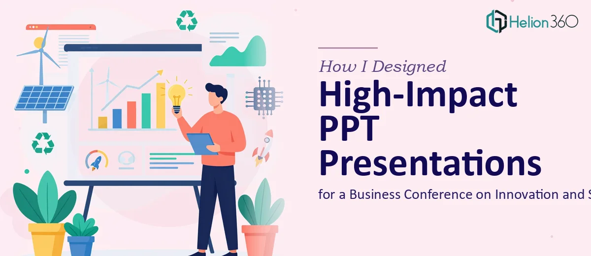
The Brief Looked Simple. The Execution Wasn't.
When our team was tasked with preparing multiple PPT presentations for a large business conference centered on innovation and sustainability, I figured we had enough in-house to handle it. We had the content, the data, and a rough idea of what each session needed to communicate. What I underestimated was how much work goes into transforming raw information into professional presentation design that actually holds an audience's attention.
The conference had multiple speakers, each covering a different angle — green technology, circular economy models, ESG reporting, and startup innovation ecosystems. Every session needed its own visual identity, while still maintaining a consistent brand thread across all slides. That's where things started to get complicated.
What I Tried to Do First
I started building the slides myself using a standard PowerPoint template. The content was solid — well-researched, structured, with data points that told a clear story. But the design? It looked like every generic corporate deck I'd seen a hundred times. Bullet points stacked on bullet points. Charts that were technically accurate but visually cluttered. No visual hierarchy, no breathing room.
I tried a few different approaches — switching templates, adjusting color palettes, adding stock images. Nothing quite clicked. The slides felt disconnected from the conference's tone. Innovation and sustainability as a theme demands a visual language that feels forward-looking, clean, and credible. I wasn't hitting that mark.
On top of that, the deadline was tight. One week for multiple decks, each needing infographics, custom charts, speaker notes, and a call to action per session. I had to make a call.
Bringing in the Right Support
After hitting a clear wall, I came across Helion360. I explained the full scope — number of decks, the conference theme, brand guidelines, and the design quality we were aiming for. Their team asked the right questions upfront: slide count per deck, existing brand assets, audience profile, and what kind of data visualization was needed.
What I appreciated was that they didn't just ask for files and disappear. There was a brief back-and-forth to make sure they understood the context — not just the aesthetics, but the purpose of each presentation within the conference program.
What the Final Decks Looked Like
Helion360 delivered the first drafts within a few days, and the difference was immediately visible. Each deck had a clear visual structure — compelling headline slides, well-spaced subheadings, and bullet points that were actually readable from a distance. The infographics simplified complex sustainability data without losing accuracy. The charts were clean and annotated to guide the viewer's eye to the key insight.
Every deck felt like it belonged to the same family, yet each had enough visual distinction to match its specific session topic. The ESG reporting deck leaned into structured data tables and muted greens. The startup innovation session used bolder typography and dynamic layouts. The brand identity stayed consistent throughout — colors, fonts, icon styles — without feeling repetitive.
Revisions were handled quickly and without friction. A few speaker-requested tweaks, some copy adjustments, and one full slide restructure. All done within the agreed timeline.
What This Project Taught Me
Designing for a business conference on innovation and sustainability isn't just about making slides look polished. It's about visual storytelling — making sure the design supports the message rather than competes with it. That's a specific skill, and it takes more than a good template to pull off.
The experience reinforced something I've seen in other projects: content strategy and design execution are two different disciplines. I could handle the content side confidently. The presentation design — the kind that works under conference lighting, in front of a mixed audience, across multiple sessions — needed a dedicated team.
For anyone managing a similar project, especially with a hard deadline and multiple decks to coordinate, the complexity tends to sneak up on you. It's not just about making things look good. It's about consistency, clarity, and making every slide earn its place.
Need Help With a Complex Presentation Project?
If you're working on conference presentations, multi-deck design, or branded PPT work and the scope is starting to feel larger than expected, Helion360 is worth reaching out to. Their team handles the design complexity so you can stay focused on the content and the conference itself. See how 40 high-quality PPTX slides were delivered under a tight deadline for a real-world example of what's possible.