

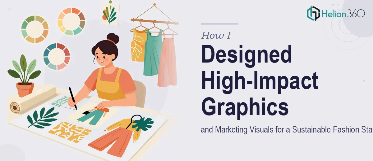
The Brief Looked Simple. It Wasn't.
When I first sat down with the brief from a sustainable fashion startup, I thought the visual direction was fairly clear. They needed product graphics showcasing organic cotton, linen, and recycled polyester. They wanted infographics comparing their footprint against fast fashion. They needed social media creatives and a compelling blog cover series. All rooted in a clean, eco-conscious aesthetic.
On paper, this was a graphic design project. In practice, it was a brand communication challenge — and a complex one at that.
Where I Hit a Wall
I started with what I knew. I sketched layout concepts, pulled together a color palette rooted in earth tones and natural textures, and began drafting the first infographic comparing water usage across fabric types. The data was interesting — organic cotton uses significantly less water than conventional cotton, recycled polyester diverts plastic from landfills — but translating those numbers into something visually compelling for a general audience is a different skill set entirely.
The product photography series was another challenge. The startup had rough ideas about showcasing each fabric with its own visual identity, but they didn't have a defined visual language yet. Without a clear brand framework, every design decision felt like guessing.
I also underestimated how much platform-specific thinking goes into social media marketing visuals. An infographic that works well on Instagram doesn't always translate to LinkedIn or Pinterest. The sizing, hierarchy, and content density all shift depending on where the content lives.
After two rounds of internal revisions that weren't landing, I accepted that this required more than one person working in isolation.
Bringing in Helion360
After hitting that wall, I came across Helion360. I explained the project scope — the product visuals, the sustainability infographics, the social series, and the blog cover images — and their team took it from there.
What stood out immediately was how they approached the brief. Rather than jumping straight into execution, they asked clarifying questions about brand tone, target audience, and the specific platforms where each asset would be used. That structured thinking made a real difference in the outcome.
What the Design Process Actually Looked Like
Building a Visual Language First
Helion360 started by establishing a consistent visual identity for the project. That meant defining a type system, an icon style, a photography treatment approach, and a color framework that could stretch across all four asset categories. Without this foundation, each deliverable would have looked like it came from a different brand.
Infographics That Actually Communicate
The sustainability comparison infographic was the most data-heavy piece. The Helion360 team structured it around three clear axes — water usage, carbon footprint reduction, and ethical manufacturing. They used simple iconography and percentage callouts rather than complex charts, which made the information accessible without oversimplifying it. The result was something the startup could use in both investor presentations and social media with minimal adaptation. If you're looking for professional Infographic Design Services, this kind of structured, data-driven approach is exactly what separates clear communication from visual noise.
Social Media Marketing Visuals Built for Each Platform
For the social series, the team created a modular template system — one that could be adapted across Instagram, LinkedIn, and Pinterest without losing visual consistency. Topics like sustainable wardrobe tips and fabric care instructions were formatted as digestible, scroll-stopping cards. The visual style stayed grounded: natural textures, soft gradients, and clean typography that reflected the brand's eco-friendly positioning.
Blog Cover Images with Editorial Weight
The blog cover series was designed to set a tone, not just label content. Each cover used layered imagery — fabric textures overlaid with bold typographic headlines — that felt editorial without being overly designed. The startup wanted readers to feel the seriousness of the environmental conversation, and the visuals delivered that without being heavy-handed.
What the Finished Work Delivered
The final asset package was cohesive in a way my early drafts simply weren't. The infographics communicated clearly. The social visuals had consistency and platform awareness. The blog covers felt like the beginning of a real editorial identity.
More importantly, the startup had a reusable visual system — not just a one-off batch of graphics. That's the difference between solving a single problem and building something scalable.
Working with Helion360 on this project taught me that sustainable fashion marketing visuals aren't just a design exercise. They're a communication strategy, and they need to be built with that broader purpose in mind.
Need Help With Complex Visual Projects?
If you're managing a visual project that's grown beyond what one person can handle cleanly, Helion360 is worth talking to. Their team works well when the brief is layered — multiple asset types, multiple platforms, a brand that's still finding its visual voice. They step in where the complexity starts and deliver work that holds together across every format.