

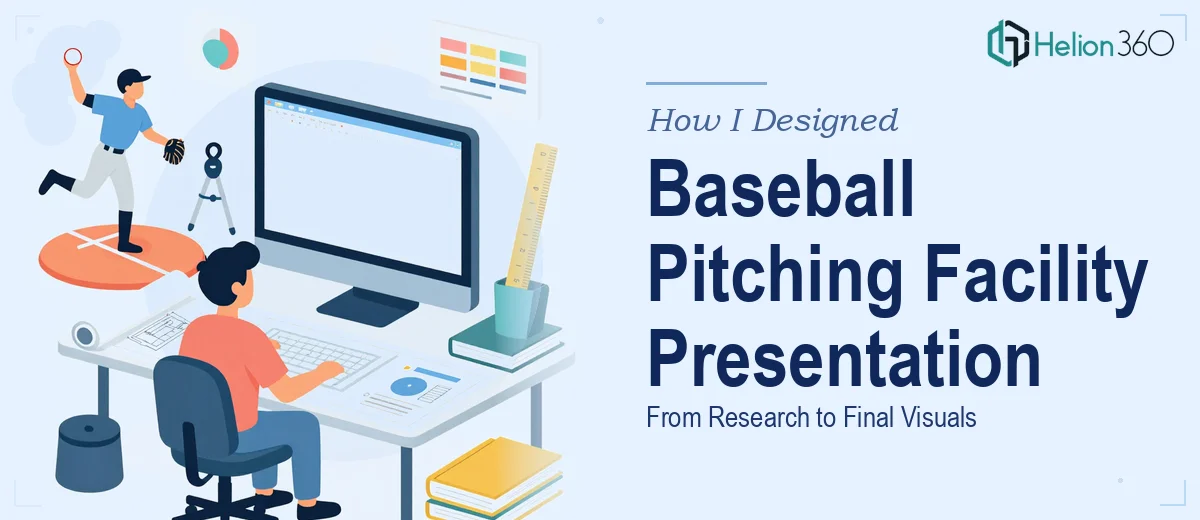
When a Facility Design Project Turns Into a Full Presentation Challenge
I was brought into a project that sounded straightforward at first: create a PowerPoint presentation for a state-of-the-art baseball pitching facility. The firm I was working with needed to present the full concept to stakeholders — covering the pitch zone layout, lighting systems, drainage, seating arrangements, and overall facility functionality.
I figured I could handle it. I know the basics of PowerPoint, and I had access to all the technical specs. But what I underestimated was just how much visual complexity this kind of presentation demands.
The Gap Between Technical Knowledge and Visual Communication
The information itself was not the problem. I had detailed notes on the facility layout, vendor specifications for the lighting rigs, drainage flow diagrams, and seating capacity charts. What I could not figure out was how to translate all of that into slides that actually communicated clearly to a non-technical audience.
A baseball pitching facility presentation is not a standard business deck. It needs to balance architectural logic with visual storytelling. The drainage system diagram looked like a mess of lines when I tried to build it in PowerPoint. The lighting layout needed precise spatial representation that I simply did not have the design skills to execute at that level. And the seating arrangement required a kind of bird's-eye floor plan view that went well beyond what I could produce with default shapes and SmartArt.
I spent a few evenings trying to make it work, adjusting layouts and swapping color schemes. The slides were functional but not presentation-ready. For a facility pitch going in front of decision-makers, functional was not going to be enough.
Bringing In a Team That Could Handle the Complexity
After hitting that wall, I came across Helion360. I explained the scope — the technical drawings that needed to become clean visual layouts, the slide structure that needed to support a clear narrative, and the tight deadline the firm was working against. Their team asked the right questions upfront: what was the audience expecting, what tone did the presentation need to set, and what raw materials did I have to work with.
That intake process alone told me they understood what this kind of industry-specific presentation design actually requires. It was not just about making slides look nice. It was about communicating a complex physical space and its systems in a way that builds confidence in the design.
What the Final Presentation Looked Like
Helion360 took the technical specifications and turned them into a cohesive visual presentation. The facility layout became a clean, annotated overhead diagram. The lighting and drainage sections were broken into focused slides with simple icons and spatial callouts that made the systems easy to follow. The seating arrangement was presented as a properly proportioned floor plan with capacity figures integrated into the visual rather than listed separately.
The slide flow followed a logical structure — opening with the facility overview, moving through each design zone, and closing with the key differentiators that made this pitching facility stand out. Every section felt intentional. The typography, color palette, and iconography all matched the professional tone the firm needed.
What I had spent days struggling with, their team delivered in a clean, polished form within the project timeline.
What I Took Away From This
Industry-specific business presentation design is its own skill set. Knowing the subject matter deeply — the baseball facility specs, the pitch zone requirements, the drainage logic — is only half the work. The other half is knowing how to structure and visualize that content so it lands with the audience. Those are genuinely different capabilities, and there is nothing wrong with recognizing where one ends and the other begins.
For a presentation that needed to represent a real facility design to real stakeholders, the quality of the visual communication mattered as much as the quality of the underlying plan.
If you are working on a facility design presentation — or any industry-specific deck where the technical content is complex and the visual stakes are high — Helion360 is worth reaching out to. They took what I had and turned it into something the firm could confidently walk into a room with.