

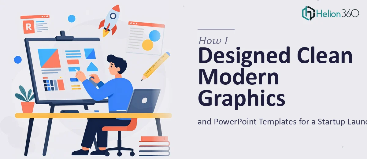
Starting From Scratch With a Startup Brand
When I first decided to pull together the visual identity for my new business, I thought it would be straightforward. A few clean graphics, a refreshed PowerPoint template, maybe a simple brochure. How complicated could it be?
Pretty complicated, as it turned out.
The challenge was not just making things look good. It was making everything feel consistent — the startup branding, the slide layouts, the promotional materials — all of it needed to speak in the same visual language. And that language had to feel modern and energetic without becoming cluttered or over-designed.
Why DIY Only Got Me So Far
I started by pulling a few free PowerPoint templates and trying to adapt them to fit my brand colors and content. The result looked patched together. The fonts did not feel intentional, the color blocks were off, and the slides that were supposed to show simple graphs ended up looking like they were built by someone who just discovered PowerPoint for the first time.
The promotional materials were even harder. I tried putting together a basic flyer in Canva, but it lacked the polished, professional look that a startup trying to make a strong first impression actually needs. Clean presentation design is deceptively hard — every element on the slide competes for attention, and if you do not have a trained eye, you end up either over-designing or under-designing.
I also had an existing PowerPoint presentation that needed a layout refresh without losing any of the current content. Trying to rework that while keeping everything structured and readable was where I finally hit a wall.
Bringing In the Right Help
At that point, I reached out to Helion360. I explained what I needed — custom PowerPoint templates built around the startup's brand, clean simple graphics, updated slide layouts, and a few promotional design pieces. Their team asked the right questions upfront: brand colors, tone, target audience, how formal or casual the presentation needed to feel.
That conversation alone told me they had done this kind of work before. They were not just picking fonts and dropping in logos — they were thinking about how the design would communicate the brand story to someone seeing it for the first time.
What the Final Design Actually Looked Like
The templates they delivered were genuinely clean. Not minimal to the point of being empty, but structured in a way where every slide had breathing room and a clear visual hierarchy. The startup branding carried through every slide — from the color palette to the way data was presented in charts.
The simple graphs that had looked clunky in my version were now visually clear and easy to read. The promotional materials — flyers and a basic brochure layout — matched the same design language as the slides, which is something I had not even thought to prioritize but made an enormous difference in how cohesive the whole package felt.
The updated PowerPoint presentation kept all the original content intact but now had a layout that actually guided the eye through the information rather than dumping it onto the slide.
What I Took Away From This
There is a real difference between a presentation that looks designed and one that just looks put together. For a startup trying to establish credibility quickly, that difference matters more than most founders realize. Clean, modern presentation design is not decoration — it signals that you take your brand seriously, and that carries weight with the people you are trying to reach.
The process also taught me something practical: adapting templates well is a skill in itself. It is not enough to swap colors and call it done. The spacing, the type choices, the way graphics sit in relation to text — all of it needs to be intentional.
If you are launching a business and finding that your investor pitch decks and marketing visuals are not quite landing the way you imagined, Helion360 is worth reaching out to — their team handles exactly this kind of work, from custom PowerPoint templates to full startup branding materials, and they deliver without overcomplicating the brief.