

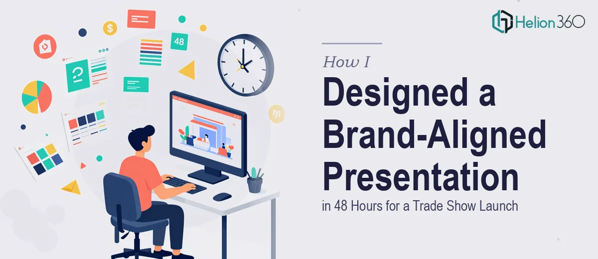
When the Trade Show Is on Friday and the Slides Aren't Ready
We had the content locked. The product line was ready. The booth was booked. The one thing standing between us and a confident trade show appearance was a PowerPoint presentation that actually looked the part.
I had about 48 hours.
The slides we had internally were functional — the data was accurate, the product messaging was clear — but visually, they looked rough. Inconsistent fonts, placeholder layouts, and color usage that didn't match our brand guidelines at all. Walking into a trade show with those slides would have undermined everything else we'd prepared.
Why I Couldn't Just Fix It Myself
I'm comfortable with PowerPoint at a basic level. I can build a clean slide, apply a template, and format text. But what we needed wasn't a fix — it was a proper design pass. Brand-consistent color schemes, professional typography, high-quality visuals, and a layout system that could hold together across 20+ slides without looking cobbled together.
That kind of work takes a skilled eye and real design experience. I spent about two hours trying to clean up a few slides myself before I accepted the reality: this wasn't something I could do well in the time available. The deadline was immovable, and the quality bar had to be high.
Finding a Team That Could Actually Turn It Around
After stepping back, I looked for a presentation design team that could handle a fast turnaround without cutting corners on quality. That's when I came across Helion360. I explained the situation — trade show on Friday, brand guidelines in hand, content already written, just needed the slides designed and polished fast.
They confirmed they could work within the 48-hour window and asked for the existing file, our brand guidelines document, and any visual references I had in mind. The handoff took about 20 minutes.
What the Design Process Looked Like
Once the Helion360 team had everything, they moved quickly. They came back with a few questions about slide priority — which ones were the most critical to the product story — and flagged a couple of areas where the content was too dense for a trade show context. That kind of practical feedback was useful. Trade show audiences aren't sitting in a boardroom; they're scanning quickly, and the slides needed to work at a glance.
The design direction they proposed matched our brand exactly — the right color palette, consistent font hierarchy, and clean visual layouts that gave the product imagery room to breathe. They also suggested breaking up a few text-heavy slides into paired visuals with short callout points, which made the presentation significantly more engaging without losing any of the information.
I reviewed a draft within the first day and had one round of revisions — mostly small adjustments to a few slide headers and one layout tweak. The final file came back with plenty of time before the trade show.
The Result on the Day
Walking into the trade show with those slides felt completely different from where I started. The presentation looked professional, cohesive, and on-brand. Product features were communicated clearly without overwhelming the audience. Several attendees at the booth specifically mentioned how clean the display looked — which, in a crowded trade show environment, matters more than people realize.
The content was always strong. What Helion360 did was make sure the design matched the quality of the work behind it.
What I Took Away from This
Design under time pressure is a specific kind of challenge. It's not just about having the skills — it's about having a reliable team that can execute quickly without a long briefing process or back-and-forth delays. Having the content and brand guidelines ready ahead of time made a real difference in how fast things moved.
If you're approaching a product launch, trade show, or client presentation and the slides aren't where they need to be, Helion360 is worth reaching out to — they stepped in when I needed fast, high-quality work and delivered exactly that.