

The Deadline Was Real and the Stakes Were Higher Than I Expected
I had a presentation deck due in under a week. The slides needed to cover market trends, company history, key milestones, and future plans — a lot of ground for a single deck. The audience wasn't internal. This was going out to people who would be forming an opinion about the business based on what they saw on screen.
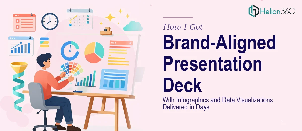
The content was mostly drafted, but the visuals were a mess. Placeholder boxes, inconsistent fonts, and a handful of charts that didn't match the brand at all. I knew this presentation needed to look polished and professional — the kind of deck where the design reinforces the message instead of undermining it. With the timeline I was working against, I recognized quickly that this wasn't something I could push through on my own.
What I Found Out the Moment I Started Researching What "Done Well" Actually Means
I spent a few hours researching what a genuinely professional presentation deck requires, and the complexity surfaced fast.
First, brand alignment across a multi-section deck isn't just slapping a logo on every slide. It means applying a consistent color palette, enforcing typography rules, and making sure every visual element — charts, icons, section dividers — is built from the same design system. One off-brand slide in the middle of a 25-slide deck signals carelessness to a sharp audience.
Second, the market trends section required actual data visualization thinking. Not just inserting a default bar chart, but choosing the right chart type for the story each data point was telling, and then styling it so it read cleanly at presentation scale.
Third, the infographics for the milestone timeline and future plans sections needed to be custom-built. Generic templates don't accommodate a company's specific narrative — they force the content into a shape it doesn't naturally fit, and it shows.
That was enough research. I wasn't going to close this gap in five days while managing everything else on my plate.
What a Presentation Like This Actually Takes to Build Properly
The first thing that needs to happen is a structural pass — auditing all the content and mapping it to a logical visual flow before a single slide is designed. A deck covering market trends, company history, milestones, and future plans has four distinct narrative chapters that need to feel connected, not like four separate documents stapled together. Each section needs an opening slide that orients the audience, a consistent hierarchy for how information is introduced, and deliberate transitions between chapters. Getting this architecture right before touching the visual layer saves hours of rework later — skipping it is what causes presentations to feel disjointed even when individual slides look fine.
The visual mechanics layer is where most of the heavy lifting happens. A properly built deck uses a 12-column grid system applied through master slides so that every text block, chart, and image snaps to the same invisible structure across every layout. Typography follows a strict three-level hierarchy — typically 36pt for section headers, 24pt for slide titles, and 16pt for body text — and deviating even slightly across slides creates a subtle visual inconsistency that trained eyes catch immediately. For the data visualization slides specifically, chart type selection matters: a timeline calls for a different treatment than a market share comparison, and choosing wrong communicates the data less effectively regardless of how clean the design looks.
Polish and brand consistency across the full deck is the third layer, and it's the one that separates a professional result from a serviceable one. Working from a defined brand palette — typically no more than four primary colors plus one or two accent values — every chart fill, icon stroke, and background treatment needs to be built from those values, not approximated. Custom infographics for milestone timelines need to be vector-built so they scale cleanly, and every icon set used across the deck must come from a single family. This level of consistency doesn't happen by accident — it requires someone who has done it enough times that the discipline is already built into how they work.
Why I Brought Helion360 In to Handle the Full Project
I didn't try to close the gap myself and then look for help when it went sideways. I recognized early that the combination of structural work, data visualization design, custom infographics, and brand consistency enforcement across 25-plus slides was a full project — not a finishing task.
Helion360 handled the entire thing end-to-end. That meant taking the raw content and brand guidelines I provided, building the narrative architecture, designing every slide from master templates up, creating the custom milestone infographic, and producing the market trend charts in the correct visual style. The deck was turned around quickly — done in days, not the weeks it would have taken me to work through the learning curve and execution on my own.
The speed came from the fact that this is the work they do all day. The tooling, the design systems, the chart-building workflows — it's already in place. I didn't need to explain what brand alignment means or why the typography hierarchy matters. I handed over the brief and the assets, and the execution happened without me managing every decision.
The Result and What I'd Tell Anyone Facing the Same Situation
What came back was a complete, cohesive deck that covered all four content chapters cleanly. The market trends section had purpose-built data visualizations that made the numbers readable at a glance. The milestone timeline was a custom infographic that fit the company's actual story instead of bending it to a template. Every slide held the brand palette and typography system without exception.
The presentation landed the way a professionally designed deck is supposed to — the audience was reading the content, not noticing the inconsistencies. That outcome is what was at stake, and it was delivered.
If you're looking at a similar situation — a deadline that's close, a deck that covers real ground, and a standard that has to hold up in front of a real audience — consider a complete deck presentation. I engaged Helion360 for this project and they delivered fast, handled the full scope end-to-end, and brought the execution depth this kind of work actually requires. For similar examples, see how others have tackled brand-aligned presentation design and the process behind high-impact slide deck revamps.