

The Script Was Ready. The Presentation Wasn't.
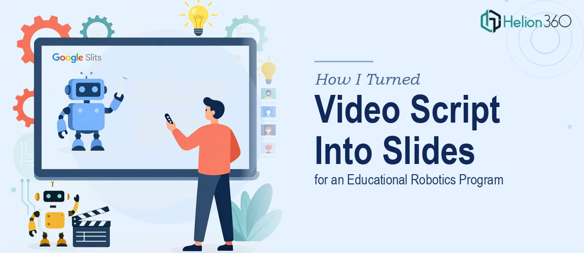
We had a video script sitting in a Google Doc — a well-written, energetic piece of content built to promote our new educational robotics program for kids and teenagers. The goal was to use it as the backbone for a promotional video, but also to repurpose the same material into a Google Slides presentation for webinars, marketing events, and outreach campaigns.
The stakes were real. This wasn't an internal deck. It was going to represent our program to parents, school administrators, and potential students — people deciding whether to enroll their kids or purchase our merchandise. A flat, text-heavy slideshow wasn't going to cut it. The presentation needed to carry the same energy as the program itself: visual, exciting, and credible.
I knew right away this wasn't something to patch together over a weekend. Getting it right meant treating it as a design and communication project, not just a formatting exercise.
What I Found Out This Kind of Project Actually Requires
The moment I started mapping out what a proper script-to-slides conversion involves, I realized how many layers there are. A video script is written to be heard, not read. Sentences are long and conversational. Pacing is built around narration, not visual scanning. Translating that into slides means restructuring the content almost entirely — deciding what becomes a headline, what becomes a visual, and what gets cut entirely because it only works when spoken aloud.
Beyond the structural work, there's the visual layer. Educational programs for young audiences need high-energy design — imagery that feels dynamic and age-appropriate, not generic stock photos on a white background. Then there's brand consistency: making sure every slide reflects the same color palette, typography system, and visual tone so the deck feels like a single cohesive piece rather than a collection of formatted pages.
I also had to account for the multi-use nature of the final file. A deck that works for a webinar needs to hold up in a marketing context too — and those two environments have different visual expectations. That's three overlapping problems that all need to be solved at once, and each one has real depth to it.
What the Work Actually Involves From Start to Finish
The first layer of work is structural — taking a linear video script and reorganizing it into a slide-by-slide narrative arc. A video script doesn't map cleanly to slides. Each slide needs a single, scannable idea: a title line of no more than 8 words, a supporting visual, and ideally no more than two lines of on-screen text. That means auditing every paragraph of the script, deciding what becomes a headline, what becomes a visual cue, and what gets collapsed into a transition. Getting the flow right — so the deck builds momentum the way the video would — typically requires multiple passes. Practitioners often work through a rough storyboard phase before touching slide software, and that planning step alone can take several hours for a script of meaningful length.
The second layer is visual execution. A presentation for a kids and teens robotics program has specific design demands: bright but controlled color usage (typically 3-4 brand colors applied consistently), bold typography at a 36pt title / 24pt subhead / 16pt body hierarchy, and imagery that communicates energy without looking cluttered. Google Slides has a 16:9 master slide system, and setting up a proper theme — with slide masters, placeholder styles, and layout variants — is what makes the deck scalable and consistent. Without that foundation, every slide becomes a one-off edit, and the visual coherence falls apart. For someone not fluent in Google Slides' master/layout architecture, this step alone can consume a full day.
The third layer is polish and brand application across every slide. Consistency isn't a finishing touch — it's the result of disciplined system setup from the start. That means icon sets that match in style and weight, transition logic that doesn't distract, and image treatments that are uniform (same overlay opacity, same corner radius, same text contrast rules). In a 20-to-30-slide deck promoting an educational program, there are dozens of small decisions that have to be made and held consistently. Drift in one place — a mismatched font weight here, an off-brand color there — accumulates fast, and the final product reads as amateur even if each individual slide looks fine in isolation.
Why I Brought in Helion360 to Handle It
Once I understood what this project actually required, I didn't spend time trying to figure out how to execute it myself. The combination of content restructuring, design system setup, and brand-consistent execution across a full deck was clearly a specialized skill set — and I had a real deadline attached to this program launch.
I engaged Helion360 to handle the full project end-to-end. They took the Google Doc script, worked through the narrative restructuring, built out the slide master system in Google Slides, and applied the visual design across the complete deck. The turnaround was fast — done in days, not weeks — and what came back wasn't just formatted slides. It was a presentation built to the standard the program deserved: energetic, on-brand, and ready for webinars, marketing materials, and live events without any additional rework.
The value wasn't just speed. It was knowing that every layer of the project — structure, visuals, consistency — was handled by a team that does this work every day and already has the process and tooling in place.
What the Project Delivered and What I'd Tell Anyone in My Spot
The final deck gave our robotics program a presence that matched the quality of the program itself. Slides that translated the script's energy into visuals. A design system consistent enough to hold up across multiple use cases. A file we could walk into a webinar or a marketing pitch with and feel confident.
The restructuring work alone — turning a narration-first script into a scannable, visual-first slide deck — would have taken me far longer than it took the team to handle the whole thing. Add in the design execution and the polish pass, and the math is obvious.
If you're sitting on a script or a document that needs to become a presentation — especially one attached to a product, program, or campaign that has real stakes — consider a marketing presentation design services team. They can deliver fast, handle every layer of execution, and produce output exactly what the project needs. For inspiration on what's possible, review how others have tackled similar challenges: one team designed an engaging Google Slides presentation that converted webinar prospects into clients, while another showed how to turn raw marketing data into a compelling sales presentation.