

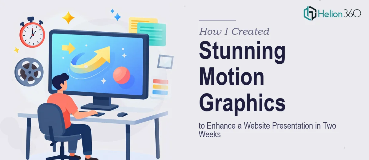
The Presentation Was Coming Up Fast and Static Slides Weren't Going to Cut It
We had a major website presentation on the calendar — the kind where the audience isn't just reading, they're experiencing. The goal was to walk stakeholders through a new digital experience, and the slides needed to reflect the same energy and polish as the product itself. Static screenshots and basic layouts weren't going to land the way this moment required.
The deadline was two weeks out. The stakes were real: first impressions with this group would shape how the project was perceived going forward. I knew immediately that motion graphics were the right tool — animated transitions, kinetic text, looping visual elements that made the product feel alive on screen. What I didn't know yet was just how much craft goes into doing that well.
I recognized quickly that this wasn't a "figure it out as you go" situation. The quality bar was set by the product itself, and anything less than polished animation work would have undermined the whole story.
What I Found Motion Graphics Design for a Presentation Actually Requires
The moment I started researching what professional motion graphics design for a website presentation involves, the complexity became obvious.
First, motion isn't decoration — it's communication. Every animated element has to reinforce the narrative, not distract from it. That means each transition, each text reveal, each looping graphic needs to be choreographed to the flow of the story. Designers working at this level think in terms of timing curves, easing functions, and frame rates — typically 24fps or 30fps for presentation contexts — not just "add a fade."
Second, the asset pipeline is non-trivial. Motion graphics for presentations involve working across tools — building animations in one environment, exporting frame-accurate video files or GIF loops, then embedding them into slide formats without losing fidelity or introducing playback issues. Getting that chain right requires experience.
Third, brand consistency across animated elements is genuinely hard. A color that looks right as a static hex value can shift in feel once it's moving, layered, or lit differently across frames. Maintaining visual coherence across a full deck of animated slides takes discipline and a trained eye.
This wasn't a weekend project.
What the Work Actually Involves From Start to Finish
The right approach to motion graphics for a website presentation starts with a narrative and structural audit. Before any animation begins, a practitioner maps the story arc slide by slide — identifying which moments call for motion to land a point, which transitions carry the viewer from one idea to the next, and which elements should stay still so the animated ones have impact. This structural pass typically results in an animation brief that functions almost like a storyboard: each slide annotated with motion intent, timing notes, and asset requirements. Skipping this step is where amateur motion work falls apart — animations get added reactively rather than purposefully, and the deck ends up feeling busy rather than compelling.
Visual mechanics are where the craft lives. Professional motion graphics for presentations are built on precise timing curves — ease-in/ease-out for element entrances, linear holds, and snappy exits typically clocking between 200ms and 400ms depending on element weight. Typography in motion follows a strict hierarchy: headline reveals at 36pt or larger come in first, supporting text at 20–24pt follows with a staggered delay of 150–300ms. Color and opacity transitions are mapped to brand palette values and never drift outside the defined set — usually a maximum of 4 primary motion colors plus neutrals. Getting this right across 20 or 30 slides is time-intensive even for experienced animators, and the margin for inconsistency is visible to any trained eye in the room.
Polish and export consistency close the loop. Once animations are built, each element needs to be reviewed for render quality — checking that video loops are seamless, that embedded motion assets don't stutter on playback, and that file sizes don't bloat the deck beyond what a presentation environment can handle cleanly. A full quality pass across a motion-heavy deck can take as long as building the individual animations, especially when accounting for cross-platform playback differences. This is where a lot of DIY attempts show cracks — the animation looked fine in the editing tool but behaves differently embedded in slides, and there isn't time left in the schedule to fix it.
Why I Brought in Helion360 to Handle It
I didn't spend time trying to learn motion graphics software under deadline pressure. The moment I understood what this work actually required — the storyboarding, the frame-accurate animation builds, the export pipeline, the polish pass — I knew the smart move was to bring in a team that does this work every day.
Helion360 handled the full project end-to-end: narrative structure and animation brief, all motion graphics builds across the full deck, and the final export and quality review. They turned it around quickly — the kind of turnaround that would have taken me weeks of learning curve just to get to a rough draft. The work came back polished, consistent, and exactly calibrated to the presentation's story.
They had the tooling, the process, and the experience already in place. There was no ramp-up, no trial and error, no back-and-forth on fundamentals. Just fast, competent execution from brief to delivery.
The Result and What I'd Tell Anyone Facing the Same Clock
The presentation landed well. The animated elements did exactly what motion graphics are supposed to do — they made the product feel real, guided the audience's attention at the right moments, and gave the whole deck a level of finish that matched the quality of the work being shown. Stakeholders noticed. The presentation achieved what it needed to.
The broader lesson was simple: presentation design is a specialized discipline with real depth — timing systems, export pipelines, brand consistency at scale — and treating it like a quick add-on is how presentations fall flat. If you're in the same position, looking at a two-week window with a high-stakes audience and motion work on the brief, engage the team that handles this kind of execution every day. Helion360 delivered for me fast, end-to-end, without the weeks of trial and error I would have needed on my own.