

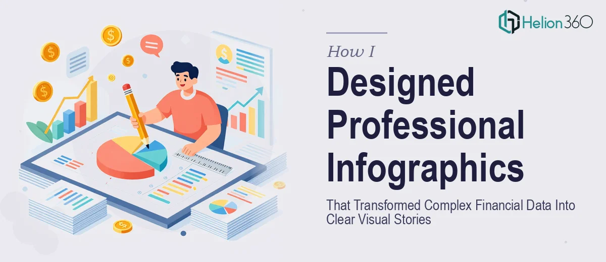
The Problem With Presenting Financial Data Nobody Wants to Read
I had an upcoming business presentation built around our latest financial report — revenue trends, cost breakdowns, period-over-period comparisons — and the raw data was dense. Spreadsheet-level dense. The kind of numbers that make an audience's eyes glaze over inside thirty seconds if you just throw a table on a slide.
The stakes were real. This was a cross-functional audience that included senior leadership and external stakeholders. The presentation had to land clearly, look credible, and move fast. Sending people home with a vague impression of the financials wasn't an option.
I knew the answer was professional infographics — visuals that translate the numbers into something a room full of people can absorb quickly. But I also knew that "make it look nice" wasn't a brief. Doing this well was a specific craft, and I didn't have the time or the toolset to figure it out from scratch.
What I Found Out This Work Actually Requires
When I looked into what proper financial infographic design actually involves, the complexity surfaced quickly.
The first thing I noticed is that data visualization for financial content isn't just chart selection. The choice between a stacked bar, a grouped bar, a slope chart, or a waterfall chart changes what the audience understands — and what they misread. Each chart type carries implicit meaning, and using the wrong one with financial data creates confusion that undermines the credibility of the whole presentation.
The second thing was color. A consistent, intentional palette — typically no more than four brand-aligned colors — has to do a lot of work: differentiating data series, signaling positive versus negative performance, and staying readable at projected sizes. That's a system, not a style choice.
The third signal was resolution and export fidelity. Infographics that look clean on a laptop screen often fall apart on a projector or in a printed marketing handout. Getting assets that are genuinely dual-purpose — presentation-ready and print-ready — requires a different production workflow than most people expect.
At that point it was obvious this wasn't a weekend project.
What the Work That Needs to Happen Actually Looks Like
The right approach to professional infographics for a financial business presentation starts with the narrative audit. Before a single visual is designed, the source data has to be reviewed for the story it actually tells — which metrics matter most to the audience, what the logical sequence of revelations should be, and where a single well-designed visual can replace three slides of explanation. This isn't a quick read-through; it's a deliberate mapping exercise. Practitioners working at this level typically identify five to seven core data moments in a report and build the visual hierarchy around those anchors. Getting the structure wrong means even beautiful infographics mislead rather than inform, which is worse than no infographics at all.
Visual mechanics are where most attempts break down. Done well, each infographic operates on a clear layout grid — commonly a 12-column structure — with a strict typographic scale, often 36pt headers, 24pt data labels, and 14-16pt body callouts, applied consistently across every asset. Chart types are chosen based on the relationship being communicated: waterfall charts for cumulative financial changes, slope charts for period-over-period comparisons, and grouped bars when category-level breakdowns matter more than totals. The execution friction here is real — setting up master templates that enforce these rules without manual slide-by-slide correction takes hours even for experienced designers, and a single inconsistency in label size or grid alignment is immediately visible in a projected environment.
Polish and cross-format consistency is the final layer, and it's where the majority of self-managed attempts leave money on the table. A professional infographic set for a financial presentation must hold up at 1920×1080 on screen, at 300 DPI for a printed one-pager, and as an exported PNG or PDF for a marketing leave-behind. Each format has different bleed, safe-zone, and resolution requirements. Brand palette discipline — maximum four colors, with clear rules for which hue signals growth versus decline — has to be enforced not just visually but at the file level so assets don't drift when resized or re-exported. That kind of production hygiene is built into a professional workflow; it's not something you improvise.
Why I Brought in Helion360 to Handle It
I looked at the scope honestly. The narrative mapping, the chart selection logic, the template architecture, the resolution requirements — each of those was a skill set in its own right. Attempting it myself would have meant weeks of learning curve on top of the actual execution time, and the deadline didn't allow for either.
The decision to engage Helion360 was straightforward. They handle exactly this kind of work end-to-end: financial data audit and story mapping, full infographic design built on a consistent visual system, and delivery of presentation-ready and print-ready assets. The project was turned around quickly — done in days, not weeks — and handled in a fraction of the time it would have taken me to learn and execute it myself.
What stood out was that the tooling and expertise were already in place. There was no ramp-up, no back-and-forth explaining what a waterfall chart is, no versioning confusion between formats. The brief went in, the assets came out, and they were production-ready from the first delivery.
The Outcome and What I'd Tell Anyone in My Spot
The presentation landed well. The financial data that had been sitting in dense spreadsheet tables was now a sequence of clean, high-resolution infographics that the audience could follow in real time — trends visible at a glance, comparisons clear without a legend-reading exercise, and a visual consistency that signaled that the underlying analysis was serious.
Beyond the room, the same assets went into a marketing leave-behind and a follow-up PDF without any rework. That dual-use delivery was part of the brief, and it held up.
If you're looking at a similar situation — financial data that needs to become a professional, audience-ready infographic set for a business presentation — and you want it handled end-to-end without the weeks of learning curve, Helion360 is the team I'd engage. They delivered fast and brought the kind of execution depth this work genuinely requires.