

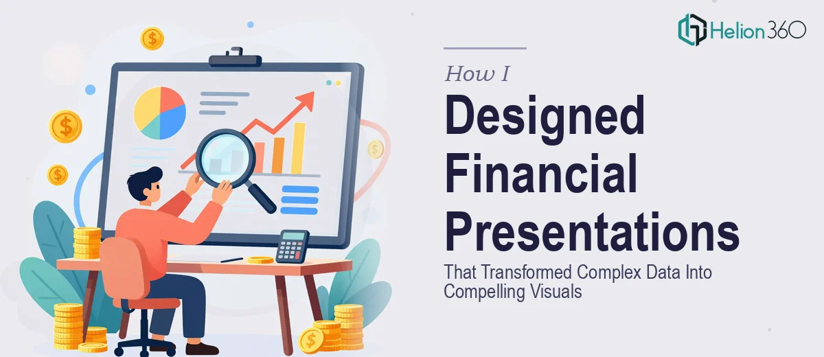
When the Numbers Were Right but the Slides Were Wrong
Our quarterly reports were solid. The data told a clear story — revenue trends, portfolio performance, risk breakdowns. But every time I put those numbers into PowerPoint, the slides looked like a spreadsheet dump. Dense tables, misaligned charts, inconsistent fonts. I knew the information was valuable. The presentation just was not doing it justice.
This was not a simple cleanup job. We were preparing for internal leadership reviews and external stakeholder meetings, where first impressions carry real weight in the financial industry. I had to get it right.
Trying to Handle It In-House
I started by rebuilding the slides myself. I reorganized the layout, swapped out some default chart styles, and tried to apply our brand colors consistently. For a while, it felt like progress. But the deeper I got into the financial data visualization work, the more I realized how much I was out of my depth — not with the numbers, but with the visual design side of things.
The charts still felt cluttered. The hierarchy of information was unclear. I was spending hours on a single slide trying to make it look like it belonged in a professional financial presentation, and the result still looked like something built in a hurry. Meanwhile, the actual analytical work was piling up.
Financial presentations are a specific discipline. They require someone who understands both design principles and how financial data behaves — what to emphasize, how to simplify without losing accuracy, and how to guide an audience through numbers without overwhelming them.
Bringing In the Right Support
After a frustrating week of tweaking slides that never looked quite professional enough, I came across Helion360. I explained what we were working on — quarterly financial reports, internal leadership decks, a mix of charts, KPIs, and narrative slides — and their team took it from there.
What stood out immediately was that they asked the right questions before touching a single slide. They wanted to understand the audience for each deck, what decisions those audiences needed to make, and which data points mattered most. That kind of structured thinking made a real difference in how the final slides came together.
What the Redesigned Financial Slides Actually Looked Like
The transformation was significant. The quarterly report slides went from wall-to-wall tables to clean, scannable layouts where the key figures were immediately visible. Charts that had previously been confusing became intuitive — proper axis labeling, consistent color coding tied to our brand, and clear callouts that drew the eye to what mattered.
The internal meeting decks got a similar treatment. Executive summary slides were tightened to one clear message per slide. Supporting data was structured so that a senior manager could absorb the key point in seconds and drill into detail only if needed. The branding in the presentation was consistent throughout — colors, typography, spacing — in a way that my DIY version never quite achieved.
Helion360 also made sure the slides were editable and reusable, so our team could update the data each quarter without breaking the design.
What I Took Away From This Process
The biggest lesson was that professional financial presentation design is genuinely specialized work. It is not enough to know PowerPoint. You need to understand visual hierarchy, data communication, and how to adapt complex information for different audiences — all while keeping everything on-brand and polished.
For anyone working in financial services or a similar data-heavy industry, investing in purpose-built presentation design pays for itself quickly. The time I was spending on layout issues alone was pulling me away from higher-value work. Getting that back was worth it.
If you are in the same situation — solid data, struggling slides, and a deadline that is not moving — Helion360 is worth a conversation. They handled the design complexity we could not manage in-house and delivered something we were genuinely confident presenting.