

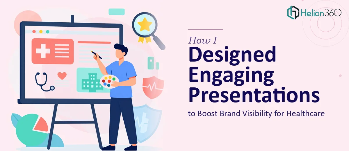
When a Healthcare Practice Needed More Than a Basic Slide Deck
I was brought in to help a small psychiatric healthcare practice with something that sounded straightforward at first — create Marketing Presentation Design Services that could boost their brand visibility and help them attract more clients. They wanted visually appealing slides, clean charts, and a professional look that felt consistent across every piece of content they shared.
Simple enough, right? That was my first thought.
But once I sat down with their material, I quickly realized this was a more nuanced project than it appeared.
The Challenge Was Bigger Than Just Design
The practice had a lot of information to communicate — service descriptions, patient journey visuals, outcome statistics, and community outreach messages. None of it was organized in a way that translated naturally into presentation slides. It was sitting in documents, rough notes, and a few older brochures that were long overdue for a refresh.
Beyond the content structure, there was a visual identity problem. The practice had no consistent color palette, no defined typography, and no clear idea of how they wanted to look across digital formats. For a healthcare brand trying to grow its online presence, that kind of inconsistency works against you.
I spent a few days trying to pull it together myself. I built a rough template, experimented with layouts, and tried to create a visual language that felt calm and trustworthy — which matters a great deal in psychiatric care. But getting the graphic design right, balancing clinical credibility with approachability, and making the charts readable without looking generic — that combination proved harder to execute than I expected.
Bringing in the Right Team
After hitting a clear ceiling with my own output, I reached out to Helion360. I explained the project — a healthcare practice, marketing presentations, no existing brand system, and a need for slides that could work both in-person and as digital assets online. Their team asked the right questions upfront: What feeling should the audience walk away with? Who is the primary viewer — prospective clients, community partners, or referring physicians? How many unique presentation types were needed?
Those questions alone told me they understood the project at a level I hadn't fully mapped out yet.
What the Final Presentations Looked Like
Helion360 took over the design work and built a complete set of PowerPoint presentations from the ground up. They established consistent visual identity — a calming color palette, clean sans-serif typography, and iconography that felt human without being clinical or sterile. Every slide followed a clear hierarchy so the viewer always knew where to look first.
The charts and data slides were especially well done. Instead of defaulting to default PowerPoint bar charts, they created custom visuals that made outcome statistics easy to read at a glance. The slides also included service overview layouts, a brand story section, and a patient journey flow — all built to be reused and updated by the practice's internal team going forward.
What I noticed most was how much the design actually carried the message. The presentations did not just look good — they communicated trust, competence, and care. For a psychiatric healthcare business trying to grow its visibility, that alignment between design and message is exactly what moves the needle.
What This Experience Taught Me About Presentation Design
Graphic design for presentations in the healthcare space is not just about making things look polished. It is about understanding how visual choices affect perception — and in mental health, that perception directly influences whether someone feels comfortable enough to reach out. Font weight, color temperature, image tone — all of it sends a signal.
I also came away with a better appreciation for what a defined brand system does for a practice over time. Once those presentation templates were built, the client had a reusable asset they could build on. New services, new data, new outreach campaigns — all of it could slide into the same visual framework without starting from scratch.
If you are working on a similar challenge — building engaging PowerPoint presentations for a healthcare or professional services brand without a strong visual foundation — Helion360 is worth reaching out to. They handled what I could not and delivered something the practice could actually use long-term.