

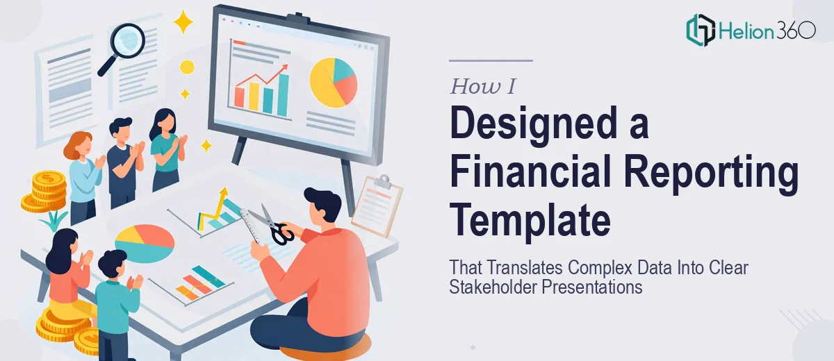
Every quarter, the same challenge came up — a pile of financial data that needed to be presented to a room full of people with completely different levels of financial literacy. Some were shareholders who wanted the big picture. Others were analysts who expected granular accuracy. Getting both groups to walk away satisfied from the same presentation felt almost impossible.
I decided the real fix was not in how I delivered the presentation, but in the foundation beneath it — a well-structured financial reporting template that could carry the weight of complex data without overwhelming the audience.
Why a Generic Template Was Never Going to Work
I started by testing a few off-the-shelf PowerPoint templates designed for financial reporting. Most of them looked decent at first glance, but they fell apart the moment I tried to populate them with real quarterly numbers. The chart placeholders were rigid, the color hierarchies made no visual sense for financial data, and there was no clear way to separate high-level summary slides from the detailed breakdowns analysts would want to dig into.
I spent a few evenings rebuilding slides from scratch, trying to create something modular — a summary section for the boardroom, a detailed financial breakdown section for the analysts, and a trend visualization layer that could work for both. The problem was that I kept running into design decisions that needed more than just PowerPoint know-how. Getting the data visualization right for financial statements — the kind of charts that convey margin trends, revenue comparisons, and variance analysis without cluttering the slide — required a level of design and accounting logic working together that I could not balance on my own in a tight timeline.
Bringing in the Right Support
After hitting that wall, I reached out to Helion360. I walked them through the full scope: quarterly reports, multiple audience types, a need for both visual polish and functional flexibility. Their team asked the right questions — about the data structure, the stakeholder hierarchy, and the kinds of decisions this presentation was meant to support.
What they delivered was not just a set of slides. It was a structured financial reporting template built around real presentation logic. The top layer had clean executive summary slides — revenue, EBITDA, and key metrics laid out in a way that a non-financial stakeholder could absorb in under thirty seconds. The deeper sections carried full income statement visualizations, variance charts, and trend lines built to satisfy someone reading every number carefully.
What the Final Template Actually Looked Like
The data visualization approach was one of the strongest parts of the output. Instead of defaulting to generic bar charts, the template used a deliberate visual hierarchy. Waterfall charts showed how individual line items contributed to net results. Small color-coded variance indicators told the story of over and underperformance without requiring a full explanation. Every chart was built to update cleanly when the underlying numbers changed — which matters enormously when you are refreshing a quarterly report under deadline pressure.
Typography and spacing were also handled with care. Financial slides tend to get cluttered the moment real data enters the picture. The template was built with enough whitespace discipline that even the densest slides remained readable at a glance.
And critically, the template was audience-adaptive. Section dividers made it easy to present the executive summary to shareholders, then transition into the analyst-facing breakdowns without the whole deck feeling disjointed.
What I Learned From This Process
The biggest takeaway was that a financial reporting template is not really a design problem alone. It sits at the intersection of accounting logic, data visualization principles, and presentation strategy. When those three things are handled together, the output is something that genuinely serves the people in the room — not just something that looks good on screen.
The next quarterly cycle was noticeably smoother. The template held up under real data. Stakeholder feedback improved. And the time I used to spend rebuilding slides from scratch was replaced by about twenty minutes of updating numbers and reviewing the output.
If you are facing the same kind of quarterly reporting challenge — where the data is real and the audience expectations are high — Helion360 is worth reaching out to. They handled the complexity I could not manage alone and delivered a template built to work under actual business conditions.