

The Situation I Was Facing — and Why It Couldn't Be Half-Done
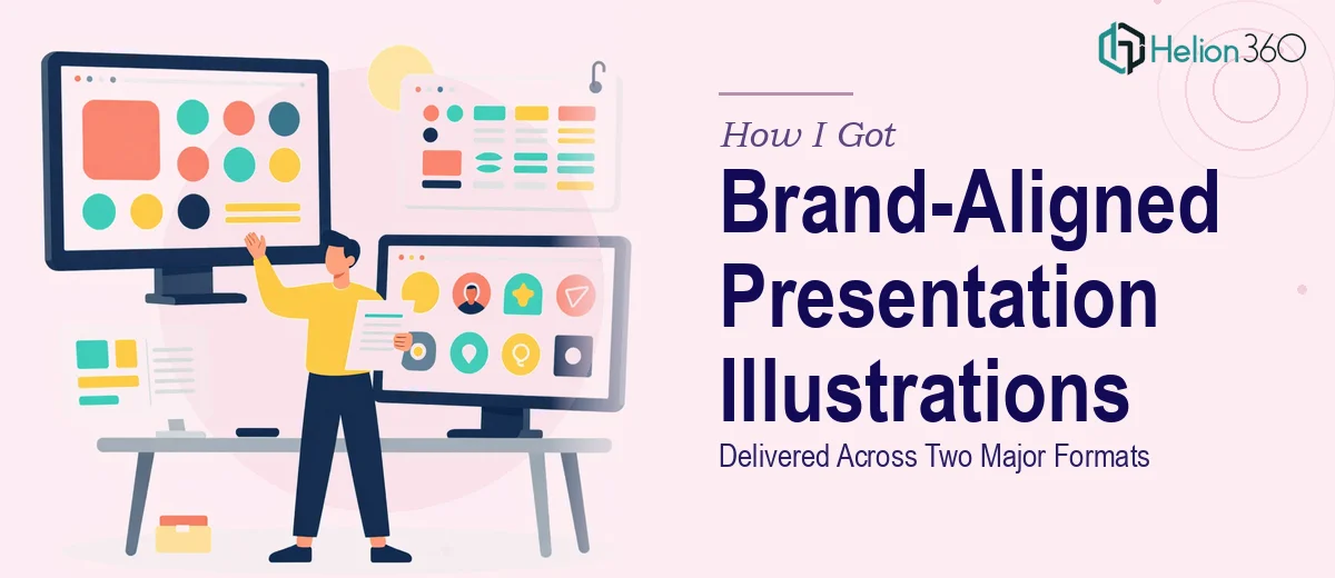
I had two major presentations landing in the same month: a quarterly report going to senior stakeholders and a product launch deck aimed at a broader commercial audience. Both needed custom illustrations — not stock icons, not repurposed clip art, but purpose-built visuals that reflected the brand accurately and worked across both digital screens and printed materials.
The stakes were real. The quarterly report would be scrutinized by leadership who expected polished, professional design. The product launch deck would be seen by potential buyers and partners for the first time. If the illustrations felt generic, inconsistent, or visually mismatched between the two formats, it would undermine the credibility of both presentations.
I knew straight away that this needed more than a quick design pass. Brand-aligned presentation illustrations done well require a specific kind of discipline — one that touches visual identity, format specs, and narrative logic all at once.
What I Found Out the Work Actually Involves
When I looked closely at what proper presentation illustration design requires, a few things made it clear this wasn't a casual project.
First, the dual-format constraint changes everything. An illustration designed for a screen at 16:9 doesn't automatically translate to a printed format at 300 DPI without rework. Color profiles differ — RGB for digital, CMYK for print — and what looks vivid on screen can appear flat or shifted in print if the source files aren't set up correctly from the start.
Second, brand alignment isn't just about using the right colors. It means applying the correct stroke weights, icon geometry, and illustration style consistently across every asset — whether it's a minimalist diagram on a data-heavy slide or a more expressive visual on a product story slide. When those two styles need to coexist within a single campaign, the illustration system has to be built to accommodate both without looking like two different designers worked on it.
Third, the content itself drives illustration choices. The quarterly report demanded clarity and restraint — visuals that support data without competing with it. The product launch needed energy and specificity. That's not one brief; it's two illustration strategies that still need to feel like they came from the same brand.
What the Work Requires When Done Properly
The foundation of any brand-aligned illustration project is a thorough audit of the existing brand system. Done well, this means pulling the full color palette — typically no more than four primary brand colors with defined tint ranges — and confirming the approved typeface hierarchy before a single vector is drawn. Illustration style decisions follow from this: whether the system uses flat design, line-based iconography, or semi-illustrative scenes depends on what the brand guidelines actually specify, not personal preference. Skipping this audit step and going straight to drawing is one of the most common ways illustration campaigns end up looking inconsistent across slides.
The visual mechanics of building the illustration assets themselves involve precision that takes time to get right. Stroke weights in a presentation illustration system are typically standardized at 1.5pt, 2pt, and 3pt depending on element hierarchy — and they must scale correctly when the same asset is used at different sizes across slides. Grid alignment matters too: illustrations need to sit on the same underlying layout grid as the text and data elements, usually a 12-column structure, so nothing looks floated or arbitrarily placed. Getting this right across a full set of assets — some colorful, some minimalist — requires iterative checking at multiple zoom levels and format sizes.
Preparing assets for both digital and print use is a layer of execution that trips people up even when the illustration work itself is solid. Every file needs to be exported at the correct resolution and color profile for each format: 72 DPI in RGB for screen, 300 DPI in CMYK for print, with bleed and safe-zone margins applied for any printed collateral. Fonts must be outlined or embedded. Linked assets need to be packaged correctly. One missed setting at export means reprints or low-resolution output — the kind of mistake that only surfaces at the worst possible moment, right before a presentation goes live.
Why I Brought in Helion360 to Handle the Full Project
Looking at what the work actually involved — dual format specs, a multi-style illustration system, two different content tones, and export requirements for both digital and print — I recognized immediately that this wasn't something to attempt on the side. The learning curve alone would have cost me weeks, and the margin for error on both presentations was essentially zero.
Helion360 handled the full project end-to-end. That meant the brand audit, the illustration system design, asset production for both the quarterly report and the product launch deck, and export-ready files for both digital and print delivery. They turned it around quickly — done in days, not the weeks it would have taken me to work through the format and brand alignment mechanics myself.
What made the difference wasn't just speed. It was that they came in with the tooling, the process, and the illustration expertise already in place. There was no ramp-up time, no trial-and-error on the brand system. The work came back coherent, consistent, and ready to use.
What the Project Delivered — and What I'd Tell Anyone in My Spot
Both presentations came out looking like they belonged to the same visual world — which, given the very different tones required, was exactly the challenge. The quarterly report illustrations were clean and data-supportive, never competing with the numbers on the page. The product launch visuals had the energy and brand specificity the commercial audience needed. Stakeholders noticed. The design held up in print and on screen without any last-minute corrections.
The thing I'd tell anyone staring at a similar brief — two formats, a defined brand system, a tight timeline — is to be honest about what the work actually takes. Presentation illustration design at this level isn't a task you squeeze in between other priorities. If you're in that position and want it handled end-to-end without burning weeks on the learning curve, Helion360 is the team I'd engage — they delivered fast and brought exactly the execution depth this kind of project demands.