

The Situation Was High-Stakes From Day One
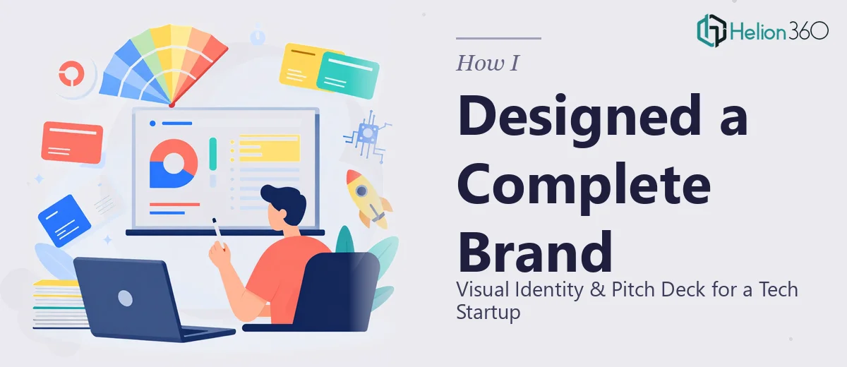
We were weeks out from our first real pitch meetings and we had nothing to show. No logo, no brand colors, no slide deck — just a product, a story, and a deadline that wasn't moving. The goal was to walk into investor rooms and client conversations looking like a company that had its act together, not a scrappy team with a PowerPoint thrown together the night before.
In that context, the materials weren't cosmetic. They were the first thing anyone would judge us on before we said a word. A weak pitch deck or an inconsistent visual identity signals to investors that you don't understand how presentation shapes perception — and in a crowded tech market, that's a fast way to lose the room. I knew immediately this needed to be done right, not just done quickly.
What I Found Out This Work Actually Requires
My first instinct was to scope this myself — pull a deck template, find a logo maker, get something out. About an hour of research killed that idea.
A proper startup pitch deck isn't a slide collection. It's a structured narrative with a defined arc: problem, solution, market size, traction, team, ask. Each section has to carry the right weight and sequence the information so an investor's questions get answered before they're asked. Getting that narrative logic right is a discipline on its own.
The visual identity layer added another dimension entirely. A startup logo needs to work at multiple sizes — a favicon, a pitch slide header, a business card, a website hero. That means vector-native files built with proportion rules in mind, not a PNG that looks fine on screen and falls apart in print.
And then the two systems — brand and deck — have to work together coherently. The typography hierarchy in the pitch presentation has to reflect the brand, not just look nice in isolation. That integration is where most DIY attempts break down, and it's also what separates a forgettable deck from one that feels like a real company.
The Work That Goes Into Getting This Right
The structural work starts before a single slide is designed. A startup pitch deck needs a narrative audit: what story are we telling, in what order, and what does each slide need to accomplish? The standard framework runs 10–14 slides covering problem, solution, market sizing, business model, traction, competitive positioning, team, and the ask. Each slide carries a specific information load, and the sequencing has to create forward momentum — not just cover the checklist. Figuring out what to say versus what to show is genuinely hard. Getting the balance wrong on even two or three slides can cause an investor to check out mid-deck, and most people don't realize that's what happened.
The visual mechanics of a pitch deck operate on strict rules. A 12-column grid ensures alignment consistency across all slides. Type hierarchy typically runs 36pt for titles, 24pt for key statements, and 16pt for supporting detail — deviating from that hierarchy creates visual noise that makes slides feel cluttered even when the content is sparse. Color usage stays disciplined: a maximum of four brand colors applied with clear roles (primary, accent, background, text). Charts and data visualizations need to follow the same visual language as the rest of the deck, which means custom-styled graphics rather than default PowerPoint chart outputs. Propagating these rules cleanly across 12-plus slides through a master slide system takes hours for someone without that workflow already built.
The brand identity layer runs parallel and has its own depth. A startup logo system needs to cover primary lockup, icon-only mark, dark and light variants, and clear-space rules — all delivered in layered vector source files. Typography selection has to account for both screen rendering and print legibility, and the color palette needs defined hex, RGB, and CMYK values to stay consistent across every application. Building a brand kit that actually holds together — one that a web developer, a printer, and a slide designer can all use without interpretation errors — requires more decisions and documentation than most first-time founders expect.
Why I Brought Helion360 in to Handle the Full Project
I didn't spend time trying to figure out how to do this myself. The scope was clear enough — visual brand identity plus a full investor pitch deck — and the timeline was tight enough that a learning curve simply wasn't an option.
Helion360 handled the full project end-to-end: brand identity development including logo system and color and type guidelines, pitch deck narrative structure, and the complete slide design built on that brand foundation. The entire thing was turned around in a fraction of the time it would have taken me to learn and execute even one layer of it on my own.
What made the engagement work was that the team already had the workflow, the tooling, and the pattern recognition from doing this kind of work repeatedly. There was no ramp-up time explaining what a good pitch deck looks like. They knew. The feedback cycles were fast and the output was decision-ready from the first version.
What Got Delivered and What I'd Tell Anyone in My Position
What came back was a complete, cohesive package: a logo system with proper file variants, a brand kit with documented color and typography standards, and a 13-slide pitch deck built on that identity — structured to move an investor through the story cleanly and arrive at the ask with confidence. The materials held together visually in a way that would have taken me weeks to approximate, and probably never to this standard.
Anyone who's staring at the same starting point — early-stage startup, real pitch meetings on the calendar, no visual identity in place yet — already knows that attempting this in-house isn't realistic. The scope is too broad and the execution standards are too specific.
If you're in that spot and want both the brand identity and the pitch deck handled end-to-end without the weeks of trial and error, Helion360 is the team to engage — they delivered fast, they worked to a professional standard throughout, and the output was ready to put in front of investors without apology.