

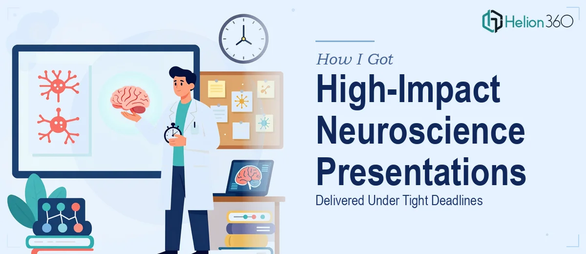
The Research Was Ready. The Presentation Wasn't.
We had a genuine problem. Our startup had produced meaningful neuroscience research findings — the kind of work that takes months of rigorous effort — and we needed to present it to an audience that included both scientists and non-specialists. The deadline was fixed. The stakes were real: this presentation would shape how our work was perceived, influence potential collaborators, and set the tone for future funding conversations.
The issue wasn't the science. The issue was translating dense, technically precise research into a visual format that could hold attention, build a coherent narrative, and do justice to the findings — all without dumbing things down or losing the integrity of the data. I knew quickly that this wasn't a formatting job. It was a specialized design challenge, and it needed to be done right.
What I Discovered This Kind of Work Actually Requires
When I started looking into what a properly designed neuroscience presentation actually involves, the scope came into focus fast. Scientific illustration for neuroscience isn't generic infographic work. It draws on established conventions for depicting brain structures, neural pathways, and experimental findings — and deviating from those conventions creates confusion for expert audiences while still needing to be accessible to generalist ones.
Beyond the scientific accuracy, there's the communication architecture. Research data doesn't naturally arrange itself into a compelling story. Turning findings into a presentation means making deliberate decisions about sequencing, emphasis, and what to simplify without misrepresenting. Then there's the visual execution layer: charts, diagrams, and data visualizations that need to be both scientifically defensible and visually clear.
What I recognized immediately was that this combination — domain fluency, narrative structure, and high-quality visual design — isn't something you assemble quickly without the right experience. The timeline made it even clearer. This wasn't a weekend project.
What the Work Itself Actually Involves
The foundation of a strong scientific presentation is structural — getting the narrative architecture right before a single slide is designed. Research findings rarely arrive in presentation order. The work involves auditing the source material, identifying the core argument, and sequencing the content so each section builds logically on the last. For a neuroscience deck, this means deciding where to place methodology, how to contextualize findings relative to existing literature, and how to frame conclusions for a mixed audience. A practitioner working through this stage typically maps 20 to 40 discrete content points and resolves them into 12 to 18 focused slides. Getting that structure wrong means even polished visuals won't land — and reworking it mid-project costs significant time.
Visual mechanics for scientific presentations operate under stricter constraints than a typical business deck. Scientific diagrams need anatomical or procedural accuracy, which means custom illustration work rather than stock assets. Data visualizations — scatter plots, connectivity maps, bar charts with error bars — need to follow research communication norms: labeled axes, clear legends, appropriate scale, and no visual distortion of the underlying data. Typography hierarchies (typically 36pt titles, 24pt section headers, 16pt body text) and a restrained palette of three to four colors help the visuals read clearly in projection environments. The friction here is that each diagram may require several hours of skilled vector work to get right, and small errors in scientific diagrams are noticed immediately by expert audiences.
Polish and consistency across a multi-slide deck is where amateur execution tends to break down visibly. Every slide needs to share the same grid alignment, the same spacing logic, and the same brand application — but scientific decks also introduce unique inconsistency risks because of the visual variety involved: diagrams sit next to charts, which sit next to photography, which sit next to text-heavy methodology slides. Maintaining visual coherence across that range of content types requires deliberate master slide architecture and a strict system for spacing and color usage. Without it, the deck looks assembled rather than designed — and for a startup presenting cutting-edge research, that impression is costly.
Why I Brought in Helion360 to Handle It
I didn't attempt this myself. The combination of scientific illustration accuracy, narrative structuring, and professional visual execution — under a tight deadline — made it obvious that this needed a team with the tooling and experience already in place.
Helion360 handled the full project end-to-end. That meant taking the raw research content and structuring the narrative arc, producing custom scientific diagrams and data visualizations that met both accuracy and visual standards, and delivering a fully polished, brand-consistent deck. The entire project was turned around quickly — done in days, not the weeks it would have taken to build the expertise and execute it from scratch.
What made the difference was working with a team that does this kind of work regularly. The design decisions that would have required hours of research and iteration on my end were judgment calls they made confidently and correctly the first time.
What Was Delivered and What I'd Tell Anyone in My Spot
The finished presentation was something the research genuinely deserved. The findings were laid out in a clear, logical sequence that served both the scientific audience and the generalist stakeholders in the room. The diagrams were accurate and clean. The data visualizations communicated the key results without requiring the audience to decode them. The deck looked like it came from an organization that takes its work seriously — because it does.
The broader lesson I took from this is that neuroscience presentation design sits at the intersection of domain knowledge, communication strategy, and visual craft. All three have to be present. Shortchanging any one of them shows up immediately in how the work is received.
If you're looking at a similar problem — research that needs to become a presentation, a tight timeline, and a high-stakes audience — Helion360 is the team I'd engage. They delivered fast, handled the full depth of execution this kind of work requires, and the result spoke for itself.