

The Problem With Building a Brand in a High-Stakes Industry
When you're running a surgical instrument company, your brand isn't just a logo — it's a signal to surgeons, hospital procurement teams, and clinical partners that your products meet the standard they require. I was at the point where we needed to move from a rough idea of who we were into something that could carry weight in a room full of serious buyers.
The brief was clear: a complete logo and brand presentation that captured precision, reliability, and the kind of credibility that a medical technology company earns. We had a deadline tied to an upcoming product showcase, and walking in without polished brand materials simply wasn't an option. I knew quickly that this wasn't something to attempt internally. The stakes were too high, the domain too specific, and the margin for a generic result was zero.
What I Found the Solution Actually Required
When I started mapping out what this project actually involved, it became obvious fast that a logo-and-brand engagement in the medical device space is a different class of work from general commercial branding.
First, there's the positioning layer. A surgical instrument brand has to communicate precision and trust without looking clinical to the point of being cold, or modern to the point of looking unproven. The visual language has to walk a narrow line — and getting there requires genuine research into how leading medtech companies have solved that same tension, then finding a distinct position within that space.
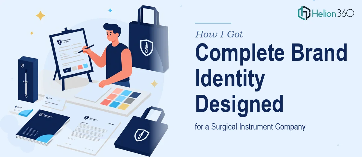
Second, the deliverable set is much larger than most people expect. A complete brand identity isn't just a logo file. It's a full system: primary and secondary color palettes, typography hierarchy, icon and mark usage rules, application guidelines across print and digital, and a brand presentation that communicates all of it coherently to internal teams and external partners.
Third, the presentation layer — how the brand story is told — matters as much as the assets themselves. A brand deck for a medtech company needs to show the logo in context, explain the rationale behind every design decision, and present the full system in a way that a non-designer executive audience can absorb and trust.
What the Work That Goes Into This Actually Looks Like
The foundation of a project like this is strategic concept development — translating a company's values and mission into visual language before a single mark is drawn. For a surgical instrument brand, that means auditing competitor positioning across the medtech space, identifying what visual codes signal precision versus innovation versus clinical authority, and defining a brand personality that sits distinctly within that landscape. This stage typically produces a mood board, a positioning rationale, and a clear design brief that every downstream decision is anchored to. Without it, a designer is guessing. With it, every choice has a defensible reason.
The visual mechanics layer is where the system gets built. A complete brand identity at this level requires vector-based logo construction with clear geometry and proportion rules, a color palette limited to a primary set of three to four brand colors with defined CMYK, RGB, and HEX values, and a typography system with at minimum a headline face, a body face, and precise size hierarchy — typically 36pt for primary headings, 24pt for secondary, and 16pt for body. Getting the logo to render correctly across every application — embossed on instrument packaging, reversed on dark backgrounds, scaled down to a favicon — requires systematic testing that takes significant time even for an experienced team.
The brand presentation itself is a full design project layered on top of the identity work. Done well, it runs fifteen to twenty-five slides, covers brand story, logo construction and usage rules, color and typography systems, photography and imagery guidelines, and real-world application mockups across the formats relevant to the business. Each slide requires layout discipline — consistent margins, a reliable grid, and visual hierarchy that makes a non-designer reader feel oriented immediately. For a company presenting to clinical and commercial audiences, the bar for that document is high. A rough presentation undermines the brand it's supposed to explain.
Why I Brought in Helion360 to Handle It
I didn't spend time testing whether I could pull this together internally. The scope was clear, the deadline was real, and the audience we'd be presenting to would read every design decision as a proxy for our product quality. That's not the moment to learn on the job.
Helion360 handled the full engagement end-to-end — from the initial positioning and concept development through to the final logo system, brand guidelines, and presentation deck. They turned the project around quickly, delivering a complete brand identity system and polished presentation in a fraction of the time it would have taken to build the expertise and tooling from scratch. The logo came through in all required formats with a full usage guide. The brand presentation covered every system element with the kind of layout discipline that makes the materials immediately usable across contexts. The work was done in days, not weeks, and it arrived ready to go into a real room.
The Result and What I'd Tell Anyone Looking at the Same Problem
What we walked into that product showcase with was a brand that looked like it belonged in the same conversation as companies three times our size. The logo held up across every format — printed on instrument trays, on screen in the presentation, and scaled down to a web icon. The brand deck gave our team a shared visual language to work from going forward, which turned out to be as valuable as the showcase itself.
Anyone running a medical device or surgical instrument business who thinks brand identity is something to figure out later is leaving a significant credibility signal on the table. The work is more involved than it appears, the domain conventions are real, and the deliverable set is substantial. If you're looking at a similar scope and want it handled end-to-end without the learning curve, Helion360 is the team to engage — they delivered fast, covered the full depth of the work, and the output was ready to use from day one.