

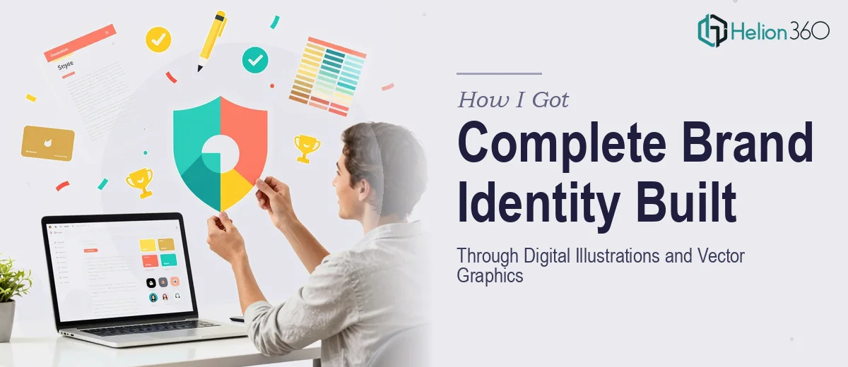
The Brand Presentation Problem I Was Staring Down
We had a company profile presentation and a full set of brand materials that needed to be built from scratch — logo, business cards, social media banners, and supporting promotional assets. The deadline was real, the audience mattered, and the stakes were clear: these materials would represent us in every pitch, partnership conversation, and client-facing moment from that point forward.
What I quickly understood was that this wasn't a "clean up the slides" task. It was a brand identity system — and every piece had to work together visually, consistently, and professionally. Getting it wrong meant showing up to important conversations with materials that undercut the work we were actually doing. That wasn't an option. This needed to be done right, and it needed to look like it was done right.
What I Found This Kind of Work Actually Requires
When I looked closely at what a proper brand identity system involves, three things stood out immediately as signals of real complexity.
First, the vector graphics work is not just drawing. Every asset — the logo, the icons used in the company profile, the decorative elements across banners — needs to be built in a way that scales without degradation, works across both screen and print, and exports correctly into every downstream format. That's a discipline on its own.
Second, the illustration style has to be defined and held consistently across every asset. It's not enough for each piece to look good in isolation. The visual language — line weights, color fills, geometric vs. organic form, level of detail — has to read as one cohesive system whether someone is looking at a business card or a 30-slide company profile.
Third, the company profile presentation itself carries its own structural demands. It's not a deck of pretty images. It has a narrative arc — who we are, what we do, how we work, why we're different — and the illustration system has to serve that story, not compete with it.
What the Execution of a Brand Illustration System Actually Involves
The structural foundation of this work begins with defining the brand's visual vocabulary before a single asset is drawn. This means establishing a primary color palette of no more than 4-5 brand colors with defined hex values, a secondary palette for supporting elements, and a clear typographic hierarchy — typically a 36pt display font, 24pt heading, 16pt body — that will govern every touchpoint. Without this foundation locked in first, the assets produced across a multi-piece project will drift visually, and correcting that drift after the fact is far more time-consuming than building the system correctly at the start. Practitioners who skip this step typically spend more time in revision cycles than they saved up front.
The vector illustration work itself operates under a specific set of mechanical rules. Each illustration needs to be built on a consistent grid — commonly a 24px or 32px base unit — so that icons, spot illustrations, and layout elements align predictably when placed together. Stroke weights need to be set as multiples of that base unit (1px, 1.5px, 2px) and held across every asset so the system reads as unified. The challenge is that maintaining this discipline across a company profile, a set of social media banners, business cards, and promotional assets simultaneously requires constant cross-referencing between files. One off-spec element can break the visual coherence of the entire system, and catching those inconsistencies takes a trained eye working methodically.
Polish and brand application across the final asset set is where significant time disappears even for experienced practitioners. Each deliverable — a banner, a profile slide, a card — has its own dimension spec, safe zone, and export requirement. A LinkedIn banner runs at 1584x396px; a business card front has a 3.5x2 inch canvas with a 0.125-inch bleed. Ensuring the illustration elements translate correctly across these formats without recomposing the visual hierarchy from scratch at each size is a non-trivial production task. For someone without a practiced workflow, this stage alone can consume days.
Why I Brought in Helion360 to Handle It
I looked at the scope — the illustration system, the company profile structure, the multi-format asset production — and it was immediately clear that attempting this myself wasn't realistic. The learning curve on just the vector production workflow would have cost me more time than the entire project should take. And this work needed to be done well, not just done.
Helion360 handled the full project end-to-end: defining the visual brand system, building the digital illustrations and vector assets, designing the company profile presentation, and producing the social media banners and business card files in all required formats. They turned the whole project around quickly — done in days, not the weeks it would have taken me to work through the execution depth this required. The tooling and the workflow were already in place. I didn't have to explain what a bleed is or why stroke weights matter. The team just knew.
The Outcome and What I'd Tell Anyone in My Spot
What came back was a cohesive brand identity and PowerPoint template — a company profile presentation that told our story clearly, a logo and vector asset library that will scale cleanly across every format we'll ever need, and social media and print assets that all read as one consistent brand. Every piece felt considered. Nothing looked like it was assembled from disconnected parts.
The business outcome was simple: we now show up to every conversation with materials that match the quality of the work we're actually doing. That's not a small thing. First impressions are made on the materials people see before they've heard a word from you.
If you're looking at a similar brand identity project — a brand identity system, a company profile, or a full set of digital illustration assets — and you want it handled end-to-end without spending weeks on a learning curve you don't have time for, Helion360 is the team I'd engage. They delivered fast and brought exactly the execution depth this kind of work demands.