

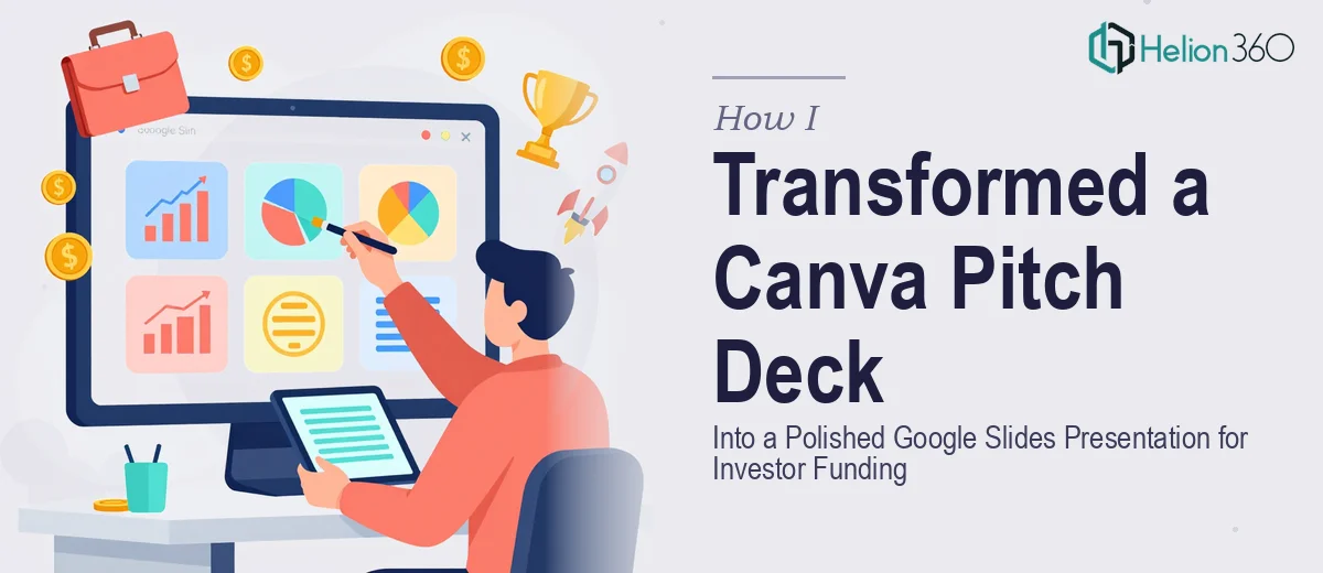
The Problem Was Bigger Than a Simple File Transfer
We were in the early stages of our first funding round. The pitch deck existed in Canva — the content was solid, the story made sense, and the visuals were reasonably put together. The problem was that every investor meeting we had lined up expected a Google Slides presentation, not a Canva share link. A share link isn't a pitch deck. It's a workaround, and sophisticated investors notice the difference.
The stakes were obvious. This was our first impression with people who would decide whether to write a check. A deck that looked cobbled together, with misaligned elements, inconsistent fonts, or broken layouts, would signal the wrong things before we said a single word. I knew immediately that this couldn't be a rushed copy-paste job. It had to look like one unified, intentional document — the kind that makes investors lean in rather than check out.
What I Found the Conversion Actually Required
My first instinct was to export the Canva slides as images and drop them into Google Slides. Five minutes of research told me exactly why that's a bad idea. Image-based slides can't be edited, scaled cleanly, or updated after the fact — and investors frequently ask for revised decks before they commit.
Doing the conversion properly means rebuilding the deck natively in Google Slides. That's not a file transfer. That's a reconstruction project. The moment I understood that, I also understood what it entailed: Canva uses its own font library, its own spacing and alignment system, and its own approach to layering elements. None of that maps directly to Google Slides. Fonts that render beautifully in Canva either don't exist in Google Slides or render differently at the same point size. Spacing that looks balanced at Canva's default canvas dimensions shifts when you move to a 16:9 Google Slides master. And any design consistency that existed across the Canva deck has to be manually re-established across every slide in the new environment — using Slide Masters, theme colors, and layout templates that most people have never touched.
Three things stood out as genuinely complex: the typography rebuild, the layout and grid reconstruction, and the visual consistency pass across all slides.
What the Work Actually Involves
The structural rebuild starts with auditing the source deck and mapping every design decision before touching Google Slides. A practitioner working on this identifies the exact font pairings — typically a heading font at 36–40pt, a subheading at 24pt, and body copy at 16–18pt — and finds the closest available equivalents in Google Fonts that preserve the visual weight and tone of the originals. The decision a practitioner makes here isn't just "which font looks similar" — it's whether the substitute renders correctly across Windows and macOS environments where investors will be opening the file. That compatibility check alone takes time that most people don't account for.
The layout reconstruction requires setting up a consistent grid inside Google Slides — typically a 12-column structure applied through the Slide Master — so that text boxes, image frames, and graphic elements align to the same invisible scaffolding across every slide. In Canva, this alignment is handled automatically by the platform's smart guides. In Google Slides, it has to be manually enforced through the master and layout layers. Any element placed outside the master propagates inconsistently the moment someone edits a slide. Getting this right requires understanding how Google Slides' inheritance model works, which is a non-trivial learning curve for anyone who hasn't built decks in it professionally.
The polish and consistency pass is where most DIY conversions fall apart. A professional approach involves locking in a palette of no more than four brand colors as the theme colors in Google Slides, then auditing every slide for color drift — instances where a text box or shape pulled a slightly different hex value. It also involves checking that image quality holds at full-screen resolution, that shadows and graphical effects translate correctly, and that no slide looks like it belongs to a different deck. On a 15–20 slide pitch deck, this review and correction pass can take several hours even for someone who does it regularly.
Why I Brought in Helion360 to Handle It
I looked at what the work actually required and made the call quickly. I didn't have the time to learn Google Slides' master and layout system from scratch, source and test substitute fonts for investor compatibility, and do a rigorous consistency pass across every slide — not with meetings already on the calendar.
Helion360 handled the full project end-to-end. That meant the Canva audit, the native Google Slides rebuild with a properly structured Slide Master, the typography substitution with compatibility-tested Google Fonts, and the full consistency pass across all slides. They also incorporated the feedback rounds we needed before the presentation was locked. The deck was turned around quickly — done in a fraction of the time it would have taken me to learn and execute it myself. What I got back was a single cohesive document, not a collection of slides that happened to share a file.
The Outcome and What I'd Tell Anyone in My Spot
The finished deck looked deliberate. Every slide shared the same grid, the same type hierarchy, the same four-color palette applied consistently. The transitions between slides felt like chapters in a single argument rather than separate pieces assembled after the fact. When we walked investors through it, the presentation didn't get in the way — which is exactly what a good investor pitch deck is supposed to do.
Anyone going into a funding round with a Canva deck and a Google Slides requirement is looking at a real conversion project, not a file export. The typography, the layout system, the consistency pass — each of those is a real body of work. If you're in that position and the timeline matters, Helion360 is the team to engage — they handled every layer of this end-to-end and delivered fast with the expertise already in place.