

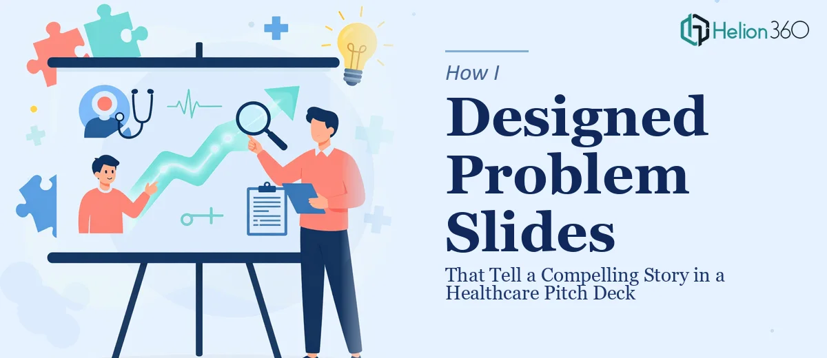
The Two Slides That Could Make or Break the Whole Deck
I was working on a healthcare pitch deck built around remote patient monitoring — a technology with real stakes, real data behind it, and a very specific audience of investors who needed to feel the urgency of the problem before they'd ever care about the solution. The problem section spanned two slides and had to carry a lot: global and regional health impact, the current standard of care and why RPM was an improvement, and the core challenges still holding RPM back from mass adoption.
These weren't background slides. They were the emotional and logical foundation of the entire pitch. If an investor didn't come out of those two slides convinced that the problem was urgent, layered, and real, nothing else in the deck would land. I knew immediately this needed to be done properly — not patched together, not just cleaned up — but actually designed to tell a story.
What I Found Out the Solution Actually Required
Once I started mapping out what these problem slides needed to accomplish, the complexity became obvious fast. The content itself was structured in three distinct stages — macro impact, current practice versus RPM benefits, and implementation challenges — and each stage required a different visual treatment to land correctly. You can't show global health statistics the same way you show a workflow comparison or a barrier analysis. Each needs its own visual logic.
Then there was the brand constraint. A three-color template was already established, and staying within it while still making the slides feel visually dynamic — not flat or monotonous — is a real design challenge. Color discipline that tight means every hierarchy decision, every callout, every icon has to work harder.
Finally, the deliverable had to be fully editable. That meant no locked assets, clean master slides, and raw source files for any elements built outside of PowerPoint. That's a production requirement, not just a design one, and it adds meaningful complexity to the build.
What Strong Problem Slide Design Actually Involves
The work starts with narrative structure — deciding how the three stages of the problem map to the visual flow across two slides. Done well, this means auditing every piece of content, assigning it a role in the arc, and deciding what gets a headline treatment, what gets a supporting visual, and what gets cut entirely. A stage like global and KSA impact typically calls for a strong data-driven anchor — a stat or figure that hits immediately — paired with a brief contextual frame. Without a deliberate story map driving that decision, the slide becomes a list of facts rather than a building argument. Getting this structure right before any design begins usually takes several hours of content mapping alone.
Visual mechanics are where the execution gets technically demanding. A three-color palette means the designer works within a strict constraint: typically a primary brand color for dominant hierarchy elements, a secondary color for supporting callouts, and a neutral for body and background. Typography has to carry weight that color can't — a clear scale like 36pt for slide headlines, 24pt for section labels, and 16pt for supporting text is standard practice for investor-facing decks. Icons, dividers, and data callouts all have to be sized and spaced on a consistent grid. Building this so it holds across both slides — and across any future edits — requires setting up master slides and style rules that propagate correctly, which is not a quick task.
Polish and consistency across the two slides is where most non-designers lose time. A comparison layout showing current standard practice versus RPM benefits, for example, has to feel balanced without being identical on both sides — the RPM column needs to feel optically better without being heavy-handed. The challenges section needs to communicate friction, not defeat. Every design choice at this stage is a judgment call: icon style, callout shape, spacing ratios. Small inconsistencies — a slightly different stroke weight on one icon, a margin that's off by a few pixels — read as amateur to an investor audience that has seen hundreds of decks.
Why I Brought Helion360 in to Handle It
I looked at what this actually required — narrative mapping, constrained palette execution, a technically clean editable build — and I didn't see a path to doing it well myself in the time available. This wasn't a case of polishing something that was mostly done. It was a case of two high-stakes slides needing full design treatment from structure through final production.
Helion360 handled the full project end-to-end: story structure across both slides, the visual design built within the three-color template, and the complete editable file package including raw source files. The turnaround was fast — done in days, not the weeks it would have taken me to work through the learning curve on investor pitch decks. They came with the tooling and the pattern recognition for this kind of work already in place, which meant nothing had to be figured out from scratch.
What Came Out of It and What I'd Tell Anyone in the Same Position
The two slides came back as a coherent visual argument. The global impact stage hit with weight. The RPM comparison read clearly and made the case without over-explaining. The challenges section felt honest rather than defensive — which is exactly the tone you want with a sophisticated investor audience. The file was fully editable, brand-consistent, and built in a way that could scale to the rest of the deck without any visual whiplash.
Problem slides are not a section you can afford to treat as a design afterthought. They carry the entire emotional case for why the solution matters, and in a healthcare context with a layered, multi-stage problem, getting that visual story right requires real craft. If you're looking at the same kind of situation — a compelling startup pitch deck with layered content, brand constraints, and no time to learn professional deck design from scratch — Helion360 is the team to engage. For similar complex design challenges, custom investor pitch deck design can transform your messaging. They delivered the full execution fast, and the quality showed.