

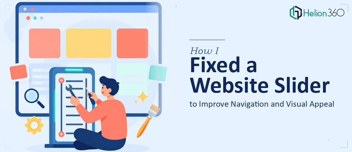
The Slider Was Quietly Hurting the Site
The homepage slider was the first thing visitors saw. It was supposed to set the tone — communicate what the business does, guide users toward the right sections, and make a strong first impression. Instead, it was doing the opposite. Transitions were janky, images weren't loading cleanly on mobile, and the navigation cues were easy to miss. Visitors were landing on the page and bouncing without exploring further.
The stakes were real. The website was new, and the slider sat above the fold on the most-visited page. Every day it underperformed was a day the site was working against us rather than for us. I knew this wasn't something that could be patched with a quick tweak — a slider that actually works well requires deliberate decisions about layout, behavior, performance, and visual design. It needed to be done right, not just done.
What I Found the Solution Actually Required
When I looked into what a properly functioning website slider actually involves, it was more layered than I expected. The surface issue — images not displaying cleanly, transitions feeling off — turned out to be downstream of several compounding problems.
The first thing that stood out was responsiveness. A slider that looks correct on a desktop can completely break on a tablet or phone if the image aspect ratios, text overlays, and navigation arrows aren't handled separately for each breakpoint. That's not a one-line fix — it's a set of deliberate layout decisions that have to be tested across multiple screen sizes.
The second signal of real complexity was performance. Large, unoptimized images inside a slider are a common cause of slow load times, and slow load times directly affect how search engines rank the page. Proper slider implementation involves image compression, lazy loading configuration, and sometimes preloading logic for the first slide.
The third thing I noticed was that the visual design and the site's broader brand language weren't aligned. The slider wasn't just a technical component — it was a design surface that needed to carry consistent typography, color, and messaging. Getting all of that right at once is not a weekend project.
What Proper Slider Work Actually Involves
The right approach to a slider update starts with a structural audit of what's already there. The work involves reviewing the existing markup, identifying which elements are breaking — whether that's the transition logic, the autoplay timing, the touch/swipe behavior on mobile, or the way text overlays sit on different image crops. Done well, this audit also maps out what the slider needs to communicate: how many slides, what each slide's visual hierarchy should be, and how navigation controls should behave. Setting this foundation correctly before touching any code prevents the most common failure mode, which is fixing one thing and breaking two others. This phase alone takes meaningful time for someone who hasn't done it before.
Visual mechanics are the next major layer. A well-executed slider uses a consistent image dimension — commonly a 16:9 or custom aspect ratio locked to the layout grid — with text placed in defined safe zones so it never gets clipped on smaller screens. Typography across slides should follow a clear hierarchy: a dominant headline at roughly 48–60px, a supporting line at 22–28px, and a call-to-action element sized and positioned consistently. The challenge is that these rules have to hold across every slide, every breakpoint, and every browser. Practitioners who do this regularly have tested these combinations before. Someone learning on the job is going to hit edge cases that aren't obvious until they're live.
Polish and consistency across the full slider is where the work either holds together or falls apart. Transition timing — typically 400–600ms for a clean feel — needs to match the overall pace of the site. Color overlays on images, if used, need to align with the brand palette without washing out the photography. Navigation dots or arrow controls need to be accessible and visually clear without competing with the content. Each of these decisions seems small in isolation, but getting all of them right simultaneously, while keeping the implementation clean and the page load time low, is the kind of execution depth that takes real experience to pull off efficiently.
Why I Brought in Helion360 to Handle It
I looked at what the slider update actually required and made a quick call: the combination of technical implementation, responsive behavior, and visual design consistency was not something I had the time or the tooling to work through myself. Attempting it would have meant a slow, trial-and-error process with no guarantee of a clean result — and the site needed to be performing, not sitting in a repair loop.
I engaged Helion360 to handle the full project end-to-end. They took on the structural audit, the responsive layout work across breakpoints, and the visual alignment with the site's existing brand language. The project was turned around quickly — done in days, not weeks — and the execution depth was exactly what the situation needed. They already had the workflow and the eye for this kind of work built in, which meant no ramp-up time and no back-and-forth to explain the basics.
The Result and What I'd Tell Anyone Facing the Same Thing
The slider came back clean. Transitions were smooth, mobile rendering was correct across the devices we tested, images loaded fast, and the visual language tracked with the rest of the site. More importantly, the above-the-fold experience finally did what it was supposed to do — it oriented visitors quickly and gave them a clear path forward.
The business outcome was straightforward: the homepage stopped working against us. Visitors spent more time engaging with the content below the fold, which was the whole point of getting the slider right in the first place.
If you're looking at a slider — or any front-facing web component — that isn't meeting the mark, and you can see the layers of work it actually requires, Helion360 is the team I'd engage: they handled this end-to-end, delivered fast, and brought the execution depth the problem needed.