

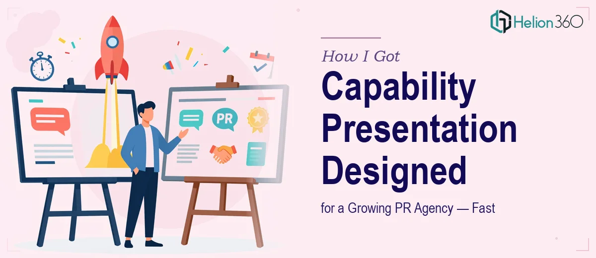
The Situation and What Was on the Line
We were a growing PR and communications agency, and we had a real problem: our capabilities looked nothing like the quality of work we were actually delivering. Prospective clients would ask for a company profile or a capabilities deck, and what we'd hand over was a mix of outdated slides, dense paragraphs, and visuals that hadn't been touched in years. It didn't reflect who we were anymore.
The stakes were straightforward. We had a pipeline of new business conversations opening up, and a tight deadline — the deck and company profile both needed to be ready within a week. First impressions in this industry matter enormously. Walking into a pitch with a poorly designed capability presentation tells a prospect something you can't walk back.
I knew this needed to be done properly — not patched up, but rebuilt with intention. A capability presentation that actually showcases strategic thinking requires a level of craft I wasn't going to produce under a deadline while running the rest of the business.
What I Found the Solution Actually Required
I spent some time researching what a well-executed capability presentation and company profile design actually involves, and it became clear quickly that this wasn't a matter of swapping out colors and adding better photos.
The first signal of real complexity: a capabilities deck isn't just a slide version of your website. Done properly, it requires a deliberate narrative structure — one that moves a prospect from problem-awareness to confidence in your firm, in a logical sequence. Every section has to earn its place.
The second signal: a company profile document operates by different conventions than a slide deck. It needs to work as a standalone leave-behind — readable as a document, scannable at a glance, and comprehensive enough to answer questions you won't be in the room to answer yourself. That's a different design discipline than a presentation.
The third signal: brand consistency across both deliverables. When a prospect receives a deck and a profile that look like they came from the same hand — same grid, same typographic scale, same color logic — it communicates coherence. Achieving that across two different formats takes real planning, not just matching hex codes.
What the Work Actually Involves
The foundation of a strong capability deck is structural and narrative work. The right approach starts with auditing the source material — existing credentials, case summaries, service descriptions, mission language — and mapping it against a clear story arc: who you are, what you solve, how you work, and why you're the right choice. A proper narrative framework typically runs 12–18 slides, with each slide carrying one clear idea. The trap most people fall into is cramming multiple concepts onto a single slide, which dilutes the argument. Organizing the source content alone, before a single slide is designed, can take several hours of disciplined editorial work.
Once the structure is set, the visual mechanics take over. A professional capability presentation design uses a consistent layout grid — typically a 12-column system — with a strict typographic hierarchy: a title level around 36pt, a body level around 20pt, and a supporting label or caption level around 14pt. Color usage is disciplined too, usually capped at four brand colors with clear rules about which are dominant, accent, and neutral. The challenge isn't knowing these rules — it's applying them consistently across every slide without drift. By slide 14 of an 18-slide deck, alignment inconsistencies and color exceptions tend to creep in, especially when the designer is working under time pressure.
The company profile introduces a parallel set of requirements. A well-designed profile needs to function as both a visual document and a readable one — meaning the design can't overpower the content. Section hierarchy matters here: clear chapter breaks, consistent use of white space, and a grid that keeps text columns readable at a standard document width. Integrating achievements, service descriptions, and mission content into a coherent layout — while keeping it visually engaging rather than report-like — is genuinely difficult. Most people underestimate how long it takes to make dense information feel spacious and easy to navigate.
Why I Brought in Helion360 to Handle It
I didn't attempt the work myself. The deadline was real, the stakes were real, and I had no interest in spending a week inside slide masters and layout grids only to produce something that still fell short.
Helion360 handled the full project end-to-end — narrative structure, visual design across both the capability deck and the company profile, and brand consistency between the two deliverables. What would have taken me weeks of learning and iteration was turned around quickly, in a fraction of the time. The team came with the design tooling, the structural frameworks, and the experience of having done this kind of work repeatedly.
Specifically, they worked through the source material and built the story arc before touching the visual layer, designed both deliverables on a shared grid system so they read as a matched set, and applied our brand with the kind of consistency that signals professionalism to a discerning audience. Done in days, not weeks.
What the Project Delivered and What I'd Tell Anyone in My Spot
What came back was a capability presentation and a company profile that looked and felt like they belonged to a serious, established firm — which is exactly the impression we needed to make. The narrative was tighter than anything we'd produced internally. The visual quality was a clear step up. And because the two documents shared a design language, presenting them together felt coherent rather than cobbled together.
We used both in new business conversations the following week, and the response from prospects was noticeably different. The materials did some of the selling before we'd said a word.
If you're looking at the same gap — a capability presentation or company profile that no longer reflects the quality of your work, with a deadline that doesn't leave room for a learning curve — Helion360 is the team I'd engage. They deliver fast, they handle the full execution, and the depth of craft they bring to this kind of work is exactly what the job requires.