

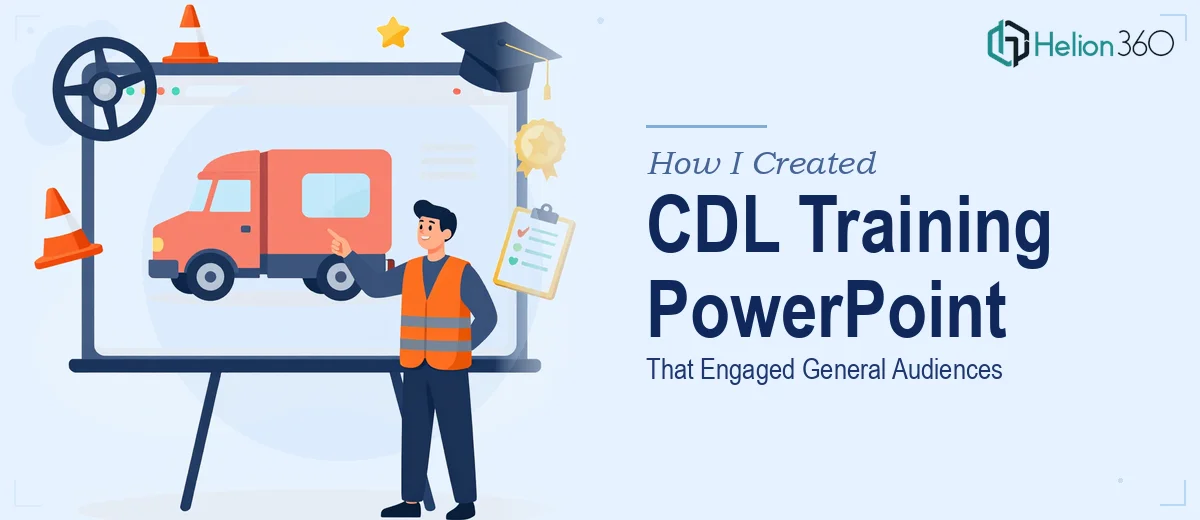
Why a CDL Training Presentation Is Harder Than It Looks
When I was tasked with putting together a training PowerPoint for a CDL program, I thought it would be straightforward. Cover the requirements, explain the process, include some safety tips, wrap it up. How complicated could it be?
Pretty complicated, as it turned out.
The challenge was not just pulling together accurate information about commercial driver's licensing. The real problem was making that information clear and engaging for a general audience — people who may have no prior knowledge of CDL requirements, the steps involved in getting licensed, or what to expect from the training process itself.
What I Tried to Build on My Own
I started by outlining the key areas the presentation needed to cover: an overview of CDL requirements, a walkthrough of the training process, the benefits of obtaining a CDL license, and safety guidelines that trainees needed to internalize before getting behind the wheel.
The content research was manageable. The design side was where things fell apart.
Every time I tried to translate that information into slides, the result looked either like a wall of text or a disconnected collection of bullet points. Nothing flowed. The slides that were supposed to simplify the CDL licensing process actually made it feel more confusing. I tried reorganizing the structure, experimenting with different layouts, and adjusting the content hierarchy — but I kept running into the same issue. The presentation did not feel like a training tool. It felt like a document that had been forced into slides.
For a CDL training program that would be used repeatedly with real trainees, that was not good enough.
Handing It Off to a Team That Could Execute
After a few rounds of revisions that were not getting me closer to what was needed, I reached out to Helion360. I described the project — a CDL training PowerPoint designed for general audiences, covering licensing requirements, the training journey, benefits of getting a CDL, and safety protocols — and their team understood the brief immediately.
What I noticed right away was that they approached it as a training design problem, not just a slide design problem. They asked about the audience profile, the likely setting where the presentation would be delivered, and whether the content needed to work as a standalone resource or in a facilitated session. Those questions shaped everything that followed.
The team restructured the flow so that each section built logically on the previous one. CDL requirements were introduced early with clear visual breakdowns. The training process was mapped out as a step-by-step journey rather than a list of tasks. The benefits section was framed in a way that connected directly to what a general audience would actually care about — job opportunities, earning potential, and career stability. The safety tips were given visual weight so they felt important rather than routine.
What the Finished CDL Training PowerPoint Looked Like
The final presentation was clean, well-paced, and genuinely easy to follow. Every slide served a purpose. The visual design was consistent without being sterile — it had enough structure to feel professional and enough clarity to work with an audience that was new to the subject.
The content I had originally drafted was mostly preserved, but the way it was organized and presented made a significant difference. Complex information about CDL licensing requirements that had previously felt dense was now laid out in a way that an audience could absorb in real time. The safety section, which is easy to make feel like a legal disclaimer, came across as practical and relevant.
The whole experience reinforced something I already suspected: designing an effective training presentation is a specific skill. Getting the content right is only part of it. Knowing how to sequence information for learning, how to use visuals to support comprehension rather than just decoration, and how to keep a general audience engaged across multiple topics — that takes a different kind of expertise.
If you are working on a training PowerPoint and finding that the content is solid but the presentation is not landing the way it should, Helion360 is worth reaching out to. They handled the structural and design challenges I could not crack and delivered something that was ready to use.
For additional perspectives on transforming complex content into clear training materials, see how teams have tackled medical device regulatory training materials and risk management training programs with similar success.