

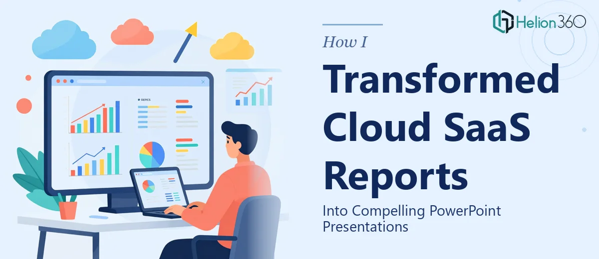
When the Data Is Rich but the Slides Are Empty
Our startup had no shortage of data. Every week, the platform generated detailed cloud SaaS reports — usage metrics, churn trends, infrastructure performance, customer adoption curves. The information was thorough, accurate, and completely unusable in a stakeholder meeting.
No one was going to sit through a raw data export. Leadership needed something they could read in ten minutes and act on. That meant turning dense, technical cloud reports into polished PowerPoint presentations that told a clear story.
I figured I could handle it. I knew the data, I knew the business, and I had PowerPoint open.
Where It Started Breaking Down
The first two decks I built were functional, but barely. The slides were cluttered. I was pulling charts directly from our analytics dashboards and dropping them in as screenshots, which looked messy and inconsistent. The font sizes were all over the place. Each slide felt like a different deck.
The deeper problem was structural. I was recreating the report in slide form rather than actually translating it into a visual narrative. Every time I tried to simplify, I worried about losing something important. So I kept adding more text, more tables, more raw numbers — which made the slides harder to follow, not easier.
Data visualization in PowerPoint is a real skill. Knowing which chart type communicates which insight, how to group related data without overwhelming a single slide, how to use layout and whitespace to guide attention — none of that comes automatically, even when you know the data cold.
After a few rounds of internal feedback that essentially said "this is too dense," I realized the issue wasn't the content. It was the presentation design itself.
Bringing in a Team That Knew the Work
A colleague mentioned Helion360, a presentation design team that regularly handled report-to-deck conversions. I sent over two of our SaaS reports along with notes on the key messages I wanted each deck to communicate, the audience profile, and our brand guidelines.
Their team came back with a set of clarifying questions — which metrics were decision-relevant versus background context, how much technical depth was appropriate for the audience, whether we preferred a narrative flow or a section-by-section breakdown. Those questions alone told me they understood the difference between a document and a presentation.
What the Final Decks Actually Looked Like
The decks Helion360 delivered were a significant step forward from what I had been building. The data visualization was clean and purposeful — bar charts for comparisons, trend lines for month-over-month movement, simple callout boxes for the numbers that needed to stand out immediately. Nothing was there just to fill space.
Each slide had one clear point. The supporting data reinforced that point rather than competing with it. The layout was consistent across all slides, which made the deck feel cohesive even though it was pulling from multiple sections of the original report.
The cloud SaaS metrics that had felt overwhelming in spreadsheet form became genuinely readable. Stakeholders who had previously skimmed our updates were engaging with the slides and asking specific follow-up questions — which is exactly what a good deck should do.
What This Process Taught Me About Report-to-Deck Conversion
There is a real difference between understanding data and knowing how to present it. I understood the cloud SaaS reports completely. What I lacked was the ability to strip them down to their core messages and design slides that communicated those messages at a glance.
Effective PowerPoint design for technical reports is not about making things look nice. It is about making decisions — what to show, what to summarize, what to cut. That editorial judgment, combined with solid data visualization skills, is what separates a useful stakeholder deck from a digital version of a spreadsheet.
I also learned that consistency matters more than I had assumed. When every slide follows the same visual logic, the audience can focus on the content instead of reorienting themselves with each new page.
If you are working with complex SaaS reports and struggling to turn them into presentations your stakeholders will actually engage with, Helion360 is worth reaching out to — they handle exactly this kind of conversion and the difference in the final output is substantial.