

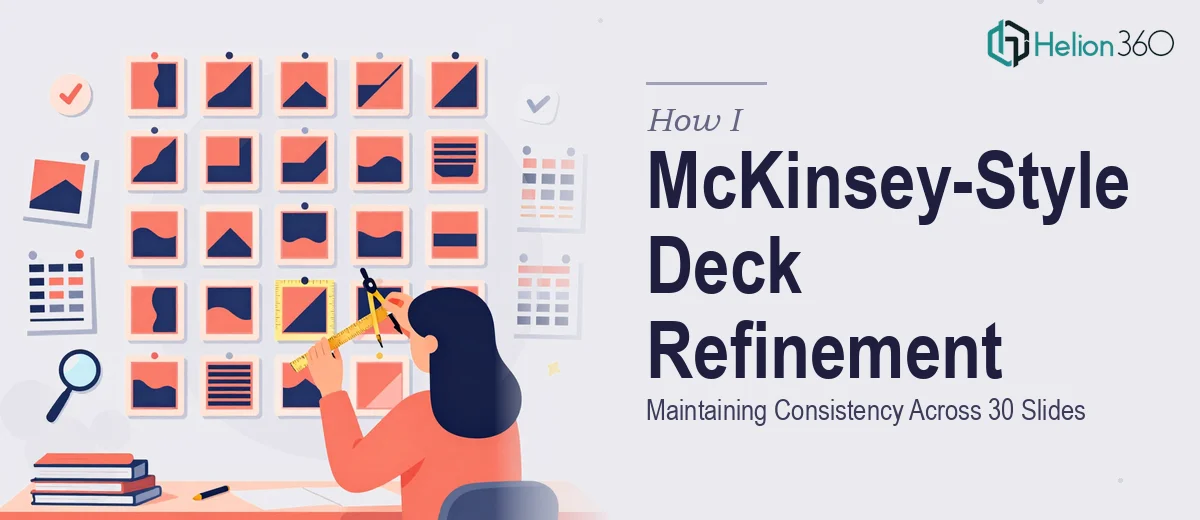
The Task Looked Simple. It Wasn't.
When I first opened the PowerPoint deck, I told myself it would be straightforward. Thirty slides, minor tweaks, clean up the layout, make it feel more consistent. How hard could it be?
The brief was clear enough: the deck needed to align with McKinsey-style presentation standards — structured thinking, clean typography, precise alignment, and a visual language that communicates authority without noise. The content was largely there. It just needed polish.
But once I started working through the slides, I realized the gap between "minor tweaking" and "McKinsey-style consistency" was wider than I expected.
What McKinsey-Style Actually Means in Practice
Most people have seen McKinsey presentations referenced online — the clean white slides, the structured headers, the disciplined use of space. What looks effortless in the final version is actually the result of very deliberate decisions made at every level of the slide.
I started adjusting font sizes, pulling margins into alignment, and standardizing how data labels appeared across charts. But every fix I made revealed something else that was slightly off. A title on slide 7 was three points larger than the same title on slide 12. The bullet spacing on a handful of slides didn't match the rest. Some slides used a slightly warmer grey for supporting text while others used a cooler neutral.
None of these were dramatic errors. But together, they broke the consistency that makes a professional presentation feel cohesive. And in McKinsey-style decks, consistency is not optional — it is the entire point.
The Part Where I Hit a Wall
I have a reasonable working knowledge of PowerPoint. I can build slides, apply themes, and handle formatting edits. But this project required something more granular: a trained eye that could hold the entire 30-slide structure in view while applying uniform adjustments across every element — text hierarchy, spacing, colour values, icon sizing, and slide-to-slide visual flow.
After a few hours, I had fixed some things and introduced new inconsistencies trying to fix others. The deck wasn't getting better in a systematic way — it was getting patched.
That's when I reached out to Helion360. I explained the situation: a 30-slide deck built in a McKinsey-style framework that needed consistent formatting, layout refinement, and visual cleanup without altering the core content or messaging.
What Happened When the Experts Took Over
Helion360's team reviewed the deck and came back with a clear plan. They would audit all 30 slides against a consistent style baseline — typography scale, margin grids, colour usage, and content hierarchy — and then apply corrections systematically rather than slide by slide.
The difference in approach was immediately obvious. Instead of patching individual slides, they treated the deck as a single design system. Every heading sat at the same optical weight. Supporting text was uniform in size and colour across every slide. Chart labels, call-out boxes, and data annotations all followed the same visual rules.
The layout refinements were subtle but significant. White space was used with intention. The visual hierarchy on each slide guided the eye in the direction the content intended. Nothing competed for attention that wasn't meant to.
When I reviewed the final version, the deck felt genuinely different — not because it had been redesigned, but because it had been made coherent. That is the actual goal of McKinsey-style presentation design: remove friction between the audience and the idea.
What I Took Away From This
Working through this project taught me that presentation refinement at a professional level is a skill set of its own. Knowing what a McKinsey-style deck is supposed to look like is not the same as knowing how to execute it across 30 slides with no variation creeping in.
The details that feel minor in isolation — a two-pixel alignment difference, an inconsistent line height, a slightly off-shade grey — compound across a full deck and undermine the authority the presentation is trying to project.
For anyone facing a similar situation with a professional presentation that needs to hold up under scrutiny, Helion360 is worth reaching out to. They handled the kind of systematic, detail-level refinement that is genuinely difficult to execute alone, and delivered a polished, professional deck without changing what the content was trying to say.