

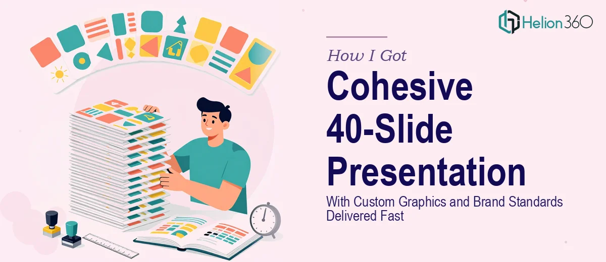
The Presentation Was Already Built — But It Wasn't Working
The deck existed. Forty slides of real business content, real data, real strategy. The problem was that none of it looked like it belonged together. Images were pulled from different sources with no visual logic, the color palette was inconsistent from section to section, and the data slides were dense walls of numbers that no one would absorb in a live presentation setting.
The audience for this deck was not a casual one. This was a business presentation that needed to hold the room, communicate credibly, and reflect a brand that people would take seriously. A rough, mismatched set of slides was not going to do that job.
I knew immediately that fixing this properly — not just tidying it up, but actually solving it — was a different kind of project than what most people assume when they hear "clean up the slides."
What Doing This Well Actually Requires
When I looked at what a properly executed presentation redesign of this scope actually involves, the list got long quickly.
First, the brand work. Creating a coherent color palette that harmonizes with an existing logo is not guesswork. It requires understanding color relationships — primary, secondary, and neutral values — and then applying those consistently across master slides, section dividers, chart fills, and icon treatments. A palette that looks unified across 40 slides demands real discipline.
Second, the infographic and image work. Sourcing stock imagery that fits a defined visual tone, editing it for consistency, and then building custom infographics to translate complex business data into visual formats — that is a distinct skill set. It is not the same as knowing how to use a presentation tool.
Third, the template architecture. A standard template for 40 slides means building slide masters that actually propagate correctly, establishing layout grids, and defining typographic rules that hold across every slide type in the deck. That is infrastructure work, not cosmetic work.
What the Solution Actually Involves
The Work Behind a Polished 40-Slide Business Presentation
Building a coherent template for a presentation of this scale starts with defining the master slide architecture. A properly constructed system uses a 12-column layout grid, a typographic hierarchy anchored at 36pt for titles, 24pt for subheadings, and 16pt for body text, and a color palette capped at four brand colors with defined usage rules for each. The work involves creating slide masters for every layout category — full bleed, split content, data, section break — so that every slide in the deck inherits the right structure without manual overrides. This alone takes significant time to build correctly, and any gap in the master setup creates inconsistency that cascades across the entire file.
The visual mechanics of the data slides present a different layer of complexity. Complex business data does not translate to infographics by default — it requires deciding which chart type communicates each dataset most clearly, stripping back chart clutter to essential data points, and then applying custom styling so every chart looks like part of the same system rather than an off-the-shelf default. Done well, this means adjusting axis labels, removing gridline noise, aligning color fills to the brand palette, and building custom icon-based infographics for process flows or comparisons. Each of these decisions takes judgment, and executing them across a 40-slide deck means making dozens of consistent micro-decisions under time pressure.
Polish and consistency across the full deck is where most attempts at DIY presentation design break down. Brand application at this scale means auditing every slide for palette compliance, checking that image treatments — tint overlays, cropping masks, border styles — follow a single defined rule, and ensuring that section transitions feel intentional rather than arbitrary. Stock imagery sourcing adds another layer: finding images that match the visual tone, editing them for consistency in color temperature and composition, and integrating them into layouts without looking like they were dropped in from a generic library. Getting all of this right across 40 slides, without a single slide feeling out of place, is the kind of quality control that takes both expertise and time.
Why I Brought in Helion360 to Handle It
I did not attempt any of this myself. Looking at the scope — the brand color work, the template architecture, the custom infographics, the image sourcing and editing, the consistency audit across 40 slides — I recognized straight away that this was not a project to learn on. It was a project to execute correctly, and quickly.
Helion360 handled the full project end-to-end. That meant building the branded template and slide master system from scratch, sourcing and editing all imagery to fit the defined visual tone, and creating custom infographics that turned the dense data slides into clear, visual communication. They also established the color palette and graphic treatment standards that now give the entire deck its coherence.
What made the decision easy was the speed. A project of this complexity — 40 slides, custom graphics, brand standards, template architecture — was turned around in a fraction of the time it would have taken me to learn and execute it myself. Done in days, not weeks.
What Was Delivered and What I'd Tell Anyone in the Same Spot
The result was a deck that looked and felt like a single, intentional piece of work. The template held across every slide type. The color palette was consistent from the first slide to the last. The data slides were clear and visual. The imagery fit. It was the kind of presentation that earns credibility before anyone says a word.
If the scope I've described sounds familiar — an existing deck that needs real structural and visual work, brand standards that need to be defined and applied across a large slide count, custom infographics that need to be built properly — the smart move is to engage a team that does this work every day rather than attempting to build those skills from scratch on a live project.
If you're in that spot and need it handled end-to-end without the weeks of learning curve, Helion360 is the team to engage — they delivered fast, handled every layer of the work, and brought the kind of execution depth this scale of project actually requires.