

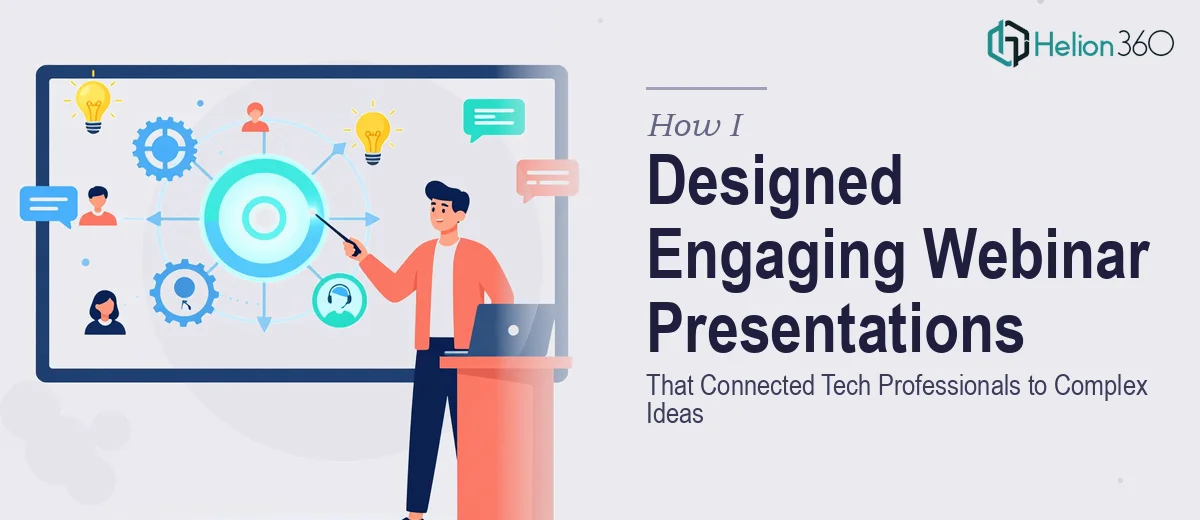
The Webinar Series Was Real, and So Was the Pressure
We were launching a webinar series for a tech startup — the kind aimed at educating professionals on genuinely complex ideas. The audience was sharp. These weren't casual viewers half-watching from a second screen. They were practitioners who would notice immediately if the visuals were generic, the layout was inconsistent, or the story arc fell flat mid-session.
The stakes were straightforward: the webinar series was tied to brand positioning. Every slide would be seen by the exact people we were trying to earn credibility with. A sloppy presentation wouldn't just underperform — it would actively work against us.
I knew this needed to be done right. Not "cleaned up a bit" right. Properly built, visually on-brand, and structured to carry dense technical content without losing the audience halfway through.
What I Found Out the Moment I Started Looking Into It
My first instinct was to figure out how much work this actually was before deciding anything. What I found quickly was that designing an engaging webinar presentation — one that actually works for a tech-savvy audience — is a multi-layered problem.
First, the content structure. Technical topics don't self-organize into a clear visual narrative. Someone has to map the information arc across each session so slides build logically and the audience is never lost. That's editorial work before it's design work.
Second, the brand consistency requirement. A vibrant, forward-thinking brand identity can't just be "applied" to a set of slides. It has to be embedded at the master slide level — palette, type hierarchy, iconography, spacing rules — so it holds across dozens of slides and multiple sessions without visual drift.
Third, the dynamic elements. Webinar audiences are watching on screens, often alone. Animations and motion need to be purposeful — guiding attention, not decorating. Getting that calibration right across an entire deck takes a level of judgment that comes from doing it repeatedly.
That was enough for me to stop treating this as something I could knock out over a weekend.
What the Work Actually Involves
The first real challenge in a project like this is structural: auditing the raw content and building a narrative arc before a single slide gets designed. For a multi-session webinar series on technical topics, that means mapping each session's core argument, sequencing information so it builds coherently, and deciding where visual anchors are needed to keep a remote audience oriented. The practitioner's job here is to identify where dense information collapses into confusion without a visual break, and where thin content needs reinforcing through layout rather than more words. That editorial-to-design handoff is where most in-house attempts break down — it looks like a design problem but it's actually a structure problem first.
Visual mechanics are the second layer. A well-built webinar deck operates on a defined layout grid — typically a 12-column system — with a strict typographic hierarchy: presentation titles at 40pt, section headers at 28pt, body content at 18pt, and captions no smaller than 14pt for screen readability. Brand colors are capped at four active palette values to avoid visual noise, with one primary accent driving CTAs and key data callouts. Infographics, icons, and data visuals each follow their own sizing rules. Setting this up correctly in master slides so it propagates consistently without manual adjustment per slide is a multi-hour job — and one small error in the master propagates everywhere.
Polish and consistency across a full series is the third layer, and it's where most projects quietly unravel. When a webinar deck runs 40 to 60 slides across three or four sessions, maintaining visual discipline — identical padding, consistent icon weights, aligned chart styles, uniform animation timing — requires a systematic QA pass that most people underestimate. A 2-point margin inconsistency or a mismatched brand color on three slides sounds trivial. In a live webinar being screenshotted and shared by a technical audience, it isn't.
Why I Brought Helion360 in to Handle the Full Project
I didn't try to work through this myself and then realize it was too much. I looked at what the project actually required — the structure work, the master slide build, the brand application, the session-by-session consistency — and recognized immediately that the smart move was to engage a team that does this work every day.
Helion360 handled the full project end-to-end. That meant taking the raw content brief and building a narrative framework for each session, constructing the master slide system with the brand identity embedded correctly from the start, and designing all the dynamic elements with intent rather than as decoration. They turned the full series around quickly — done in days, not the weeks it would have taken me to learn and execute it at this level. The tooling was already in place. The judgment on what works for a technical webinar audience was already built in.
There was no back-and-forth trying to explain what "on-brand" meant. They got it, built it, and delivered it fast.
What Was Delivered and What I'd Tell Anyone in the Same Position
What came back was a complete, session-ready webinar presentation series — visually cohesive, brand-consistent across every slide, with a clear narrative structure that made complex technical content genuinely followable. The dynamic elements guided attention without distracting. The data visuals translated dense information into something a sharp audience could absorb in real time. The master slide system meant that future sessions could be built on the same foundation without starting over.
The business outcome was what we needed: the webinar series launched on schedule and positioned the brand exactly the way we intended in front of the audience that mattered.
If you're looking at a similar project — a webinar series, a technical audience, brand identity that has to hold across a large deck — and you want it handled end-to-end without the learning curve, Helion360 is the team I'd engage. They delivered for me fast and brought exactly the depth of execution this kind of work requires.