

The Brief Looked Simple. The Execution Was Not.
When I was tasked with pulling together a convention theme design that would work across both PowerPoint presentations and printed materials, I thought I had a handle on it. We had a clear brand identity, a palette I liked, and a solid understanding of what the event needed to communicate.
But once I started building things out, I hit a wall fast.
The slide deck looked fine on its own. The brochure mockup looked fine on its own. But when I placed them side by side, they didn't feel like they belonged to the same event. The font weights were slightly off. The color usage wasn't consistent. The visual hierarchy that worked in PowerPoint fell apart when translated to print layout.
This wasn't a skill gap in the traditional sense — it was a scope problem. Convention theme design across multiple formats requires a system, not just a style.
Where the Complexity Lived
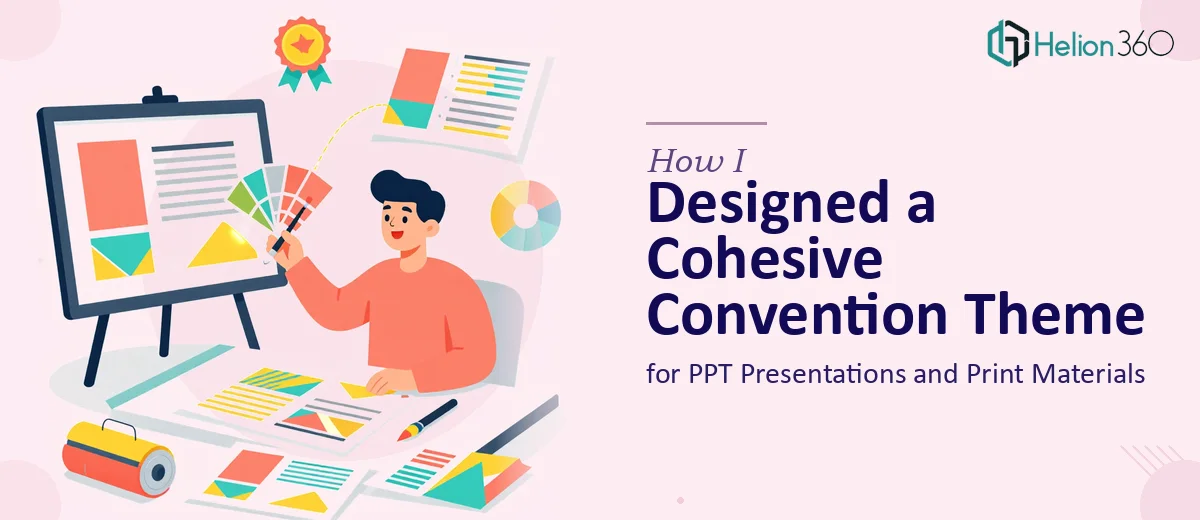
Convention materials aren't just a slide deck with matching brochures. For this project, the deliverables included presentation slides, promotional brochures, event banners, and supporting visual elements. Each format has different rules.
Print materials require CMYK color management, bleed settings, and resolution standards that don't apply to screen-based PPT design. A deep teal that looks sharp on a display can print muddy. Layouts that feel balanced on a 16:9 slide can look sparse on an A4 brochure. Trying to manage all of this while also keeping everything cohesive across the full convention theme was genuinely complex work.
I had basic proficiency with PowerPoint and some experience in design tools, but bridging the gap between digital presentations and production-ready print files was beyond what I could handle cleanly on my own within the timeline.
Bringing in the Right Team
After a few failed attempts at getting the materials to look unified, I reached out to Helion360. I explained the project — the convention theme, the mix of digital and print deliverables, the brand guidelines I needed them to work within, and the tight deadline.
Their team asked the right questions upfront. They wanted to understand the event context, the audience, the tone we were going for, and which materials would be seen together versus independently. That early conversation made it clear they weren't just going to apply a template — they were thinking about the design system as a whole.
How the Work Came Together
Helion360 started by establishing a core visual language: a defined color system that worked in both RGB and CMYK, a type hierarchy that could scale from a slide headline down to a brochure caption, and a set of layout principles that translated across formats.
From there, they built out the PowerPoint master slides — section headers, content layouts, and title slides — all aligned to the convention theme. The slide design felt energetic but structured, exactly what you need for a live presentation environment.
The print materials followed the same grid logic. The brochure panels mirrored the proportions used in the slides. The banners used the same graphic elements but scaled and composed for large-format output. Nothing felt like it was designed in isolation.
When I reviewed the full set of materials together for the first time, the cohesion was immediately obvious. It looked like one campaign, not three separate design projects.
What I Took Away From This
The biggest lesson was understanding where the real difficulty in convention theme design lives. It's not in making individual pieces look good — most designers can do that. The hard part is making everything feel like it came from the same place, especially when the formats are this different.
Managing that system across PPT and print simultaneously requires both design expertise and production knowledge. Trying to patch it together without that combination costs more time than just getting the right support from the start.
The event ran smoothly. Attendees engaged with the materials. The brand came through clearly across every touchpoint — from the presentation screen to the brochure in someone's hand.
Need Help With a Convention Theme Design?
If you're facing a similar project — multiple formats, tight timelines, and a brand that needs to stay consistent across all of it — Helion360 is worth talking to. Their team handles exactly this kind of work: convention theme design, PPT presentations, print materials, and the systems that tie them together. If the scope is bigger than what you can manage alone, they're a practical next step.