

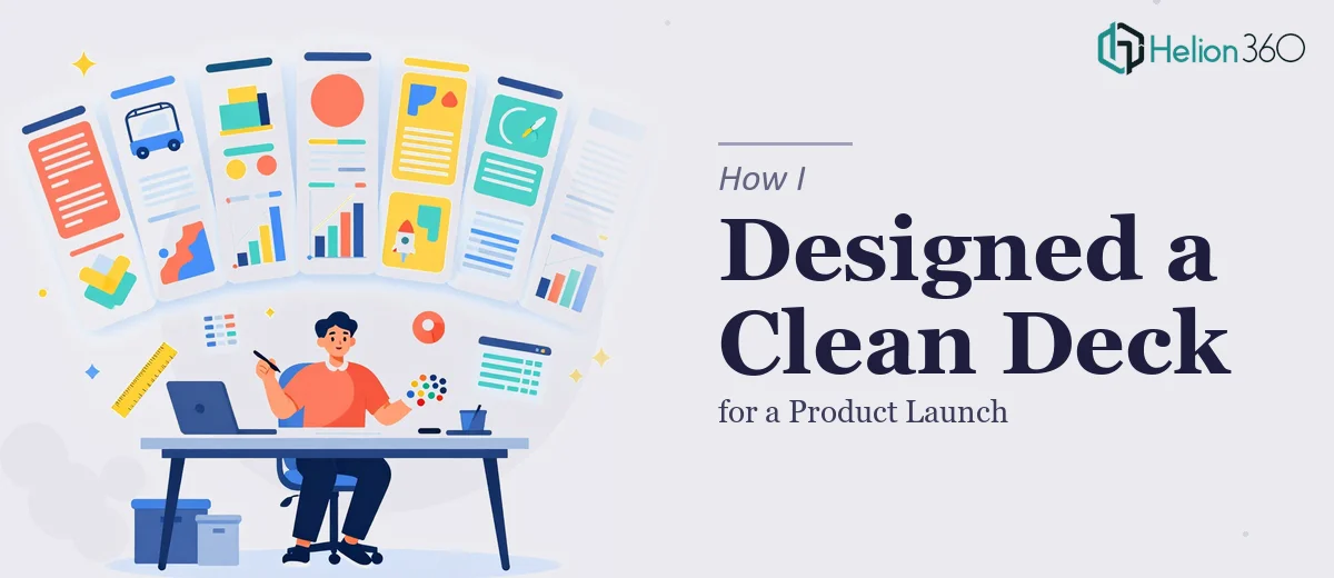
The Brief Seemed Simple Enough
We had a product launch coming up and needed a short PowerPoint deck to go with it. The requirements were straightforward on paper: no more than ten slides, a clean modern design, key product features, a few company milestones, and a couple of slides introducing the team. Nothing wildly complex.
I figured I could handle the initial structure myself. I knew the product well, had the content ready, and had used PowerPoint enough times to feel reasonably confident. I opened a blank template, started laying things out, and within an hour, I realized the gap between "a deck that works" and "a deck that looks professional" is wider than I'd assumed.
Where the Self-Build Hit a Wall
The content wasn't the problem. I had clear messaging about the product features, solid numbers on company achievements, and headshots and bios for the team. The issue was translating all of that into a visually coherent presentation design.
My slides looked like a document. Too much text, unbalanced layouts, inconsistent font sizes. The feature slides felt heavy. The team slides looked like a directory listing. I tried swapping in a PowerPoint template from a free resource site, but it didn't align with our brand colors and the placeholders were awkward to work around.
I also ran into a real constraint: the deck had to stay under ten slides while covering a meaningful amount of ground. That kind of slide economy requires design judgment — knowing what to show visually versus what to say in a caption, how to use whitespace, how to make data feel light rather than dense. That's not something you pick up from YouTube tutorials in a single afternoon.
Finding the Right Help
After spending most of a day on revisions that weren't moving the needle, I reached out to Helion360. I'd come across them while searching for presentation design support and their work samples showed exactly the kind of clean, modern aesthetic I was after.
I shared the content — the product feature descriptions, the achievement stats, the team bios, and our brand guide — and explained the ten-slide constraint. The team at Helion360 came back with a few clarifying questions about tone and audience before getting started. That part was reassuring. They weren't just designing slides; they were thinking about how the deck would land with the people watching it.
What the Final Deck Looked Like
The finished presentation design came back structured and cohesive. Here's roughly how the ten slides were organized:
Slide 1 — A title slide with a strong visual and the product name front and center.
Slides 2–3 — The problem we solve and how the product addresses it, visualized with simple icons and short text blocks rather than paragraphs.
Slides 4–6 — Key product features, each given its own visual treatment. No bullet-point walls. Icons, short descriptors, and a consistent layout across all three slides made them easy to scan.
Slide 7 — Company achievements presented as a clean visual grid — milestones and numbers displayed in a way that felt confident without being overwhelming.
Slides 8–9 — Team member slides with headshots, names, titles, and a one-line description each. Simple, professional, and consistent.
Slide 10 — A closing slide with a call to action and contact information.
The whole deck followed a consistent color palette tied to our brand, used a single readable typeface, and kept whitespace working in its favor. It looked nothing like what I'd built myself — and that was a good thing.
What This Project Taught Me
There's a version of this project where I would have shipped my rough draft and called it done. It would have been readable. But it wouldn't have made the impression we needed for a product launch.
Presentation design isn't just about arranging content — it's about guiding attention, building trust, and making the right things memorable. Keeping a deck to ten slides while maintaining clarity and visual impact is genuinely a design skill, not just a formatting task.
Helion360 delivered a deck that we were proud to present. The turnaround was fast, the communication was clear, and the result spoke for itself in the room.
Need a Clean Deck Without the Back-and-Forth?
If you're working on a product launch and need a tight, well-designed PowerPoint presentation that actually holds attention, the team at Helion360 is worth reaching out to. They handle the design complexity so you can focus on what you're launching.