

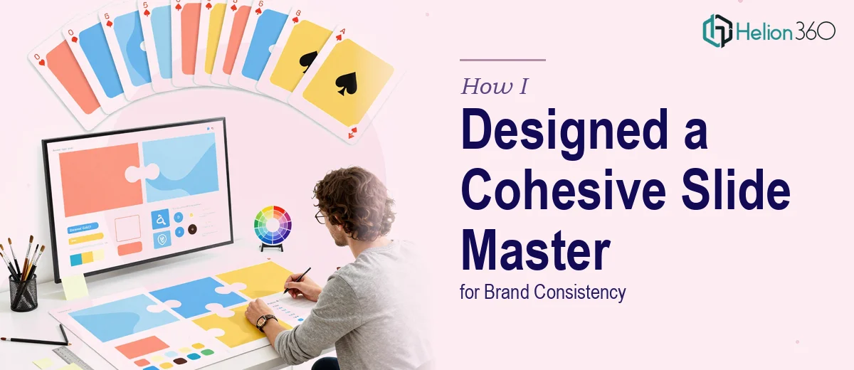
The Problem with Our Presentation Looked Manageable Until It Wasn't
We had a growing set of presentation materials — pitch decks, internal updates, client-facing reports — and none of them looked like they came from the same company. Fonts were inconsistent slide to slide. Brand colors were applied differently depending on who had last touched the file. Logos were stretched, margins were arbitrary, and the overall impression was one of a team that hadn't thought carefully about how it showed up visually.
The stakes were real. We were heading into a stretch of high-visibility conversations — partner meetings, a couple of investor touchpoints, and a product walkthrough for a prospective client. Handing over a deck that looked patched together wasn't an option. I recognized quickly that fixing this properly meant building a real slide master system, not just standardizing fonts across one file. That work had to be done right, and it had to be done before the calendar caught up with us.
What I Found That a Proper Slide Master System Actually Requires
I started by looking into what a professionally designed PowerPoint slide master actually involves. What I found made it clear this wasn't a Saturday afternoon task.
A true slide master isn't a single formatted slide — it's a layered parent-child hierarchy where a root master controls global rules and individual layout slides inherit from it. Changes to typography, color, and spacing need to propagate correctly through every layout, or the whole system breaks the moment anyone adds a new slide.
Beyond the technical structure, there's the brand translation layer: taking logo files, a brand color palette, and typography guidelines and converting them into something that behaves correctly inside PowerPoint's constraints. That means defining named theme colors so the palette applies consistently across charts, tables, and shapes — not just slide backgrounds. And it means setting type hierarchies that actually hold across different content types.
Then there's the content deck itself — the presentation built on top of that master. That's a separate body of design work, and it has to respect every rule the master establishes while still communicating clearly and looking polished.
What the Work Involves End to End
The structural foundation of this kind of project is the slide master architecture itself. A well-built master uses a 12-column implicit grid to govern element placement, with defined safe zones for headers, body content, and footers. Type hierarchies follow a deliberate scale — typically something like 36pt for titles, 24pt for subtitles, and 16pt for body — and those sizes are locked into the master's text placeholder styles so they don't drift when content is added. Getting this architecture right so that every child layout inherits cleanly takes real familiarity with how PowerPoint's master view actually works. Someone new to it will spend hours fighting inherited formatting overrides that undo changes made at the wrong level of the hierarchy.
Visual mechanics — chart styles, icon systems, table formatting — are the second major layer of execution. Charts need to use named theme colors so they update automatically if the palette ever changes; hardcoded hex values break that connection. Tables need custom cell styles with consistent padding, border weights, and header formatting baked in. Icon sets need to be sized and aligned to a common baseline so slides don't look hand-assembled. Each of these elements has its own formatting logic, and applying it consistently across a full deck requires both design judgment and technical knowledge of PowerPoint's object formatting system. The friction here is that it's painstaking, detail-level work — a misaligned icon or an off-brand chart color is easy to miss and immediately visible to a trained eye.
Polish and consistency across the full deck is where a lot of otherwise solid work falls apart. A maximum of four brand colors should appear across the entire presentation — headline color, accent, background, and text — and every instance of color usage needs to be audited against that palette. Spacing between slide elements should follow consistent vertical rhythm rules, not visual guesswork. Running a full consistency pass across 20 or 30 slides requires a systematic eye and enough familiarity with the brand standards to catch deviations that aren't obvious at a glance. Without a defined checklist and the experience to know what to look for, this pass typically gets skipped or done incompletely — which is how branded decks still end up looking inconsistent at delivery.
Why I Brought in Helion360 to Handle It
Looking at the scope of what a properly executed slide master and branded deck actually involved, attempting it myself wasn't a realistic option. The timeline was tight, I didn't have the PowerPoint architecture expertise to build the master hierarchy correctly on the first pass, and the consistency work alone was a full project in its own right.
I engaged Helion360 to handle the full project end to end. They took the brand assets — logo files, color codes, type guidelines — and built the slide master system from scratch, set up the full layout library with properly inherited styles, and then designed the presentation deck on top of it. The whole thing was turned around quickly, in a fraction of the time it would have taken me to get the master architecture right through trial and error alone. What I received was a system that any member of the team could use to create new slides that looked consistently on-brand — not just one polished deck that couldn't be extended.
The Outcome and What I'd Tell Anyone in My Spot
The final deliverable was a complete branded presentation system: a fully structured PowerPoint slide master with a clean layout library, a named theme color palette, locked type hierarchies, and a content deck built on top of it that held together visually from the first slide to the last. The partner and client conversations went well — and the presentation contributed to that, because it looked like it came from a company that had its act together.
If you're looking at a similar gap — inconsistent decks, no real master system, a deadline that doesn't leave room for a learning curve — Helion360 is the team I'd engage. They delivered fast, handled the full execution depth this kind of work requires, and the result was something the whole team could build on going forward.