

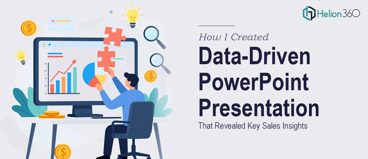
The Situation I Was Staring At
Our sales leadership team needed a clear picture of where we stood in the market — not a gut-feel snapshot, but a proper competitor research presentation that mapped real positioning, pricing signals, product gaps, and customer sentiment across the competitive landscape. The deck was going into a strategy meeting with senior stakeholders, and the quality of the analysis would directly influence decisions about where to push resources next quarter.
That raised the stakes immediately. A rough, cobbled-together PowerPoint full of copy-pasted screenshots and unformatted tables wasn't going to cut it. The findings needed to be credible, visually coherent, and structured in a way that made the strategic implications obvious to a room full of people who don't have time to decode raw data. I recognized quickly that doing this well was a real project — not an afternoon task.
What I Found the Work Actually Required
When I dug into what a proper competitive analysis presentation actually demands, a few things became clear fast. First, the research layer itself is not trivial. Pulling together meaningful intelligence on competitors means going beyond their homepage — it means synthesizing product documentation, review platforms, pricing pages, sales positioning language, and market commentary into a coherent picture. That kind of structured research takes deliberate methodology, not a few Google searches.
Second, the translation from research to slide is its own discipline. Raw findings — a spreadsheet of competitor features, a set of customer quotes, a matrix of pricing tiers — don't automatically become slides. Every data point needs to be evaluated for what story it tells and how much visual real estate it deserves. Feature comparison tables need to be built to actually communicate, not just document. Market positioning maps need axes that mean something.
Third, the visual execution of a data-heavy presentation requires real design fluency. Charts need to be the right type for the data being shown. The hierarchy of information across slides needs to guide the reader's eye without them noticing it's being guided. That's a set of skills that takes years to develop, not hours.
What the Work Itself Actually Involves
The right approach to a competitor research presentation starts with structuring the source intelligence before a single slide gets built. That means auditing what data exists, identifying the gaps, and mapping a narrative arc — typically moving from market context, to competitor profiles, to gap and opportunity analysis, to strategic implications. Done properly, each section answers a specific question a decision-maker would ask. The structural decisions made here determine whether the final deck lands as a coherent argument or a disconnected collection of findings. Getting this audit and mapping right typically takes longer than people expect, especially when the raw inputs arrive in mixed formats.
Visual mechanics are where a competitive analysis presentation either builds credibility or loses it. Comparison frameworks — feature matrices, positioning maps, SWOT summaries — need to follow strict layout rules to remain scannable. A 12-column grid keeps elements aligned across slides; typography hierarchies like 36pt headlines, 24pt subheads, and 16pt body text ensure the eye moves predictably. Chart types matter enormously: a bar chart and a dot plot communicate very different things about the same competitive data. Choosing the wrong one doesn't just look off — it obscures the insight. These decisions require fluency with both data visualization principles and presentation software behavior, and edge cases multiply when the dataset is large or inconsistent.
Consistency across a multi-section deck is the part that quietly kills most DIY attempts. A competitive analysis presentation often spans 30 to 50 slides covering different data types — qualitative customer feedback alongside quantitative feature comparisons alongside narrative strategic commentary. Keeping the palette disciplined to a maximum of 4 brand colors, maintaining consistent icon treatment, and ensuring that every data callout follows the same visual convention across all slide types is painstaking work. One inconsistent slide in front of a senior audience signals that the analysis itself might be similarly uneven. Maintaining that discipline across a full deck, while incorporating revisions to the underlying data, is the kind of execution friction that compounds fast.
Why I Brought in Helion360 to Handle It
I didn't spend time trying to figure out if I could pull this off myself. The scope was clear, the stakes were real, and the timeline was tight. What this project needed was a team that already had the research methodology, the design system, and the presentation build process in place — not someone learning on the job.
Helion360 handled the full project end-to-end: structuring the competitive intelligence into a narrative framework, building the visual system that made the data legible, and producing a finished deck that was consistent, on-brand, and ready for the boardroom. They turned the full project around quickly — done in days rather than the weeks it would have taken me to research, draft, design, and revise it myself. The depth of execution that went into the comparison frameworks and data visualization alone would have required a significant learning curve. Having a team that does this work every day meant none of that friction landed on my plate.
What the Deck Delivered and What I'd Tell Anyone in My Spot
The finished presentation gave our leadership team a genuinely clear view of the competitive landscape — where our product led, where gaps existed, and where customer sentiment pointed toward unmet needs that represented real sales opportunities. The strategic discussion that followed was sharper because the analysis was structured to answer the right questions rather than just report data. Decisions that had been sitting in ambiguity got made.
If you're looking at a similar project — competitor research that needs to become a credible, decision-ready presentation on a real deadline — Helion360 is the team I'd engage. They delivered fast, handled the full scope, and brought the kind of execution depth this work genuinely requires.