

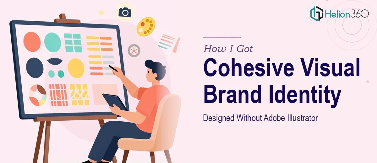
The Brand Looked Like It Was Made by a Committee of Strangers
I had a growing business with no real visual identity. The logo was a rough draft from two years ago, the social media graphics were inconsistent from week to week, and the website banner looked like it had been designed in a different decade. None of it felt like one brand. None of it felt deliberate.
The stakes were real. We had a product launch coming up, a new round of promotional materials to produce, and a website refresh on the roadmap. Stakeholders were going to see all of it. Customers were going to see all of it. First impressions were going to be made — and what we had wasn't going to make the right ones.
I knew this wasn't something to patch together with a free template. A brand identity system done properly is a system, not a collection of individual files. I needed to understand what that system actually takes to build before I could make a smart decision about who should build it.
What I Found a Real Brand Identity Actually Requires
Once I started looking at what proper visual brand identity design involves, it became clear fast that the surface-level work — making things look good — is the easy part. The hard part is the underlying system.
A real brand identity is built on defined rules, not improvised decisions. That means a color palette with exact hex values and usage hierarchy, a typography system with specific weights and size relationships, a logo with defined clear-space rules and approved usage variations. Without those rules locked down in a brand guidelines document, every designer who touches the brand afterward guesses — and the result is exactly what I already had.
Beyond the rules, the work spans multiple mediums at once. Social media graphics, promotional banners, product visuals, and web assets all have different dimensions, different viewing contexts, and different production requirements. Keeping them visually consistent while adapting them correctly for each format is a craft skill that takes real working knowledge of both design principles and the tools. Doing it in Photoshop and Illustrator, at production quality, across dozens of deliverables — that's not a weekend project for someone who isn't already fluent in both.
What Doing This Work Well Actually Looks Like
The right approach starts with a structural audit of the brand's existing visual assets and a deliberate decision about what the identity needs to communicate. This means defining a primary color palette of no more than four brand colors, each with hex, RGB, and CMYK values, alongside a secondary palette for supporting uses. Typography selection follows a clear hierarchy: a primary display typeface for headlines, a secondary typeface for body and supporting text, with a defined size scale — typically something like 48pt/32pt/20pt/14pt across usage tiers. Getting this foundation wrong means everything built on top of it is inconsistent by default. In practice, this foundational work alone takes significant back-and-forth between concept and refinement before a single deliverable is production-ready.
Visual mechanics across the deliverable set introduce their own layer of complexity. A logo needs to be constructed on a precise grid in Illustrator — vector paths, not rasterized shapes — so it scales cleanly from a 16px favicon to a billboard without quality loss. Social media graphics and banners require correctly sized artboards for each platform: an Instagram square at 1080×1080px behaves very differently compositionally than a LinkedIn banner at 1584×396px or a Facebook ad creative at 1200×628px. Applying a consistent visual grid, brand colors, and typographic system across all of those formats while keeping each one compositionally balanced is where most non-specialist attempts break down. The edge cases — how a logo sits on a dark background versus a light one, how a promotional banner adapts to a vertical format — require judgment that only comes from doing this work repeatedly.
Polish and consistency at scale is the final piece, and it's where brand identity projects most commonly fall apart. A brand guidelines document needs to codify every decision — approved logo variations, minimum logo sizes, color usage rules, do's and don'ts for typography pairing — so the system holds up when it's handed to a third party or used six months later by someone who wasn't in the original project. Creating that document is itself a multi-hour design task. Without it, all the work upstream exists only in the files themselves, which means the brand identity has no durability. Producing a guidelines document that's clear, complete, and visually well-designed requires the same design skill as the identity work itself.
Why I Brought in Helion360 to Handle It
I recognized quickly that what this project needed wasn't a single fix — it was a full system built from scratch, across multiple deliverables, to a production standard I didn't have the tools or time to reach myself. Attempting it without that expertise in place would have cost me weeks and still produced something unreliable.
Helion360 handled the full project end-to-end and delivered fast. That meant the logo system in vector format with all required variations, the complete color and typography guidelines, production-ready social media graphics and promotional banner templates sized for every relevant platform, and a brand guidelines document that locked all of it down. What would have taken me weeks of learning curve and iteration was turned around in a fraction of that time — delivered clean, consistent, and ready to use across every channel we needed.
The value wasn't just the output. It was the fact that the team already had the tooling, the process, and the design judgment in place. There was no ramp-up. The work came back at a level I couldn't have reached on my own.
What the Deliverables Actually Did — and What I'd Tell Anyone Seeing What I Saw
The result was a brand that finally looked like one brand. Every touchpoint — social graphics, banners, product visuals, web assets — drew from the same visual system and felt deliberately connected. The product launch went forward with materials that looked credible and consistent. Internal stakeholders noticed immediately. More importantly, customers had a coherent visual experience across every channel.
The brand guidelines document meant that every piece of design work done after the project started from a defined foundation, not a guess. That durability is worth as much as the deliverables themselves.
If you're looking at an inconsistent visual identity and a stack of deliverables that need to be production-ready fast, Helion360 is the team to engage — they handled the full scope of this work quickly, and the depth of execution they brought is exactly what a project like this needs.