

The Task Seemed Simple at First
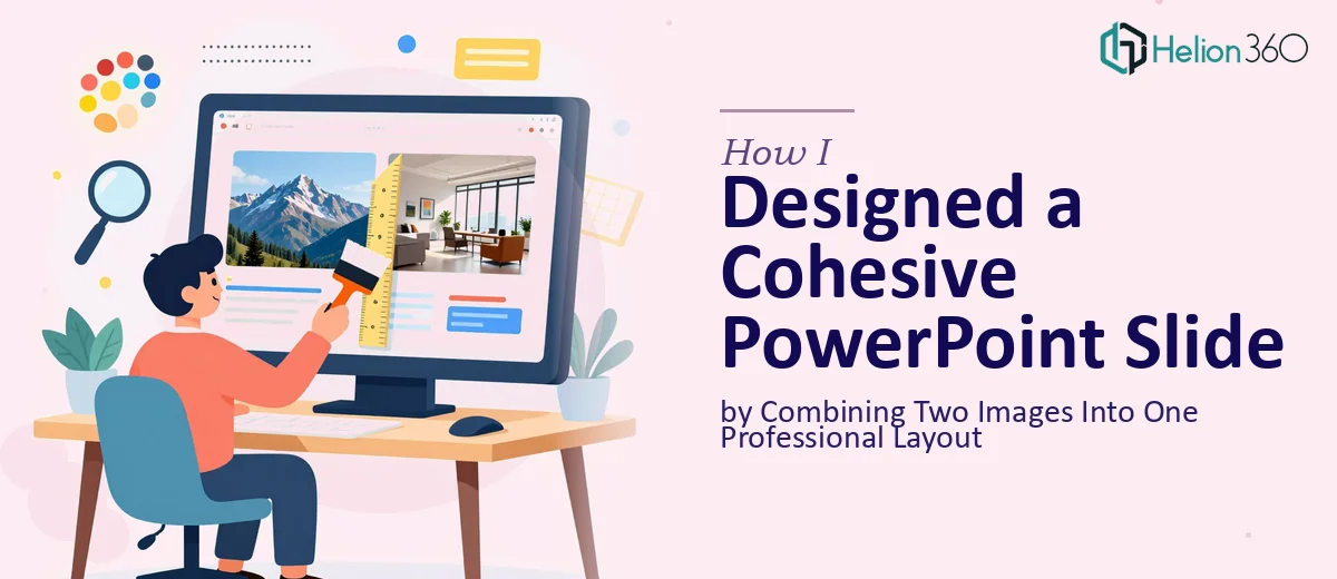
I had two separate photos that needed to live on a single PowerPoint slide. The idea was straightforward — combine both images into one cohesive layout that matched the rest of the presentation, kept both visuals clearly visible, and still left room for a text overlay and supporting elements.
On paper, it sounded like a quick job. In practice, it turned into something more layered than I expected.
Where Things Started to Get Complicated
The first challenge was proportions. Both images had different aspect ratios and lighting conditions. Placing them side by side looked awkward. Overlapping them lost detail from one or both. Cropping too aggressively made them feel disconnected from the message the slide was meant to carry.
I spent a while trying different arrangements — splitting the slide down the middle, using one image as a background with the second inset, experimenting with shapes to mask edges. Each version had something off about it. The color tones between the two photos clashed subtly. The text I needed to overlay disappeared against busy areas of both images. The spacing never felt intentional.
Beyond the layout, there was also the question of consistency. The slide had to follow the existing PowerPoint presentation's design language — fonts, color palette, alignment grids. Every choice I made in isolation ended up looking mismatched once I dropped it into the actual deck.
This was not a matter of effort. It was a matter of knowing exactly how to handle layering, masking, color correction within a slide, and design hierarchy in a way that looks natural rather than assembled.
Bringing in the Right Help
After hitting a wall on the layout, I reached out to Helion360. I shared both images, the existing deck, and a brief explanation of what the slide needed to communicate. Their team asked a few clarifying questions about the intended audience and the key message the slide was carrying, then took it from there.
What I noticed immediately was that they did not just place the images — they made design decisions. One image was used as a full bleed background with careful color grading to reduce its visual noise. The second image was brought in as a well-masked focal element, positioned in a zone that naturally drew the eye. Text overlays were placed in the breathing room created by the layout, sized and colored so they read clearly against both images without needing a heavy text box or dark band behind them.
The color scheme across both images was unified through consistent toning, so the slide no longer looked like two separate photos sharing the same space. It looked like one intentional design.
What the Final Slide Actually Delivered
The finished slide fit seamlessly into the rest of the deck. Both images were clearly visible. The hierarchy was clean — the viewer knew exactly where to look first and where the supporting information sat. There was no visual clutter, no competing focal points, and no awkward cropping.
The text legibility held up even when the slide was projected at a larger scale, which is something I had not even thought to test in my earlier attempts. The spacing around key elements was consistent with the rest of the presentation's grid, which made the whole deck feel more polished as a result.
What This Experience Taught Me About Slide Design
Combining images in PowerPoint is not just a matter of placing two photos on a slide. It involves understanding how visual weight works, how color relationships affect perception, and how a layout needs to serve the message rather than just hold the content. When those elements align, a slide does not just display information — it communicates it.
The difference between a slide that looks assembled and one that looks designed comes down to those details. Getting them right takes both skill and experience with how presentations actually work in context.
If you are working on a presentation where professional presentation design is needed and the result keeps falling short, we can help. Our team handles exactly this kind of detail work on PowerPoint layouts, and we've delivered professional presentations ready to use without further adjustment.