

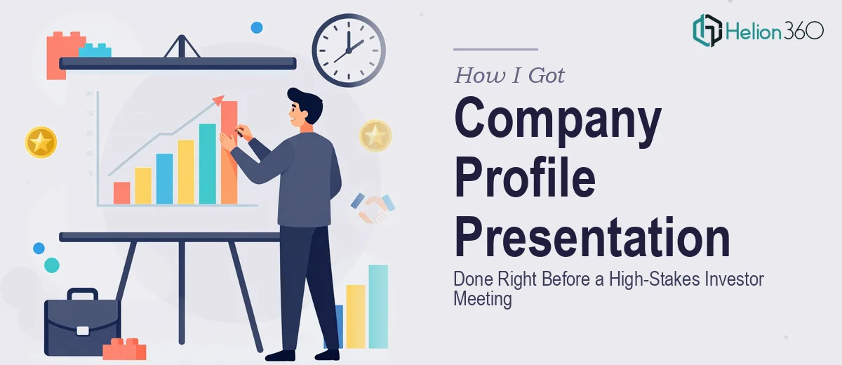
The Problem We Were Facing — and Why Getting It Wrong Wasn't an Option
We had an investor meeting confirmed in under two weeks. The deliverable was a company profile presentation — the kind that walks a room of potential partners through who we are, what we've built, and where we're taking the business next. What we had on hand was rough: scattered slide fragments, an unformatted case study document, and a brand guide that had never actually been applied to any presentation asset.
This wasn't an internal update. The audience would be evaluating us as a credible player in the renewable energy space, and the presentation would be the first real artifact they'd have of our story. A weak company profile presentation doesn't just fail to impress — it actively erodes the credibility you've spent months building. I knew immediately that 'good enough' wasn't an option here, and that doing this well would require more than a weekend of slide editing.
What I Found Out This Kind of Work Actually Requires
I spent a day mapping what a genuinely strong company profile presentation design needs to do — and it's not a simple ask. It isn't a pitch deck and it isn't a brochure. It sits between the two, which makes it harder to execute than either one alone.
Done well, the presentation has to carry a coherent narrative across five or six distinct content areas — mission and values, a milestone timeline, team overview, case studies showing real impact, and a credible forward vision. Each section has its own logic, its own data requirements, and its own visual treatment. The through-line connecting them has to feel intentional rather than assembled.
Then there's the brand consistency challenge. A presentation going to investors has to read as if it came from a single, confident brand — and that means enforcing typographic hierarchy, color palette discipline, and visual layout rules across every slide. The moment something looks off-system, the audience starts to wonder whether the organization is as coherent as it claims. I could see clearly that building this correctly, in ten days, without the specialized tools and experience to do it, wasn't a realistic path.
What the Work Actually Involves — and Where It Gets Hard
The first layer is structural: auditing the source material and mapping the narrative arc before a single slide gets touched. For a company profile presentation, this means deciding what belongs in each section, what gets cut, and what sequence will carry an investor from first impression to genuine interest. The story arc for a renewable energy startup needs to establish mission credibility early, build momentum through the milestone timeline, and land on a forward vision that feels earned. Getting the architecture wrong means no amount of visual polish fixes it — the slides may look clean but the audience loses the thread. This structural work alone, done with proper attention, takes longer than most people expect.
The second layer is visual mechanics. A professional company profile presentation typically uses a 12-column layout grid that governs image placement, text columns, and whitespace across every slide. Typography runs on a clear hierarchy — headline at 36pt or larger, subheadings at 24pt, body at 16pt — applied consistently through master slides, not manually adjusted page by page. The milestone timeline section, which is one of the most visually complex components in this type of deck, requires custom graphic construction that aligns dates, callout labels, and icons without crowding. Anyone attempting this for the first time will spend hours on alignment corrections alone.
The third layer is brand application and polish across the full deck. The company's palette — typically four approved brand colors maximum — has to be applied with discipline across backgrounds, accent elements, chart fills, and icon treatments. Every case study slide needs to follow the same visual template so the section reads as a cohesive unit, not a collection of individually-formatted pages. Exporting a final PDF that renders correctly at print resolution, with embedded fonts and no compression artifacts, adds another set of technical steps that are easy to get wrong without the right workflow. For a deck that may be printed and handed to investors, that final delivery quality matters more than most people realize until it's too late to fix.
Why I Brought in Helion360 to Handle the Whole Thing
I didn't attempt to build this myself and then look for help. I recognized early that the gap between what we had and what this presentation needed to be was too large to close with spare hours and good intentions. What was needed was a team that does this kind of work every day, with the systems already in place.
Helion360 handled the project end-to-end — starting with the narrative structure, moving through the full visual design and brand application, and delivering a final presentation-ready file. They worked through the milestone timeline, the case study slides, the team overview section, and the forward vision pages as a single unified project, not as separate tasks stitched together. The turnaround was fast — done in days, not the weeks it would have taken me to even get up to speed on the professional presentation deck execution requirements. For a deadline like ours, that speed wasn't a nice-to-have. It was the whole point.
The Outcome — and What I'd Tell Anyone in the Same Position
What came back was a company profile presentation that read like a single, confident document — clear narrative, clean visual hierarchy, brand-consistent from the first slide to the last. The investor meeting went well. The materials held up in the room and held up afterward when the PDF was circulated. The feedback we got was that the presentation communicated exactly what we needed it to: a credible team with a real track record and a clear sense of direction.
The thing I'd tell anyone facing a similar deadline is this: don't spend your time learning what the work requires and then struggling to execute it. The gap between a polished company profile presentation and a rough one is visible to the people you most need to impress. If you're in the same spot I was — real deadline, high-stakes audience, materials that aren't close to ready — Helion360 is the team to engage. They handled the full execution fast, and the quality showed.