

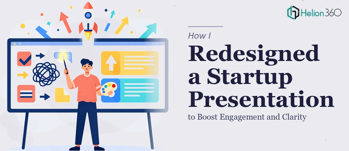
The Problem With Our Existing Company Profile
We had grown — new team members, new projects, a new website — and our existing company profile presentation hadn't kept pace. What we were sending to potential clients and partners still reflected who we were eighteen months ago. The design was inconsistent, the copy felt generic, and the branding didn't match anything on our new site.
The stakes weren't abstract. Whenever we walked someone through our company deck, I could feel the gap between what we'd become and what the slides were saying. A presentation is often the first structured impression a business makes, and ours was undermining the work we'd done everywhere else. It was clear this needed to be handled properly — not patched.
What I Found a Real Presentation Redesign Actually Requires
Before bringing anyone in, I spent time understanding what a proper company profile presentation redesign actually involves. What I found quickly made clear this wasn't a one-afternoon job.
First, the content and narrative structure had to be rethought from the ground up. A company profile isn't just an About Us page reformatted into slides — it needs a deliberate arc: who we are, what we do, why it matters, and proof that we deliver. Every section has to earn its place.
Second, the visual system had to be rebuilt with discipline. That means a defined color palette applied consistently, a clear typographic hierarchy, and a layout grid that holds across every slide — not just the title card. Done well, this alone takes significant planning.
Third, portfolio work and client testimonials needed to be integrated in a way that felt designed, not tacked on. That's a structural and visual problem simultaneously — and it's where a lot of presentations fall apart.
The more I looked at it, the clearer it became: this project needed someone who does this work every day.
The Work That Needs to Happen
The right approach to a company profile presentation redesign starts with a full content audit and narrative mapping. Every existing section — the company overview, the mission statement, the team intro, the portfolio — gets evaluated for whether it belongs, where it sits in the story, and what it needs to say. The structure that works best typically follows a clear three-act logic: establish credibility, demonstrate capability, prove results. Getting this architecture right before touching a single slide is what separates presentations that hold attention from ones that lose it by slide four. Skipping this step and jumping straight into design is one of the most common mistakes, and it shows.
Visual mechanics are where the real execution depth lives. A properly built presentation uses a 12-column layout grid that governs every element on every slide — margins, image placement, text columns, icon positioning. Typography follows a strict hierarchy: primary headlines at 36pt or above, section headers at 24pt, body copy at 16-18pt, with no more than two typeface families across the entire deck. The brand color palette is locked to four or fewer values, applied with rules about when each fires. Setting all of this up correctly inside the master slide system — so changes propagate without breaking anything — takes hours of precise technical work, even for someone who knows the tools well.
Polish and consistency across a multi-section deck is the phase that most people underestimate. Once portfolio slides, testimonial blocks, and team pages are in place, every transition point has to be checked: do the visual weights match? Does the iconography style stay consistent? Are client logos treated with the same grid logic as everything else? A deck that looks sharp on slide two but inconsistent by slide twelve signals a lack of craft. Catching and correcting these details requires both a trained eye and the patience to work through the whole presentation systematically — not just the headline slides.
Why I Brought in Helion360 to Handle It
I recognized early that this wasn't a project I could do justice to with whatever time I had available between everything else on my plate. The narrative work, the visual system, the portfolio integration, the branding consistency — each of those is a discipline in its own right. Attempting it myself would have meant either a slow, painful learning process or a finished product that didn't reflect the standard we were trying to set.
Helion360 handled the full project end-to-end. They rebuilt the narrative structure, established the visual system from scratch, and integrated the portfolio and testimonial sections in a way that felt native to the deck — not added on. The turnaround was fast: done in days, not weeks, and handled in a fraction of the time it would have taken me to learn and execute it myself. That speed mattered. We had meetings coming up and needed the deck to be ready.
What made the difference was working with a team that already has the tooling, the templates, and the design discipline built in. There was no ramp-up time, no back-and-forth on basic decisions. They moved.
The Outcome and What I'd Tell Anyone in My Spot
What came back was a company profile presentation that finally matched where we actually are as a business. The narrative was clear, the design was cohesive from cover to close, and every section — the team overview, the portfolio showcase, the client testimonials — felt like it belonged. The first time I walked someone through it, the difference was immediate. The conversation shifted. We were being taken more seriously.
The broader lesson is straightforward: a company profile presentation is a business asset, and it should be treated like one. Doing it well requires a level of structural thinking and visual craft that takes real time to develop. If you're looking at a similar project and want it handled end-to-end without the weeks of learning curve, Helion360 is the team I'd engage — they delivered fast and brought exactly the execution depth this kind of work demands.