

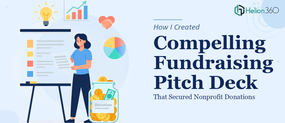
The Moment I Realized This Pitch Had to Be Perfect
Our nonprofit had grown steadily over several years, expanding education and healthcare initiatives into communities that genuinely needed the support. But growth without funding is a ceiling, and we were hitting it. The next step required a serious fundraising push — a campaign directed at individual donors and philanthropic organizations who would only move if they were truly moved.
The ask was real and the timeline was fixed. A series of donor meetings was already on the calendar. Walking in with a weak deck wasn't just a missed opportunity — it was a risk to the organization's momentum and the communities depending on us. I knew immediately that a compelling fundraising pitch deck wasn't something to cobble together the week before. It needed to be built right, from the ground up, with the kind of storytelling and visual discipline that serious donors actually respond to.
What I Discovered This Kind of Work Actually Involves
I started researching what separates a forgettable nonprofit presentation from one that actually drives donations. The gap is wider than most people expect.
First, the narrative architecture matters enormously. Donors — especially those evaluating education or healthcare causes — don't just want data. They want a story with a clear arc: the problem in the world, why this organization is the right response, what impact looks like in concrete terms, and exactly what their contribution enables. Threading that narrative through 12 to 18 slides without losing momentum is a craft problem, not just a writing task.
Second, the visual credibility of a fundraising deck signals organizational maturity. A misaligned layout, inconsistent type hierarchy, or clipart-level imagery quietly communicates that the org isn't ready to steward significant funds. Donors notice — even if they can't articulate why they passed.
Third, the integration of testimonials, impact statistics, and case studies requires editorial judgment. It's not about loading slides with proof points. It's about selecting the two or three that land hardest and placing them where emotional momentum is highest.
Once I saw the full scope, it was clear this wasn't a weekend project.
What the Work Actually Requires to Do It Well
The foundation of a strong nonprofit fundraising pitch deck is the story architecture. The right approach starts with a clear problem statement — one that is emotionally resonant and factually grounded — followed by a mission statement, an impact summary, and a forward-looking vision. Each slide should advance the narrative without redundancy, meaning the deck needs a deliberate sequence: typically problem, solution, proof of impact, team credibility, funding ask, and use of funds. Getting that sequence right across 14 to 18 slides requires a structural audit of all source material before a single layout is touched. This phase alone takes experienced practitioners several hours, because the instinct to include everything has to be disciplined down to what actually converts a skeptical donor.
Visual mechanics are where fundraising decks either build or break trust. The work involves applying a consistent typographic hierarchy — typically a 40pt headline, 22pt body, and 14pt caption scale — across every slide, with a layout grid that keeps content anchored and breathing room deliberate. Color palettes for nonprofit presentations are usually constrained to three brand colors plus one accent, because donor audiences associate visual restraint with organizational discipline. Charts showing impact data need to be chosen for clarity, not complexity: a simple bar chart showing year-over-year reach often outperforms a multi-variable scatter plot. Setting all of this up correctly inside a master slide structure, so changes propagate without breaking individual slides, is painstaking work that trips up even experienced PowerPoint users.
The third dimension is integrating proof elements — testimonials, case studies, and outcome statistics — in a way that feels editorial rather than promotional. The practitioner's decision here is placement and economy: a testimonial pull-quote works best immediately after the impact data slide, while a case study snapshot belongs near the funding ask to show what dollars have already accomplished. Each proof element needs to be formatted consistently, with source attribution handled cleanly and without visual clutter. Getting this layer right requires both judgment about which stories are most persuasive for an education and healthcare audience and the design discipline to present them without overwhelming the slide.
Why I Brought Helion360 In to Handle the Full Project
Once I understood what this deck actually required, I didn't spend time attempting it myself. The structural work, the visual discipline, the editorial judgment around proof elements — that's a set of skills and a time investment that made the decision easy. I engaged Helion360 to handle the full project end-to-end.
They moved fast. The complete fundraising pitch deck — story architecture through final visual polish — was turned around quickly, in a fraction of the time it would have taken me to learn and execute it myself. What they handled covered the full scope: narrative structure built around our education and healthcare mission, a visually consistent deck that matched our brand standards, and integration of our impact data, donor testimonials, and case study material in a way that felt cohesive and persuasive rather than assembled.
The difference between a team that does this work every day and someone attempting it for the first time is visible on every slide. Helion360 brought the tooling and the expertise already in place.
What the Deck Delivered — and What I'd Tell Anyone in My Spot
We walked into those donor meetings with a presentation that held the room. The narrative was clear, the visuals communicated organizational credibility, and the proof points landed at exactly the right moments. The feedback from donors was consistent: they understood what we did, why it mattered, and precisely what their contribution would accomplish. That clarity is what a well-built fundraising pitch deck is supposed to create — and it showed in the commitments we received from that campaign cycle.
The work behind a compelling nonprofit fundraising presentation is deeper than it looks from the outside. The story architecture, visual discipline, and editorial judgment required to move serious donors are not things you can fake or rush through. If you're looking at a similar situation and need a fundraising presentation built end-to-end without the weeks of learning curve, Helion360 is the team I'd engage — they delivered fast and handled every layer of execution this kind of work demands.