

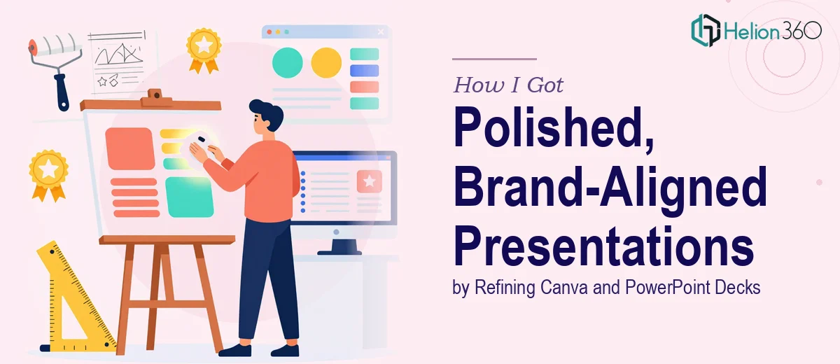
The Problem With Having Two Decks and a Conference Coming Up
We had a conference presentation locked in on the calendar, and I was sitting with two half-finished decks — one built in Canva, one in PowerPoint — neither of which looked remotely ready to go in front of a professional audience. Both had good content. Neither had design that matched the quality of what we were actually saying.
The stakes were real. This wasn't an internal team update. It was a conference stage, which meant the slides would be projected large, scrutinized by people who didn't already know us, and judged in the first few seconds before anyone heard a word. An inconsistent, rough-looking deck would undercut the message before it even landed.
I knew straight away this needed more than a quick cleanup. It needed someone who understood visual communication and brand-aligned design — not just someone who could move boxes around a slide.
What I Found Out Refinement Actually Involves
My first instinct was that this was a few hours of work. Tidy things up, swap a few fonts, make it look consistent. But when I started researching what polished, professional presentation design actually requires, that picture changed fast.
Refining an existing deck — especially across two different tools like Canva and PowerPoint — is not the same as starting clean. A practitioner first has to audit what's there: inconsistent font scaling across slides, mismatched color values that look similar on screen but aren't, placeholder layouts that were never adapted for real content, and spacing that's entirely arbitrary rather than grid-based.
Brand alignment is its own layer of complexity. It's not just applying a logo. It means ensuring every visual element — type hierarchy, palette, icon style, image treatment — reads as a coherent system. Done correctly, every slide feels like it belongs to the same family. Done incorrectly, the deck looks assembled rather than designed.
Then there's the cross-tool problem. Canva and PowerPoint handle typography, layout, and image rendering differently. Consolidating both into a single polished output requires decisions about which platform to finalize in, and rebuilding elements that don't transfer cleanly.
That's when I understood this was real work — not a weekend task.
What the Refinement Work Actually Requires
The foundation of any deck refinement is a structural and narrative audit. Before touching a single visual, a practitioner has to map what each slide is doing: is it introducing a concept, proving a point, or transitioning the audience? Slides that are trying to do too many things at once get restructured so one idea carries one slide. A proper type hierarchy — typically a 36pt headline, 24pt subhead, and 16pt body — gets established and enforced across every master slide. This phase alone, done with real discipline, surfaces problems that no amount of visual polish can fix later. Rushing past it is what causes decks to look busy even after they've been "cleaned up."
Visual mechanics come next, and this is where the measurable complexity sits. A 12-column layout grid gets established so that content alignment is never eyeballed — it's anchored. Color discipline means working from a palette capped at four brand colors, with specific hex values locked and applied consistently, not approximated. Charts and data visuals get rebuilt rather than reformatted if the source formatting is inconsistent, because inheriting bad chart styling from a previous version compounds problems rather than solving them. Getting this right across 20 or 30 slides in two different tools takes significantly longer than most people expect — not because individual decisions are hard, but because the volume of decisions is high and each one has downstream effects.
The final layer is polish and brand consistency across every surface of the deck. This means icon style is unified — flat, outline, or filled, but never mixed. Photography and illustration treatments follow one rule throughout: consistent overlay opacity, consistent cropping ratio, consistent placement logic. Slide transitions, if used, are either removed or standardized to a single subtle transition type. A practitioner doing this properly checks every slide against every other slide, not just against a brand guide document. It's methodical, time-intensive work, and it's the layer most likely to be left incomplete when someone tries to handle it under deadline pressure.
Why I Brought in Helion360 to Handle It
Once I understood what this actually involved, attempting it myself was not on the table. I had a conference date that wasn't moving, content that needed to stay intact, and zero margin for a learning curve on cross-platform design refinement.
I brought Helion360 in to handle the full project end-to-end. They took both decks — the Canva version and the PowerPoint — audited the content structure, established a proper design system, and delivered a single refined, brand-aligned output. The work that would have taken me weeks to attempt myself was turned around quickly, and the quality wasn't a best-effort polish job — it was a properly designed deck.
Specifically, they handled the structural narrative review, the visual rebuild with a consistent grid and palette, and the cross-platform consolidation into a finalized PowerPoint ready for the conference stage. The tooling and the expertise were already in place. That's the difference.
The Outcome and What I'd Tell Anyone in My Spot
What came back was a deck that looked like it was built from scratch with intent — not patched together from two different tools under deadline. The type hierarchy was consistent from slide one to the last slide. The brand palette held throughout. The layout grid meant nothing was floating arbitrarily. When it went up on the conference screen, it read as professional before a single word was spoken.
The business outcome was simple: we showed up looking like we meant it, and the audience engaged with the content rather than being distracted by inconsistent design.
If you're looking at a similar situation — two rough decks, a real deadline, and a room full of people you want to impress — Helion360 is the team I'd engage. They delivered fast, handled the full execution depth this work requires, and saved me the weeks I would have spent trying to figure it out myself.