

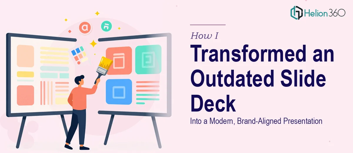
The Slide Deck That Was Holding Us Back
We had a presentation that had been around for years. The content was solid — the key messages were there, the data was accurate — but the slides themselves looked like they were built in a different era. Inconsistent fonts, misaligned layouts, stock clip art that had no place in a professional setting, and zero visual hierarchy. Every time I opened it, I felt a quiet sense of dread.
We had a review meeting coming up, and I knew the deck needed more than a few tweaks. It needed a complete PowerPoint redesign from the ground up.
I Tried to Handle It Myself First
I opened the file, made a plan, and started working through it slide by slide. I updated some fonts, replaced a few background colors, and tried to clean up the layout on a handful of slides. After a couple of hours, I had made incremental improvements — but the overall presentation still felt patchy and inconsistent.
The real problem was that I had no clear visual system to work from. Our team did not have a defined set of brand guidelines at the time, which meant every design decision I made was a guess. One slide looked clean, the next looked cluttered. The typography was still fighting itself. And with over thirty slides to work through, I was burning time I did not have.
This was not a matter of effort — it was a matter of skill and consistency. A proper slide deck redesign requires decisions that compound across every slide: a type hierarchy that works at a glance, a color palette that reinforces the brand, layout logic that keeps the audience focused. I was trying to do all of that without a clear foundation.
Bringing in the Right Team
After hitting that wall, I reached out to Helion360. I explained the situation — old deck, no formal brand guidelines, a tight turnaround, and a need for something that looked genuinely modern and professional. Their team asked the right questions upfront: what industry, what audience, what tone did I want the slides to carry? That conversation alone helped clarify what the presentation actually needed to accomplish.
I shared the original file along with some rough notes on our brand colors and typography preferences. From there, Helion360 took over.
What the Redesign Actually Involved
The transformation went well beyond swapping fonts and adjusting colors. The team restructured the visual flow of the entire deck, creating a consistent slide master that gave every layout a unified feel. They introduced a clean grid system so content had room to breathe without looking sparse. Data slides that had previously been walls of numbers were converted into clear, readable visuals that made the key points land immediately.
Branding was applied deliberately throughout — not just on the title slide, but carried consistently through section breaks, content slides, and the closing. The result was a presentation that looked like it came from a single, intentional source rather than years of piecemeal edits.
What I noticed most when I reviewed the finished deck was how much easier it was to follow. The story the slides told had not changed — the content was still ours — but the visual design now supported that story instead of competing with it.
What I Took Away From This
Modernizing a slide deck is not just a cosmetic exercise. It is a structural one. The typography, layout, spacing, color usage, and visual hierarchy all have to work together for a presentation to feel polished and credible. Getting that right across thirty-plus slides, with no existing brand system to reference, is genuinely difficult work — and doing it halfway produces results that are worse than starting from scratch.
I also learned that having a clear brief matters enormously. The questions Helion360 asked at the start shaped the entire outcome. Knowing the audience, the purpose, and the tone before a single slide is touched saves a significant amount of back-and-forth later.
If you are sitting on a slide deck that you know is not doing justice to your content, Helion360 is worth reaching out to — they took what I had and delivered exactly the kind of modern, brand-consistent presentation that I could not build on my own.