

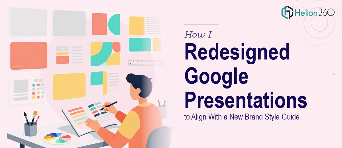
When a Brand Refresh Means Every Slide Needs to Change
Our team had just completed a full visual identity overhaul — new color palette, new typography system, new logo treatment. The brand guidelines were sharp, well-documented, and ready to roll out. The problem was the backlog: multiple Google Presentations, each sitting somewhere in the drive, none of them reflecting the new brand identity. These weren't just internal documents — they were materials that went in front of clients, partners, and stakeholders. Showing up to a meeting with slides that contradicted the new brand was not an option.
The team was stretched, the presentations needed to be handled concurrently, and getting them wrong would mean re-doing the work a second time. I knew this needed to be handled properly — consistently, efficiently, and with real attention to the guidelines — the first time through.
What I Realized This Actually Involves
My first instinct was to estimate the scope as simple find-and-replace work. Swap the hex codes, update the fonts, move on. But the more I looked at the existing files, the more I understood why that framing was wrong.
A brand style guide isn't just a color swatch. It specifies primary and secondary palette relationships, type hierarchy across heading, subheading, and body levels, spacing rules, logo placement zones, and image treatment standards. Applying that consistently across multiple presentations — where each file has its own legacy formatting, inconsistently applied text boxes, embedded images, and overridden master slide settings — is a different exercise entirely.
The other signal was scale. Even at five slides per presentation, handling several documents concurrently means tracking version consistency across all of them simultaneously. One slide in one deck that still uses the old palette creates a credibility problem. The standard had to be airtight across the full batch, not just one file at a time.
What Proper Brand-Aligned Google Slides Redesign Looks Like
The work starts with a structural audit of the existing files before any visual changes happen. Every presentation needs to be mapped against the style guide to identify what's out of compliance: legacy font usage, hardcoded colors that bypass the theme, placeholder images, and slide master conflicts. In Google Slides, theme settings can be overridden at the individual slide or text-box level, meaning a surface-level font change won't catch everything — a practitioner has to audit at the element level, not just the master. Across multiple files running concurrently, this audit step alone takes focused time to do without introducing new inconsistencies.
The visual mechanics of applying a new brand identity to Google Presentations require precision at the theme-setup level first. A well-executed update means defining the brand palette correctly in the custom theme — typically no more than four primary colors with two to three accent options — so that every new element inherits the right colors automatically. Typography hierarchy follows a fixed scale: common practice aligns heading, subheading, and body at ratios like 36pt, 24pt, and 16pt respectively, with line height and letter spacing defined per level. Setting this up in Slides' master view so it propagates correctly across all slide layouts takes expertise; doing it incorrectly means every layout needs manual correction, which multiplies the time cost significantly.
Polish and cross-deck consistency is where most attempts fall apart. With several presentations in the batch, the real execution challenge is ensuring that the same brand decisions — image crop and treatment style, icon weight and color, margin and padding discipline, logo sizing and placement — read identically whether someone opens presentation one or presentation five. A consistent layout grid (typically built around a 12-column structure with defined safe zones) needs to underpin every slide across the full set, not just be approximated visually. Maintaining that across concurrent files, catching edge cases like slides with tables or embedded charts that need manual recoloring, is where the execution depth becomes clear.
Why I Brought in Helion360 to Handle It
Once I understood the actual scope — a structured audit across multiple files, theme and master setup, typography system application, and brand-aligned presentation updates — it was immediately clear that attempting this piecemeal with an already-stretched team was the wrong move. The risk wasn't just time; it was inconsistency. A batch of presentations that almost matches the style guide is worse than a batch that hasn't been updated yet.
Helion360 handled the full project end-to-end: the compliance audit against the brand guidelines, the Google Slides master and theme rebuild, and the full visual update applied consistently across every presentation in the batch. The work was turned around quickly — done in days, not weeks — which is exactly what the team needed given the concurrent demand. They came to it with the process and tooling already in place, which meant no ramp-up time and no trial-and-error on our dime.
The Result and What I'd Tell Anyone Looking at the Same Problem
What came back was a full set of presentations that read as a coherent brand family. The color palette, typography hierarchy, spacing, logo treatment, and image style were consistent slide to slide, deck to deck. The materials were immediately usable — no additional cleanup, no second pass. The team could pick up any one of the files and present with confidence that it reflected the current brand accurately.
The broader lesson was simple: brand alignment across multiple presentations isn't a formatting task. It's a systematic design exercise that requires understanding both the brand guidelines and the technical structure of the tool being used. If your team is looking at a similar batch of Google Presentations that need to be brought into compliance with a new style guide — and you need it done right and done fast — Helion360 is the team to engage. They handled the full execution for us quickly and delivered the kind of cross-deck consistency this work demands.