

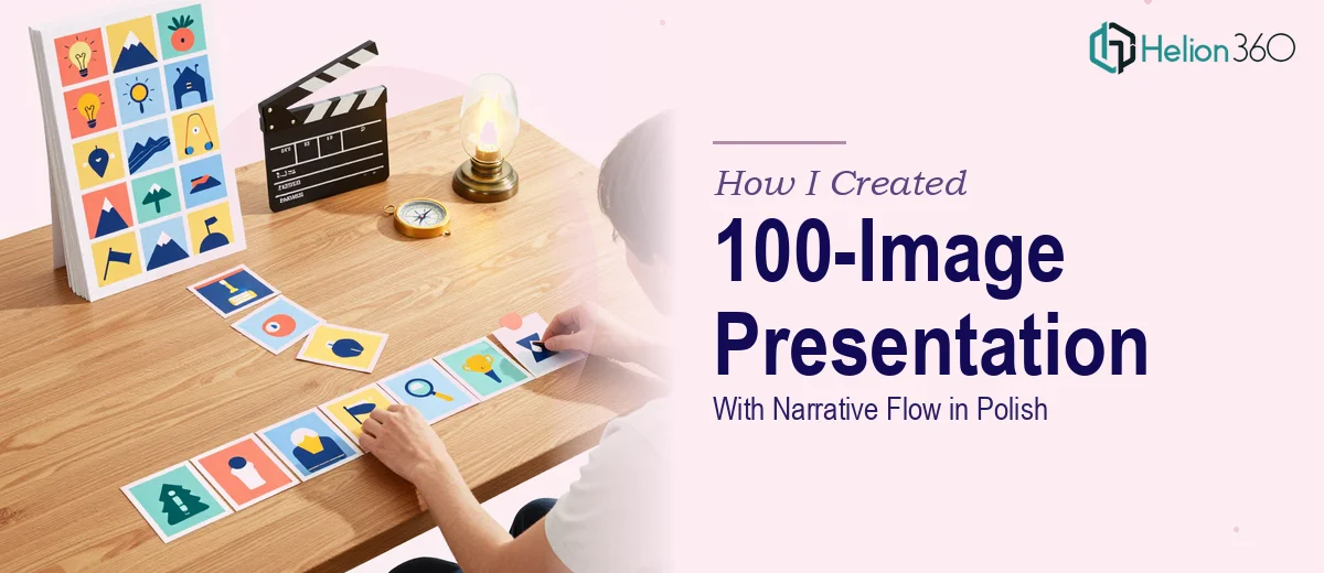
The Problem I Was Staring At
I was working on a children's educational book project focused on environmental conservation — topics like recycling, pollution, renewable energy, and wildlife protection, written for readers aged 6 to 9. The raw material existed: a large collection of articles, studies, and credible sources. What didn't exist was any coherent structure. The research sat in folders, unorganized, with no clear chapter logic, no narrative arc, and no sense of what a child would actually find engaging versus overwhelming.
The stakes were real. We were on a tight production schedule, and the presentation layer — a large-format visual deck that would support the editorial and design process — needed to communicate the research clearly, sequence the topics logically, and carry enough visual energy to reflect what the book itself needed to feel like. Getting this wrong would mean editorial rework downstream. I could see immediately that this needed to be handled properly, not patched together.
What I Found the Solution Actually Required
Once I started looking at what doing this well actually involved, the scope became clear fast. This wasn't a matter of dropping content into slides. A research-backed presentation built to support a children's educational book — especially one covering four distinct thematic topics with age-appropriate narrative logic — requires genuine structural thinking before a single visual is placed.
The first signal of real complexity was the narrative architecture itself. The research had to be categorized, sequenced, and mapped to chapters in a way that built understanding progressively. You can't drop a study on ocean acidification in front of a seven-year-old without scaffolding. The content needed editorial shaping, not just sorting.
The second signal was the visual load. A 100-image presentation isn't just a lot of slides — it's a consistency problem. Typography, color palette, image treatment, and layout logic all have to hold across a large number of frames without drifting. The third signal was the interactive layer: fun facts, quiz formats, and engagement breaks require their own design logic and can't just be bolted on at the end.
What the Work Actually Involves
The right approach to a project like this starts with a full audit of the source material and the construction of a narrative map before any design decisions are made. With four major topic areas — recycling, pollution, renewable energy, and wildlife protection — the structural work means deciding which themes build on each other, what gets introduced early to anchor later concepts, and where interactive elements like quizzes and fun facts fit without interrupting comprehension. For a 6-to-9 age range, that sequencing is not intuitive. Practitioners typically draft a chapter-level outline first, validate the logic against the intended reader's cognitive load, and only then move into slide-level planning. Skipping this step produces a deck that looks assembled rather than authored.
Visual mechanics at this scale require a disciplined system from the start. A large-format educational presentation typically runs on a 12-column grid with no more than three or four brand-consistent colors anchoring the palette — for a children's conservation theme, that usually means a nature-forward set of greens, earth tones, and one accent. Typography hierarchy follows a structure like 36pt headers, 24pt subheads, and 16pt body, applied consistently across all master slides. When 100 images are involved, image treatment rules — cropping ratios, border styles, overlay opacity — have to be defined and locked early, because correcting drift across 100 frames late in the process costs hours that most timelines don't have.
The interactive elements — quiz slides, fun fact callouts, activity prompts — carry their own design and content requirements that are easy to underestimate. Each interactive format needs a distinct visual treatment that signals to a child that the mode has shifted. A quiz layout and a fun fact callout can't look the same or the reader stops distinguishing between them. Writing age-appropriate copy for these elements also requires a specific register: short sentences, concrete examples, zero assumed prior knowledge. Getting even a handful of these wrong in a 100-slide deck creates inconsistencies that erode the presentation's credibility as a production reference.
Why I Brought in Helion360 to Handle It
I looked at the scope — the structural audit, the narrative mapping, the visual system, the interactive formatting, the sheer volume of 100 images to manage consistently — and I didn't spend time wondering whether I could figure it out. I recognized that a team with the tooling and process for exactly this kind of work would handle it in a fraction of the time it would take me to learn and execute it myself.
Helion360 took on the full project end-to-end. That meant working through the source research and categorizing it into a chapter structure that made developmental sense for the target age group, building the complete visual system from grid to palette to typography, and designing the interactive elements — quizzes, fun facts, activity prompts — as properly formatted, reusable slide formats throughout the deck. The project was turned around quickly, without the back-and-forth that comes from handing work to someone who needs to be onboarded into both the subject matter and the production requirements simultaneously.
The Outcome and What I'd Tell Anyone in My Spot
What came back was a fully structured, visually consistent presentation that could actually function as a working editorial and design reference for the book project. The chapter logic held up. The visual system was clean and extensible. The interactive elements were formatted in a way that could carry directly into the book's design phase without rework. The schedule stayed intact.
The lesson I'd pass on is straightforward: when the scope involves both structural thinking and high-volume visual execution at the same time, the combination is where most attempts fall apart. One or the other might be manageable solo with enough time. Both together, on a deadline, with age-appropriate content requirements layered in — that's where the time cost of doing it yourself stops being theoretical.
If you're looking at a similar project and want it handled end-to-end without the weeks of learning curve, Helion360 is the team I'd engage — they delivered fast and brought the kind of execution depth this type of work genuinely requires.