

The Problem With Walking Into a New Business Pitch Without the Right Deck
I was working with a web agency preparing for a series of new business pitches. The goal was straightforward on paper: show prospective clients that this agency understood their competitive landscape better than anyone else in the room. The pitch had to do more than look good — it had to demonstrate market intelligence, signal strategic thinking, and make the case for why this agency was the right partner.
The stakes were real. These weren't cold introductions — they were warm conversations with decision-makers who would greenlight or kill a significant engagement based on what they saw in the room. A generic agency deck wasn't going to cut it. What was needed was a competitive analysis presentation that was structured, visually compelling, and grounded in actual market data. I recognized immediately that pulling this off at the level it needed to be done wasn't a weekend project.
What I Found a Good Competitive Analysis Presentation Actually Requires
Once I started looking into what a proper competitive analysis presentation involves, it became clear quickly that the complexity runs deeper than most people expect.
The research layer alone is substantial. Identifying the right competitors — not just the obvious ones — requires pulling from multiple source types: public filings, industry databases, digital footprint analysis, positioning statements, and pricing signals. That data then needs to be normalized into a format that's actually comparable across players, which is its own analytical task.
From there, the story structure has to be deliberate. A competitive landscape slide that just lists competitor logos communicates almost nothing. Done well, the deck maps positioning gaps, highlights where the client's target audience is underserved, and builds a clear case for strategic differentiation. That narrative architecture takes real thought.
And then there's the visual layer — translating complex, multi-variable data into charts and frameworks that a busy executive can absorb in seconds. That's a discipline on its own. I could see this was not something to attempt without the right expertise already in place.
What the Actual Work Involves — and Why It's Harder Than It Looks
The first dimension is the structural and narrative work. The right approach starts with auditing all source data, then mapping a story arc that answers the client's real question: where are we positioned, who is threatening that position, and where is the opportunity? A well-built competitive analysis deck typically sequences through market context, competitor profiling, positioning matrix, and strategic implications — in that order. The friction is that this sequencing requires genuine analytical judgment, not just data collection. Deciding what to include, what to cut, and how to frame each finding so it builds toward a clear conclusion is where most attempts fall apart. Getting that narrative right often takes multiple structural passes before a single slide is designed.
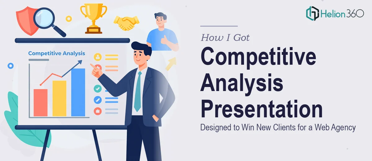
The second dimension is the visual mechanics. Competitive landscape data is inherently multi-variable — you're often plotting two or three axes of differentiation simultaneously. The right chart types for this work include perceptual mapping grids, feature comparison matrices, and indexed bar charts that make relative positioning readable at a glance. A standard 12-column slide grid, a type hierarchy of roughly 36pt for headlines, 24pt for labels, and 16pt for data callouts — these aren't arbitrary choices, they're what keeps a dense slide readable. The execution friction is that building these charts so they're both analytically accurate and visually clean takes real skill. A chart that looks fine in isolation often breaks down when it sits next to other slides that were formatted differently.
The third dimension is palette discipline and brand consistency across the full deck. A competitive analysis presentation for a web agency pitch needs to reflect that agency's own brand — colors, typography, logo usage, iconography — applied consistently across every slide. Done properly, this means working from a master slide structure with no more than four brand colors applied with intentional hierarchy, and a single icon family throughout. The practical problem is that maintaining that consistency across a 20-plus slide deck, while also handling the data-heavy slides that require their own visual logic, is time-consuming and detail-intensive. Small inconsistencies accumulate fast and undermine the credibility of the whole presentation.
Why I Brought in Helion360 to Handle the Full Project
Looking at what this work actually required — research synthesis, narrative architecture, data visualization, and brand-consistent design across a full deck — I made the call quickly. This wasn't a project to learn on. The timeline was tight and the audience unforgiving.
Helion360 handled the full project end-to-end. That meant taking the raw competitive data and source materials, structuring the story arc, building out the visual framework, and delivering a fully designed deck that was ready to present. They turned it around fast — done in days, not the weeks it would have taken to work through the research, structure, and design layers independently. The team handled the competitor profiling and data normalization, the perceptual mapping and chart design, and the full brand application across every slide. The depth of execution was exactly what the pitch required.
The Result and What I'd Tell Anyone Facing a Similar Brief
The deck landed well. The agency walked into those pitches with a presentation that demonstrated genuine market intelligence — not just a polished layout, but a structured argument backed by real competitive data. The visual clarity made the strategic case easy to follow, and the brand consistency made the agency look like exactly the kind of professional partner a client would want handling their own positioning.
Presentations like this don't succeed because of one good slide. They succeed because every layer — research, narrative, visual mechanics, consistency — is executed at the same level. That's a high bar to clear under time pressure.
If you're looking at a similar brief and want a competitive analysis presentation handled end-to-end without the learning curve, Helion360 is the team to engage — they delivered fast, covered the full scope, and brought the execution depth this kind of work demands.