

The Moment I Realized This Presentation Had to Be Right
We had a product launch event locked in — a room full of prospects, partners, and a handful of press contacts. The PowerPoint was the centerpiece of the whole thing. It wasn't a background document or a leave-behind. It was the story we were telling live, on a large screen, in front of people who were deciding whether to care about what we'd built.
The stakes were clear: a weak presentation would flatten the energy in the room. A strong one would carry the narrative, make the product feel inevitable, and leave people with something they'd remember. I knew immediately that "polishing a few slides" wasn't what this needed. It needed a presentation built for visual storytelling from the ground up — one where every slide earned its place in the sequence.
That recognition settled it. This wasn't something to patch together the night before.
What I Found Out a Launch Presentation Actually Requires
I started pulling together what it would actually take to do this right, and the scope became clear fast.
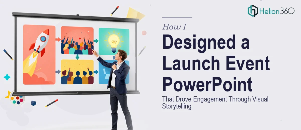
A launch event PowerPoint isn't a report reformatted with better fonts. It's a scripted visual experience with a defined arc — problem, tension, reveal, proof, call to action — where each slide has a specific role. Practitioners who do this well talk about "slide economy": every element on screen either advances the story or gets cut. That discipline alone requires a sharp editorial eye that most people building decks don't exercise because they're too close to the content.
On top of structure, there's the visual language. The chart types, the iconography, the motion — each choice either reinforces the narrative or dilutes it. And then there's the brand layer: a launch event is a brand moment, which means the presentation has to hold together visually as a cohesive identity piece, not just a sequence of informative slides.
Each of these layers is a real skill set. Seeing all three stacked together made it obvious this was a project that needed dedicated expertise.
What the Work to Build This Presentation Actually Involves
The first layer of work is structural and narrative. Done well, this starts with auditing the source material — the product story, the key proof points, the audience's likely objections — and mapping a clear slide-by-slide arc before a single layout is touched. A practitioner building a launch deck typically works to a tight story spine: no more than one key idea per slide, with transitions that feel earned rather than arbitrary. The friction here is that most people skip this phase or compress it, which means the visual work that follows is built on a shaky foundation. Rebuilding narrative structure mid-production is expensive in time and clarity.
The second layer is visual mechanics. A launch event deck that holds up on a large screen operates on a disciplined layout grid — typically a 12-column structure — with a strict type hierarchy: 40pt headline, 24pt supporting text, 16pt captions, and no exceptions. Color usage follows the same discipline: a maximum of four brand colors with defined roles, so the palette reads as intentional rather than decorative. Getting these mechanics right across a full deck of 20 to 40 slides requires the kind of systematic thinking that takes hours to execute even for experienced designers — and for someone new to master slide architecture, the learning curve alone can consume most of a tight timeline.
The third layer is polish and brand consistency. This means every slide reads as part of the same visual system — consistent icon weight, matched spacing across sections, animation behavior that's purposeful rather than distracting. On a launch deck, a single slide that breaks the visual language breaks the audience's trust in the brand for a moment. Achieving true consistency requires working from a locked master template and having the discipline to catch every deviation across every slide. That level of review takes time and a trained eye that spots things a non-specialist will miss entirely.
Why I Brought in Helion360 to Handle It
I didn't spend time attempting this myself. The combination of narrative architecture, visual mechanics, and brand-level consistency across a full event deck was too specific a skill set — and the timeline was real.
Helion360 handled the full project end-to-end via business presentation design services: story structure and slide sequencing from the source material, layout and visual system design built for large-format display, and brand-consistent execution across every slide in the deck. They turned the whole thing around quickly — done in days, not the weeks it would have taken me to learn the tooling and work through the production decisions myself.
What stood out was that this is exactly the kind of work they do at volume. The expertise and the systems were already in place. There was no ramp-up time, no back-and-forth to establish basic design fundamentals. The brief went in, the deck came out — polished, on-brand, and built to perform in a live setting.
The Result and What I'd Say to Anyone Facing This
The deck landed well. The room tracked with the narrative, the product reveal hit at the right moment in the sequence, and the visual quality held up on the large screen without a single slide feeling out of place. Feedback from the event consistently pointed to professionally designed business PowerPoint presentations as a factor in how clearly the product story came through.
The bigger takeaway was how much of that outcome depended on decisions made in the structural phase — decisions that happen before any visual work begins. That's not intuitive if you've only ever seen the finished product.
If you're looking at a similar launch moment and want a presentation built for it end-to-end — narrative, visual system, and brand consistency — Helion360 is the team I'd engage. They delivered fast and brought exactly the level of execution depth a launch event deck requires.