

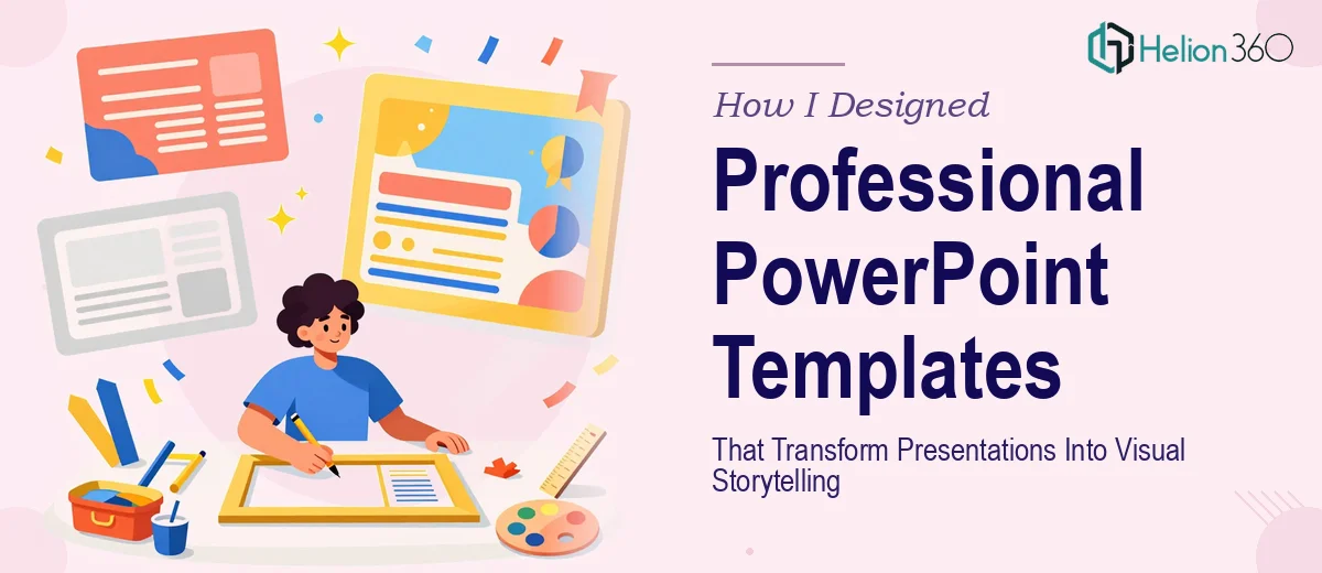
When a Simple Template Request Turned Into Something More Complex
It started with what I thought would be a straightforward task. Our team needed a set of branded PowerPoint templates — something clean, professional, and flexible enough to be reused across different types of business presentations. I had worked with PowerPoint before, so I figured I could handle it.
I spent the first couple of days experimenting with layouts. I pulled together some color references, matched our brand fonts, and started building out slide masters. On the surface, things looked fine. But the moment I started testing the templates across different use cases — a sales deck, a company overview, a data-heavy report — the cracks started showing. Alignment was off on certain slide sizes. The layouts that worked for one type of content fell apart with another. And the visual hierarchy, which is what actually makes a presentation easy to follow, just wasn't there.
I realized this wasn't just a design task. It was a system-level design challenge.
What Good PowerPoint Template Design Actually Requires
A professional PowerPoint template is not just a pretty background and a logo in the corner. It is a structured framework that needs to work across dozens of different content types, users, and screen formats.
The slide master has to be built correctly from the start — with properly defined layouts, consistent spacing, and a type system that scales without breaking. Color palettes need to be set as theme colors so that charts and SmartArt inherit the right values automatically. And every layout needs to be tested with real content, not placeholder text, before it is finalized.
I was capable of handling parts of this, but doing all of it well — while maintaining visual consistency, brand alignment, and functional flexibility — was more than I could deliver on my own within the timeline I had.
Bringing in a Team That Knew the Process
After hitting a wall with the master layout structure, I came across Helion360. I explained what I had started, what was not working, and what the end goal was. Their team asked the right questions — about brand guidelines, how the templates would be used, who would be editing them, and what level of design complexity was needed across the slide library.
From there, they took over the build entirely.
What they delivered was a complete business presentation design services solution — not just a single file. There were distinct layout variants for title slides, section dividers, content slides, data slides, and closing slides. Every element was anchored to the slide master, which meant any user editing the deck would stay within the visual system without needing design knowledge. The color theme was mapped correctly, so charts and tables automatically matched the brand palette. Typography was set using custom font pairs that kept things readable even at smaller sizes.
The templates were also built with usability in mind. Placeholder boxes were sized and positioned so that content dropped in naturally. Icon slots were grouped and easy to swap. The whole system felt considered, not just assembled.
What the Finished Templates Actually Changed
Once the template library was in use, the difference was visible almost immediately. Presentations that previously looked inconsistent — different fonts, mismatched colors, uneven spacing — started looking cohesive. People on the team were producing decks faster because the structure was already in place. They were not redesigning from scratch every time.
Visual storytelling in a presentation is not just about aesthetics. It is about making information easy to follow. When the layout does the heavy lifting, the audience spends more time engaging with the content and less time decoding the slide. That shift happened noticeably across the decks we produced after the templates were in place.
The other thing I took away from this experience is that PowerPoint template design is genuinely a technical discipline. Getting the slide master right, building layouts that hold up under real content, and ensuring the file is clean and easy to use for non-designers — that takes expertise. It is not something most people realize until they try to do it properly.
If you are working on a similar project and finding that the technical side of building a solid PowerPoint template system is getting complicated, Helion360 is worth reaching out to — they handled the complexity I couldn't and delivered something that actually worked in practice.