

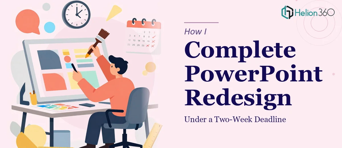
When the Deadline Is Real and the Deck Is a Mess
We had a marketing event coming up in two weeks, and the PowerPoint presentation we planned to use had not been touched in over a year. The data was outdated, the design looked dated, and the slides simply did not reflect the quality of the campaign we were about to launch. It was not a situation where a quick color swap would fix anything. The whole deck needed a proper overhaul.
I figured I could handle it. I had used PowerPoint plenty of times before, and how hard could a deck update really be?
What I Quickly Realized About a Real Presentation Redesign
I started by opening the file and immediately understood the scale of the problem. There were over thirty slides. Some had mismatched fonts, others had charts built from data that no longer existed in the source files. A few slides had been clearly copy-pasted from different templates at different points, so nothing visually aligned. The color palette was inconsistent, and the slide hierarchy made no logical sense for a live presentation.
I spent the better part of a day just trying to create a master slide template, and even that was not coming together cleanly. Reformatting charts, replacing outdated statistics, maintaining brand consistency across every slide, and doing all of this while also managing the rest of the campaign work — it became obvious very quickly that I was going to run out of time before I ran out of slides.
The event was not going to move. The deck had to be ready.
Bringing in the Right Team at the Right Time
After hitting that wall, I came across Helion360. I explained the situation — an existing deck that needed a complete redesign, fresh data integrated throughout, brand consistency applied across all slides, and a hard two-week deadline. They asked the right questions upfront: what was the event context, what brand assets were available, and what tone should the presentation carry.
That initial conversation gave me confidence that they actually understood what a professional presentation redesign involves. It is not just making slides look nicer. It is restructuring the visual hierarchy, making data readable at a glance, and ensuring the deck works as a communication tool — not just a document.
I handed over the original file, the updated data, and brand guidelines, and their team took it from there.
What the Redesigned Deck Actually Looked Like
The turnaround was faster than I expected. Within the first few days, I received an initial version that already looked significantly more polished than anything I had put together. The slide layout was clean and consistent. The charts had been rebuilt with the current data and formatted so the key numbers read clearly without needing a second look. The typography followed a clear hierarchy, and the overall visual tone matched the marketing campaign it was supposed to support.
There were a couple of rounds of revisions — mostly small adjustments to specific slides and a few wording changes — and the final version was delivered with days to spare before the event.
What I Took Away From This Experience
Updating a PowerPoint presentation sounds simple until you are standing in front of thirty inconsistent slides with a deadline bearing down. A proper PowerPoint redesign involves layout thinking, data visualization decisions, and brand application skills that go beyond what most people use day-to-day in the software.
What the Helion360 team delivered was not just a cleaner version of the old deck. It was a presentation that actually worked for the context it was going into — a live marketing event where first impressions matter.
If you are in a similar position — a deck that needs a real update, a deadline that is not flexible, and not enough hours to do it justice yourself — Helion360 is worth reaching out to. They handled what I could not manage alone and delivered something I was genuinely confident presenting.