

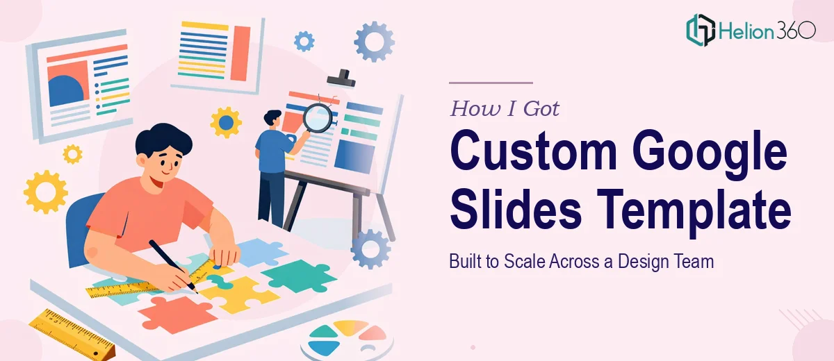
The Problem I Was Staring At
Our team was growing fast. New contributors were jumping into decks weekly, and every presentation came out looking slightly different — different fonts, misaligned headers, inconsistent brand colors, slides that clearly weren't built from the same starting point. It was becoming a credibility problem. When you're a startup putting marketing solutions in front of clients, visual inconsistency signals internal chaos, and that's not a message you want to send.
I needed a single custom Google Slides template that the whole team could work from — something that enforced structure without restricting flexibility, that looked polished from slide one, and that new contributors could pick up without a training session. The deadline was real. We had a round of client presentations coming up in under two weeks, and I knew this wasn't a problem I could half-solve with a few tweaks to an existing theme.
This needed to be done properly, and it needed to be done quickly.
What I Found This Kind of Project Actually Requires
I started by looking at what a properly built Google Slides template actually involves, and it was more than I'd assumed. A production-ready template isn't just a branded color palette dropped onto a blank slide — it's an architectural decision. Every layout, every placeholder, every font pairing has to be set at the master slide level so it propagates consistently to every new slide a contributor creates.
The first signal of real complexity was the slide master system itself. Google Slides uses a hierarchy of master slides and layouts, and if those aren't configured correctly from the start, contributors will override styles manually, which defeats the entire purpose. The second signal was typography. A working type scale — something like 36pt for section titles, 24pt for slide headers, 16pt for body copy — has to be embedded in the master, not applied slide by slide. Third was the color system. A strict palette of no more than four brand colors needs to be set at the theme level so that every chart, shape, and text element pulls from the right values automatically. Each of those elements alone requires deliberate technical setup, not just aesthetic taste.
What the Work Itself Actually Involves
The structural work starts with an audit of every presentation use case the team actually needs — client-facing decks, internal reporting slides, pitch formats, data-heavy layouts. Once those are mapped, the right approach is to design a master slide architecture that covers each context without creating redundant or confusing layout options. A well-built template typically includes eight to twelve distinct slide layouts in the master, each serving a specific content pattern. Getting that number right — not too few that contributors improvise, not so many that the template becomes overwhelming — is a judgment call that takes experience to land correctly. Skipping this structural phase means the template looks finished but breaks down the moment someone tries to use it for something the designer didn't anticipate.
The visual mechanics layer is where most DIY attempts fall apart. A proper 12-column grid needs to be applied consistently across every layout so that text blocks, images, and data panels align to predictable positions regardless of which layout a contributor selects. Typography has to be embedded at the theme level — not manually applied — with a clear hierarchy: typically 36pt for section title slides, 28pt for slide-level headers, and 16pt for body copy with 1.3x–1.5x line spacing for readability. Charts and diagrams need placeholder styling that matches the palette so that when a contributor drops in a bar chart, it doesn't render in Google's default blue. Setting all of this up correctly, and verifying it holds across every layout variant, takes hours of careful configuration.
Polish and consistency across a multi-layout template is the final layer, and it's the one that determines whether the template actually gets used or quietly abandoned. Brand application has to be airtight — primary, secondary, accent, and neutral tones applied at the theme level with no rogue colors appearing in shape defaults or slide backgrounds. Icon sets, dividers, and graphic elements need to sit on locked background layers so contributors can't accidentally move them. Every layout needs to be tested with real content — long headlines, short headlines, dense data, sparse copy — to confirm that placeholders resize and reflow gracefully. This testing phase alone surfaces a dozen small fixes that look minor individually but compound into a messy experience if left unresolved.
Why I Brought in Helion360 to Handle It
I looked at what this project genuinely required — the master slide architecture, the typography system, the grid, the palette enforcement, the layout testing — and recognized immediately that attempting it myself wasn't a realistic option. I didn't have the tooling set up, and even if I did, the learning curve alone would have eaten the two weeks I had before our client presentations.
Helion360 handled the full project end-to-end through their Business Presentation Design Services. That meant the structural audit of our use cases, the master slide build across all layout variants, the brand application at the theme level, and the full round of layout testing with real content samples. They turned it around quickly — the complete template, tested and ready to distribute to the team, was delivered in days. That's the kind of speed that only happens when a team does this work all day with the process and tooling already built in.
What We Got and What I'd Tell Anyone in the Same Spot
What came back was a complete, production-ready custom Google Slides template — twelve layouts, a locked master, a clean type scale, a four-color brand palette applied at the theme level, and a set of pre-styled chart and data slide formats. The team adopted it immediately. Within a week, every deck going out to clients looked like it came from the same house. The inconsistency problem disappeared, and new contributors could build a professional presentation without any guidance.
The business outcome was straightforward: our client-facing presentations started reflecting the quality of the work we were actually delivering, which is what they should have been doing all along.
If you're looking at a similar problem — a team that needs a consistent, scalable presentation system built right and fast — Helion360 is the team to engage. They handled every layer of this project end-to-end and delivered in a fraction of the time it would have taken to figure it out internally.